Color will have to work extra hard to elevate and comfort a hazardous client searching for product endurance and variety.
This article will help you choose the best women’s colors to exhibit to the public and expand your business. Let’s get started.
Table of Contents
Main factors
Shades for women in S/S 22
Adding the perfect tones
Main factors
In a tumultuous environment, balance the S/S 22 color palette to encourage adaptability and pragmatism while offering confidence and a much-needed boost.
- To ensure product durability and popularity, rely on neutrals: actual colors of butter, yellow, and olive oil green offer freshness. Using undyed, raw fibers is an even more incredible circular design process.
- Cheerful brights will connect but strike the appropriate balance: the bulk of clothing purchases will be influenced by a cost-per-wear perspective, so use mid-level colors for a gentler message, or mix bold brights with reliable neutrals.
- Green may advertise well-being and all-natural attributes: nutritious, plant-based colors will resonate with individuals seeking a relaxing, calm existence.
- ‘Flawed’ hues will be valued as the resale and rental markets grow: weird neutral colors and pastels will offer a soft elegance with a sentimental narrative to tell.
- The long-term impact of the stay-at-home style will continue to blur the barriers between fashion and interiors: refresh fundamental closet elements with great mid-century colors.
Shades for women in S/S 22
The S/S 22 palette is divided into enhanced nature and everyday pleasure.
Enhanced nature
Enhanced nature emphasizes mood-boosting colors, such as energizing warm tones and soothing cold tones.
Everyday pleasure
Everyday pleasure is a collection of natural and earthy hues with a soothing, sensual attraction that promotes stability and tranquility.
Primary essential tones
Women’s core colors are the basic shades on which to create your design. They will also continue to have importance in the fashion world as ageless and trans-seasonal neutrals are more vital than ever.
Golden Harvest is a transitional color from last summer’s fashion palette for S/S 22 to give a sense of durability.
Adding the perfect tones
Natural shades
Trends will provide a sensation of escape, from wanderlust photos to runway inspiration. Color and pattern are unprocessed yet polished, pointing to all-natural components like sand sunsets and traces of light green that resemble sea reflections.
For floral designs, boost neutrals with black accents, combining them with natural fibers like textiles and natural cotton. The use of heightened neutrals creates a sense of opulent escape.
Classic hues of pinks and purples
The growth of traditional romantic shades such as orchid flowers, lavender silk, and beetroot has been attributed to the effect of modern femininity.
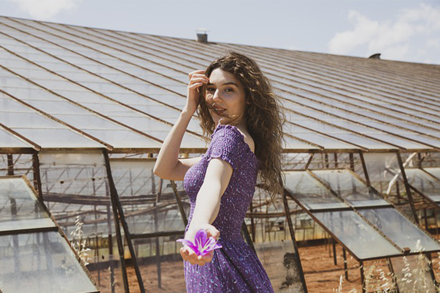
By mixing these colors in unusual combinations, forward-thinking businesses bring them into a more modern form. Play around with warm neutrals and light blues. Layering and styling require unanticipated color contrast.
Playing with shades of yellow
Utility clothing and industrious neutrals will appeal to efficiency and sustainability consumers.
Knits can be combined into subtle color-blocking and striped patterns. Olive oil and wild mushrooms are used to refresh essential outerwear.
Darker tones
Cooling ocean hues counterbalance warm tones. Anticipate color to embody this mood in the new world, which will see a resurgence of travel, optimism, and innovation.
The energizing red glow, molten orange, and nectar harmonize with the turquoise tonic and aloe gel.
Use them in soft hues to modernize impressionistic florals and check on the check. Make a statement with a single block color across casual summer maxi and robe styles.
Natural original colors
Showcase the beauty of undyed color to provide zero-waste solutions. The principle of applying color in its simplest form will gain appeal as firms focus on a limited approach to design.
In addition to organically derived processes like indigo, expect to see an increase in undyed fibers in their natural color range.
Subtlety is crucial. Experiment with different textures in the jersey and woven categories to demonstrate delicate contrasts. Denim pants, skirts, and jackets in timeless indigo punctuate the look.
Greens never go out
To provide a nourishing and relaxing effect, combine greens.
Because of their relationship with nature and wellbeing, greens will remain one of the most prominent color groups for S/S 22.
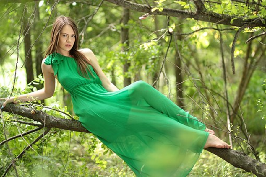
Greens were popular in high-end stores in 2019, and for S/S 22, the trend will shift to nurturing, plant-based tones that will attract customers seeking a relaxing, balanced lifestyle.
To refresh the relaxed touring and shorts categories, follow the “get your greens” trend and blend various greens.
Cozy shades of gray
Use colors that are soft and imperfect to add a sense of coziness.
As the resale and rental sectors grow, consumers will become more accustomed to second-hand colors and their lovely imperfections.

The delicate prettiness of greyed-off neutrals and pastels has a nostalgic allure.
To refresh watercolor and tie-dye designs, mix and match colors. To make jersey tees and loungewear more affordable, give them a textured appearance.
Striking balance between light and dark
Mid-century tones link fashion and interior design. Fashion and homeware will continue to blend and collaborate due to the long-term impact of the stay-at-home style. Interior design will continue to influence women’s fashion.
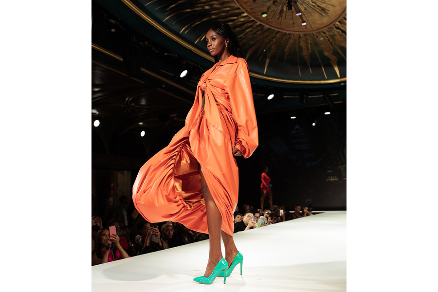
Rich mid-century tones will drive new narratives for opulent, comfort-focused capsules. Update classic utility clothing with golden harvest and ginger cookies. Mix molten orange with black for a dramatic take on wallpaper florals.
Floral shades
Champagne and rose tones create a gentle luxury for the new relaxed mood of occasion attire. A shift away from non-sustainable sequins and flourishes will give organic silkies a new chance to stand out, conjuring a sense of luxury for summer occasions.
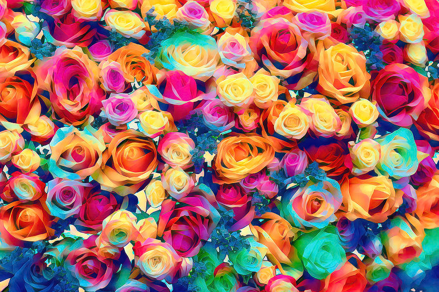
The delicate and luscious champagne and rose tones are offset with chilling pure water. Use this palette to refresh lounge-inspired event dresses, accessible tailoring, and blouses from head to toe.
Bright looks never fade
Mid-level brights will have an influence but in a more deliberate, risk-averse manner. Color will become much more thoughtful and risk-averse in the new world.
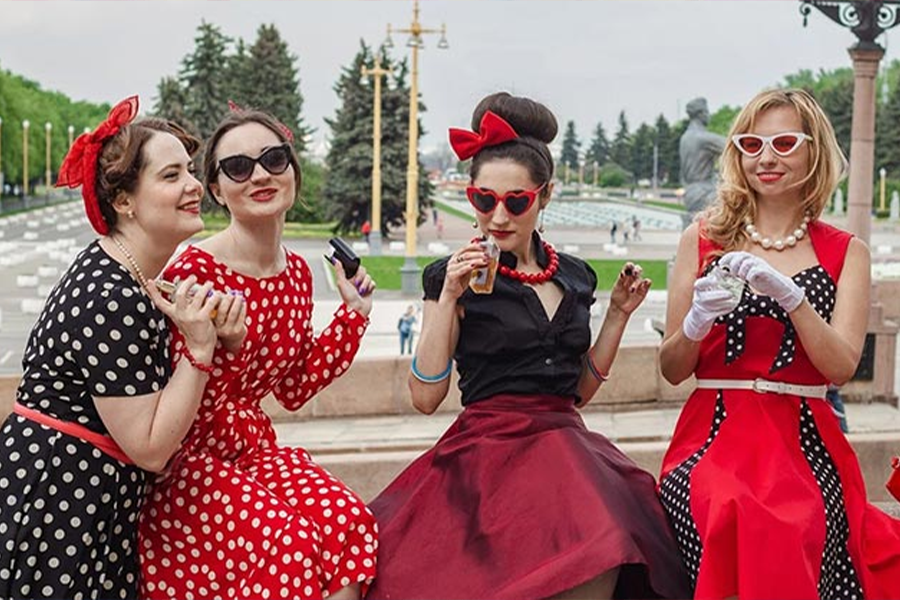
As shown in these soft hues, which fall midway between bright and pastel, vibrant color combinations will take on a more pared-down form. A lively ground, mango sorbet, and light blue or grey are examples of bright colors.
Conclusion
To enhance and grow your business, you need to know the colors that most women are drawn to even though each woman has a particular color taste. If you remember all of the colors mentioned in this article, you can be certain that your business will grow.
