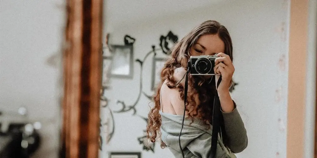
Looking towards the A/W 25/26 season promises an exciting array of vibrant colors that will transform the activewear industry landscape completely. This forecast presents a palette of shades that mirror fitness enthusiasts’ changing preferences, catering to those searching for rejuvenation and others looking for a boost in energy and motivation. Whether designing collections for workout routines or peaceful yoga practices that bring zen vibes, staying updated on these color trends is essential for developing attractive and modern products. This guide delves into five color narratives that will take center stage in the Autumn/Winter 2025/2026 season, guiding you on integrating them into your athletic wear ranges. Prepare to infuse your lineups with power, tranquility, and everything in between.
Table of Contents
● Ambient brights: Power and stamina
● Organic neutrals: Grounding and reassuring
● Twilight darks: Mystical adventure
● Wholesome mid-tones: Nostalgic comfort
● Washed-out pastels: Calming serenity
● Conclusion
Ambient brights: Power and stamina

The A/W 25/26 season introduces a palette of vibrant hues that exude energy and strength. This color story combines intense shades like Cherry Lacquer, Neon Flare, Flame, and Solar Orange to create high-impact looks that resonate with power and stamina.
These pulsating colors are perfect for performance-driven activewear lines, particularly those designed for intense, strength-focused sports. The key to leveraging this palette effectively lies in layering. Hot brights can be combined with restorative darks to create depth and visual interest. Small accents of cooler tones like Midnight Navy and Moonstone Blue can be incorporated to balance the overall look and add a refreshing contrast.
When working with ambient brights, it’s essential to consider the fabric and finish. These colors truly come alive in moisture-wicking, high-performance materials that enhance their vibrancy. Strategically placed color blocks or bold graphic prints can maximize the impact of these energetic hues, creating activewear pieces that stand out and inspire wearers to push their limits during workouts.
Organic neutrals: Grounding and reassuring
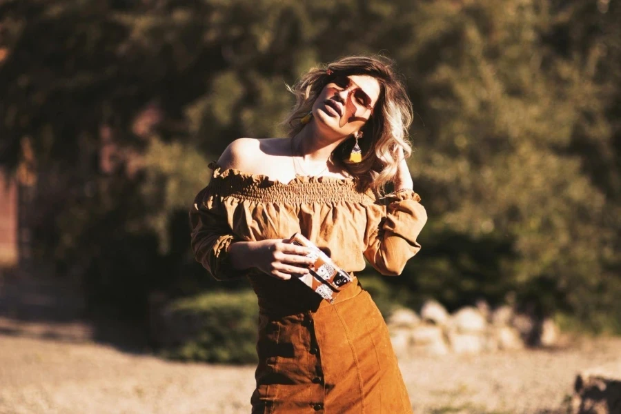
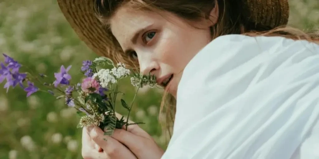
The A/W 25/26 season embraces a shift towards nature-inspired hues that offer a sense of comfort and reassurance. This palette blends warm tones like Tea Stain and Cherry Lacquer with new neutrals, creating a grounding aesthetic that resonates with those seeking comfort-driven styles.
These organic neutrals are ideal for activewear lines that prioritize comfort and sustainability. The earthy tones lend themselves beautifully to yoga wear, loungewear, and lifestyle pieces that emphasize a connection to nature. When incorporating these colors, designers should consider using natural fibers and highlighting low-toxic, botanical-certified dyes in their creations.
The appeal of this color story lies in its versatility and timeless quality. By combining different shades within this palette, designers can create layered looks that feel both sophisticated and approachable. Textures play a crucial role in bringing these colors to life – think soft, brushed fabrics for loungewear and moisture-wicking, organic materials for performance pieces. This approach not only enhances the visual appeal but also reinforces the natural, grounding qualities of the color scheme.
Twilight darks: Mystical adventure

The A/W 25/26 season introduces a captivating palette of mystical darks that ignite imagination and evoke a sense of adventure. At the heart of this color story is Future Dusk, the 2025 Color of the Year, which sets the tone for a range of deep, enigmatic hues perfect for technical winter layers and utility-driven pieces.
These twilight darks are ideal for outerwear and cold-weather activewear collections. The depth and richness of these tones come alive in lustrous and textured materials, adding an extra dimension to performance gear. Designers can play with combinations of matte and shine finishes to create visually intriguing pieces that stand out in low-light conditions, perfect for early morning or evening outdoor activities.
Activewear brands might consider incorporating subtle, iridescent details or reflective elements that catch the light in unexpected ways to fully embrace the mystical adventure theme. This approach enhances the visual appeal and adds a practical safety feature for outdoor enthusiasts. By balancing functionality with an air of mystery, these twilight darks can transform ordinary activewear into pieces that inspire wearers to embark on new adventures, whether in urban settings or the great outdoors.
Wholesome mid-tones: Nostalgic comfort
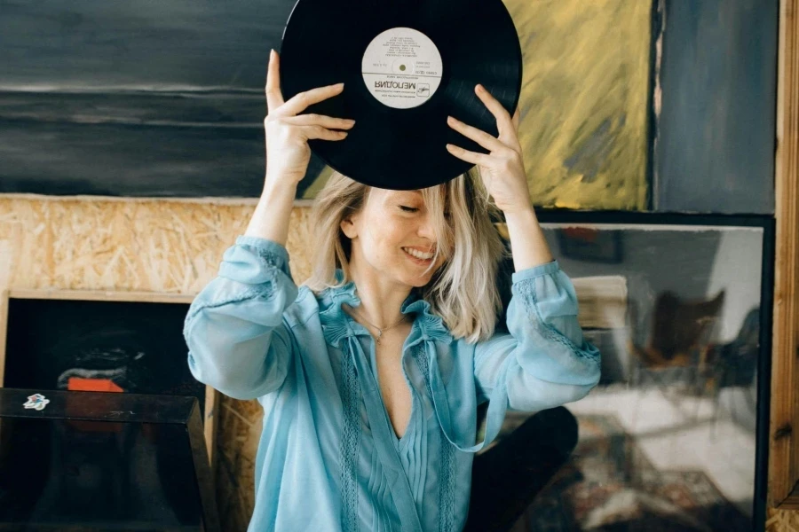
The upcoming autumn/winter collection for 2025 and 2026 draws inspiration from nostalgia by featuring a range of mid-tone colors that reflect a sense of familiarity and comfort from the past era.
These dependable colors breathe new life into comfort-driven styles, heritage sports, and outdoor-inspired silhouettes. Designers can leverage this palette to create curated collections that blend cooler brights with warm mid-tones, offering designs that feel both comfortingly familiar and refreshingly contemporary. The versatility of these hues makes them perfect for athleisure wear and retro-inspired activewear lines.
To fully embrace the nostalgic comfort theme, brands might consider incorporating vintage-inspired textures and patterns into their designs. Think corduroy accents, retro color blocking, or subtle jacquard weaves that add depth and interest to the garments. These wholesome mid-tones also lend themselves well to mix-and-match collections, allowing wearers to create personalized, layered looks that resonate with their individual style while maintaining a cohesive, nostalgic aesthetic. By balancing retro charm with modern performance features, these colors can create activewear that’s both functionally advanced and emotionally appealing.
Washed-out pastels: Calming serenity
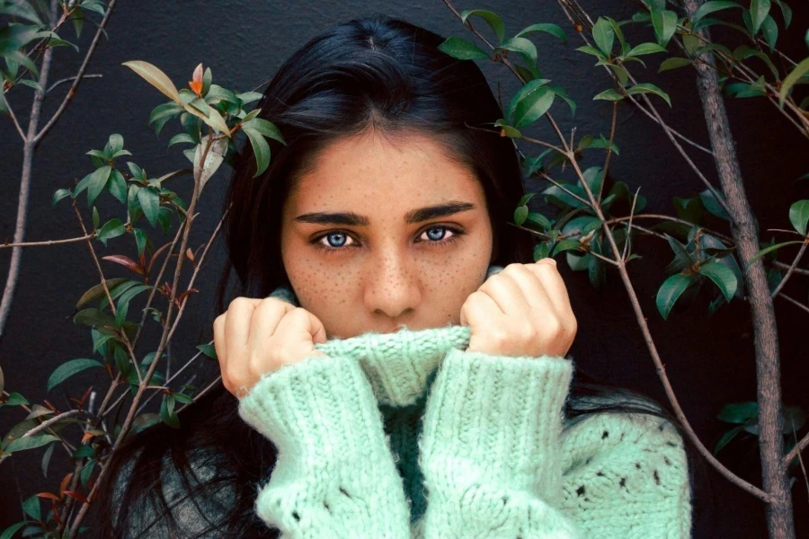
The upcoming A/W 25/26 collection welcomes a gentle approach with a range of muted pastel colors that convey calmness and peace of mind. These soft hues include Celestial Yellow and Transcendent Pink paired with Moonstone Blue and earthy tones for a balanced and tranquil look.
The soft and understated tones work well for technical outfits and delicate layers as a unique option from the usual activewear color palette. The key to maximizing the impact of these pastels lies in exploring different textures and translucency levels. Designers can experiment with sheer overlays, ribbed fabrics, or brushed surfaces to add depth and interest to these subtle shades.
To fully capture the essence of calming serenity, brands might consider incorporating these pastels into activewear designed for low-impact exercises, recovery gear, and lifestyle pieces. The gentle and comforting vibe exuded by these shades complements the increasing emphasis on wellness and personal nurturing within fitness regimens. Combining these pastel colors with user-friendly designs and elements that increase comfort and ease of use in activewear collections can produce calming garments that boost the wearer’s feelings of calmness and revitalization throughout and after their exercise routines.
Conclusion
As we gear up for the A/W 25/26 seasons in the world of activewear design, there are a variety of vibrant color schemes to explore. From bright tones that set the mood to soft pastels that soothe the senses, each palette speaks to different facets of one’s fitness journey. By integrating these fashionable trends into offerings, brands can craft captivating collections that align with their audience’s changing needs and preferences. Whether it is high-performance workout gear or cozy recovery attire, these color trends serve as a basis for creating fresh and appealing designs. Blending activewear and everyday fashion is increasingly creating color schemes that will spark innovative and practical designs, seamlessly merging style and functionality.
