As we look ahead to Autumn/Winter 25/26, color trends are evolving to reflect our changing world, offering a unique blend of familiarity and innovation. This season’s palette presents an opportunity to create fresh, seasonal looks while leveraging existing color investments. From celestial-inspired hues that evoke wonder and tranquility to subversive darks that speak to rebellious spirits, these trends cater to various tastes and moods. Whether you’re drawn to the nostalgic charm of retro blues or the bold call to action of neon flares, these color combinations promise to breathe new life into collections. Let’s explore how these hues can be reimagined to create captivating and relevant designs for the coming season.
Table of Contents
● Future dusk: Embracing the night sky
● Celestial yellow: A versatile glow
● Cherry lacquer: Subversive appeal
● Retro blue: Nostalgic charm
● Neon flare: A call for change
● Earthen mid-tones: Timeless appeal
● Conclusion
Future dusk: Embracing the night sky
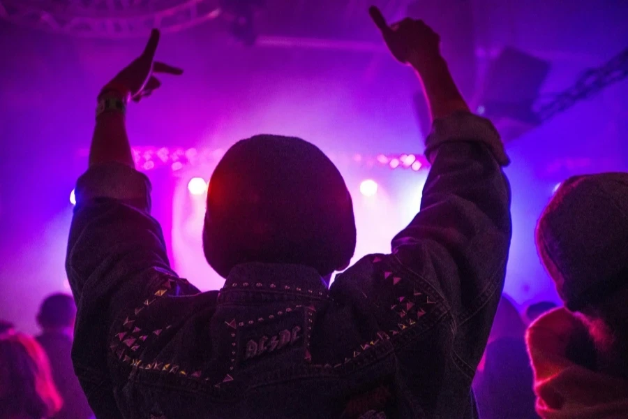
Future Dusk, the 2025 Color of the Year, leads us into a new era inspired by the second space age. This deep, mysterious hue captures the allure of the night sky, reflecting a collective desire for restoration and guidance in uncertain times.
When paired with Celestial Yellow, Future Dusk takes on a spiritual glow, creating a captivating contrast that speaks to both the mystical and the optimistic. For those seeking a more ethereal palette, combining it with Midnight Blue and Moonstone Blue evokes the vastness of the cosmos, perfect for creating dreamy, otherworldly designs.
To add a touch of warmth and softness, Cosmetic Pink can be introduced, balancing the cool tones with a gentle, human element. Neon Flare brings a kinetic spark for a more energetic twist, ideal for activewear or statement pieces that demand attention. This versatile palette creates impactful, forward-looking collections that resonate with those who find solace and inspiration in the stars above.
Celestial yellow: A versatile glow
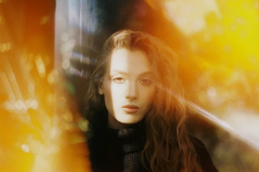
Celestial Yellow emerges as a surprisingly versatile shade, embodying a soft optimism that resonates deeply in today’s world. This hue brings a gentle, uplifting energy to designs, perfect for those seeking comfort and inspiration in their surroundings. Its warm glow is a beacon of hope, reflecting the growing interest in spirituality and mindfulness, especially among younger generations.
Combining with soothing Tranquil Blue and Galactic Lilac, Celestial Yellow creates a serene palette for cozy living spaces and wellness-oriented products. Adding Pink Sorbet to this combination adds a touch of sweetness, resulting in a fresh and calming aesthetic that promotes relaxation and inner peace.
For those looking to create more vibrant stories, Celestial Yellow pairs beautifully with Flame, introducing a lively energy to designs. Deep Emerald serves as a rich winter base, grounding the palette and adding depth. This versatile hue allows for endless possibilities in creating uplifting, seasonally relevant designs that cater to a wide range of tastes and preferences, from subtle and sophisticated to bold and energetic.
Cherry lacquer: Subversive appeal
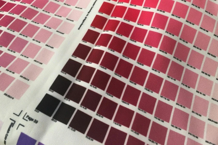
Cherry Lacquer emerges as a captivating hue that speaks to the rise of niche subcultures and the allure of dark romance. This rich, deep shade embodies a sense of rebellion and sophistication, perfect for those who dare to stand out. Its glossy, intense nature adds a touch of luxury to any design, making it an ideal choice for statement pieces and bold accents.
When paired with Thrift Pink and Cosmetic Pink, Cherry Lacquer takes on a subversive yet sensual appeal. This unexpected combination creates a striking contrast that challenges traditional color norms while maintaining an air of elegance. For a more grounded look, Heritage Mustard can be introduced, adding a cozy, artisanal spin that balances the intensity of Cherry Lacquer.
Intense Rust brings a sense of low-key luxury and contemporary craft to elevate the palette further. For those seeking to add an element of surprise and wonder, pops of Aquatic Awe create an intriguing juxtaposition. This versatile combination allows for creating bold, statement-making pieces that capture the zeitgeist of our times, appealing to those who appreciate the interplay between edgy and refined aesthetics.
Retro blue: Nostalgic charm
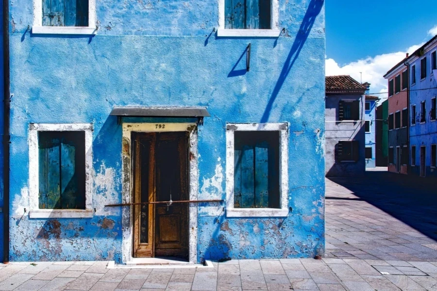
Retro Blue takes center stage this season, embodying a nostalgic charm that resonates with the ongoing thrift movement. This aged, authentic hue brings a softer joy to designs, offering a refreshing alternative to recent seasons’ bold, dopamine-inducing brights. Its muted tone evokes memories of cherished vintage pieces, creating an instant connection with those who appreciate the allure of bygone eras.
Retro Blue creates a palette that exudes low-key luxury when combined with cosmetic neutrals like Transcendent Pink and Rustic Caramel. This combination is perfect for creating timeless pieces that feel familiar and fresh, appealing to those who value longevity in their possessions. Adding these warm, subtle tones balances the coolness of Retro Blue, resulting in a harmonious and inviting aesthetic.
For a more dynamic approach, pairing Retro Blue with enduring Crimson and dusted Surreal Green offers a modern take on primary colors. This unexpected combination breathes new life into classic color schemes, allowing for the creation of designs that bridge the gap between vintage inspiration and contemporary style. The result is a palette that feels both nostalgic and forward-thinking, perfect for those who appreciate the art of reimagining the past for the present.
Neon flare: A call for change
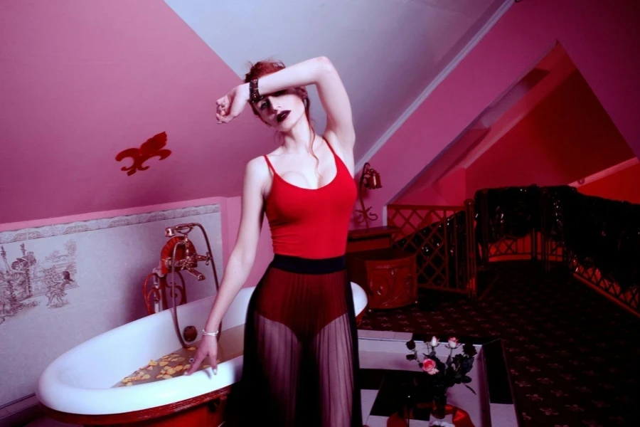
Neon Flare bursts onto the scene as a bold and energetic hue, symbolizing a powerful call for change. This vibrant shade captures the urgency of environmental concerns while injecting a sense of optimism and action into designs. Its synthetic brightness starkly contrasts natural tones, representing the delicate balance between human progress and nature’s preservation.
When paired with earthy Basalt and the silver-toned Borrowed Blue, Neon Flare brings a futuristic utility feel to outdoor and active-inspired designs. This combination speaks to those who seek adventure and innovation, blending high-tech aesthetics with a connection to the natural world. The juxtaposition of these colors creates a dynamic tension that reflects the complexity of modern life.
Neon Flare can be combined with wild and mossy greens alongside the rebellious Punk Purple for a more revolutionary approach. This palette inspires thoughts of change and rebellion, perfect for designs that aim to make a statement or challenge the status quo. The result is a collection of colors that not only catches the eye but also sparks conversation and encourages action. They appeal to those who want their choices to reflect their values and desire for a better future.
Earthen mid-tones: Timeless appeal
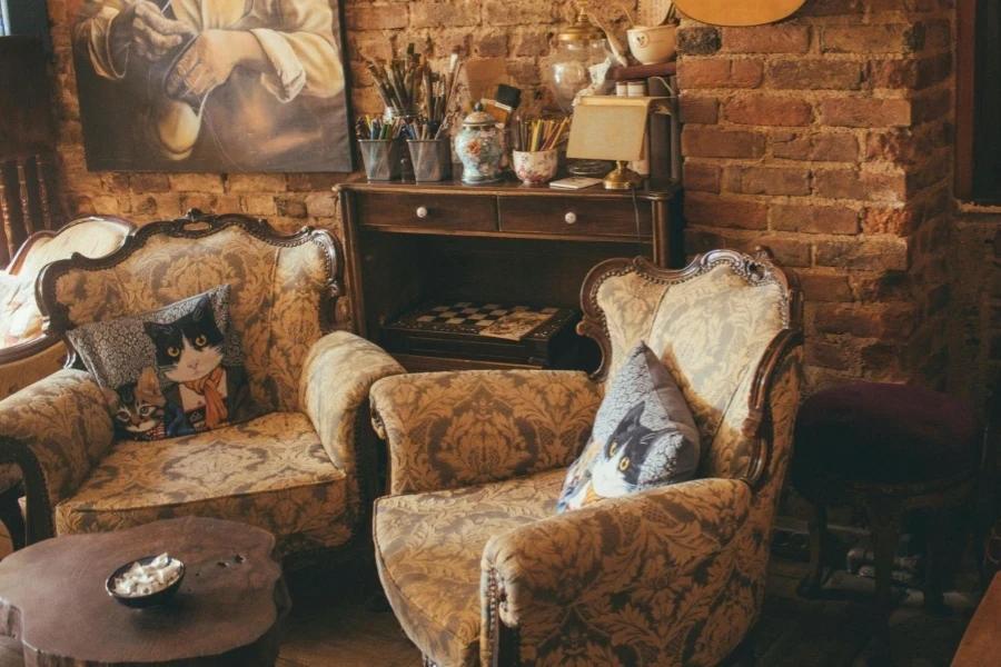
Earthen mid-tones continue to captivate with their timeless appeal, offering a sense of grounding and stability in an ever-changing world. This season sees a subtle shift from greens to blues, with greens taking on a more mythical, subterranean quality. These nuanced hues speak to the enduring desire for investment pieces and elevated utility, providing a versatile foundation for any collection.
Rustic Caramel emerges as a key player in this palette, infusing warmth and comfort into long-term sepia tones. Combined with these established hues, it creates a rich, inviting aesthetic that feels familiar and fresh. This combination is perfect for crafting cozy narratives and designs that stand the test of time, appealing to those who appreciate quality and longevity in their possessions.
Pops of Solar Orange and Electric Indigo can be introduced to add depth and intrigue to the earthen palette. These unexpected accents bring a sense of curiosity and energy to the otherwise muted tones. The key to success with this palette lies in embracing hyper-texture and evoking contemporary craft. By focusing on these elements, designers can create future vintage pieces that blend timeless appeal with modern sensibilities, resulting in current and enduring designs.
Conclusion
As we look ahead to Autumn/Winter 25/26, the above color combinations offer a rich tapestry of possibilities for creating fresh, seasonally relevant collections. From the mystical allure of Future Dusk to the timeless appeal of earthen mid-tones, each palette tells a unique story that resonates with contemporary desires and values. By strategically incorporating these trends into existing color assortments, it’s possible to strike a balance between familiarity and innovation, creating exciting new designs while protecting long-term investments. As the world continues to evolve, these thoughtfully curated color stories provide a powerful tool for expressing creativity, addressing changing needs, and inspiring those seeking comfort and excitement in their surroundings.
 Afrikaans
 አማርኛ
አማርኛ العربية
 বাংলা
বাংলা Nederlands
 English
 Français
 Deutsch
 हिन्दी
 Bahasa Indonesia
 Italiano
 日本語
日本語 한국어
한국어 Bahasa Melayu
 മലയാളം
 پښتو
پښتو فارسی
فارسی Polski
 Português
 Русский
 Español
 Kiswahili
 ไทย
ไทย Türkçe
 اردو
اردو Tiếng Việt
 isiXhosa
 Zulu
Zulu