As you plan your A/W 24/25 women’s collection, color will play a crucial role in creating an enticing and visually cohesive assortment. In this article, we’ll highlight the top 10 shades to incorporate, along with practical tips on how to apply them for maximum impact. From nostalgic neutrals to vibrant accents, these key colors will help you curate a palette that feels fresh yet wearable. We’ll also explore styling and merchandising strategies to optimize your color story across categories. Get ready to elevate your offerings and captivate customers with an irresistible range of hues that showcase your trend expertise and drive sales in the upcoming season.
Table of Contents
1. Reimagine core colors with textural interest
2. Embrace the versatility of ground coffee brown
3. Elevate looks with barely-there greys
4. Capitalize on chalk’s minimalist appeal
5. Appeal to youth with gender-inclusive gelato pastels
6. Achieve earth-inspired hues with pink neutrals
7. Enliven pieces with vibrant pollen yellow
8. Use flame red as a seasonal accent
9. Explore the versatile blue color family
10. Tap into timeworn mid-tones for a vintage vibe
Reimagine core colors with textural interest
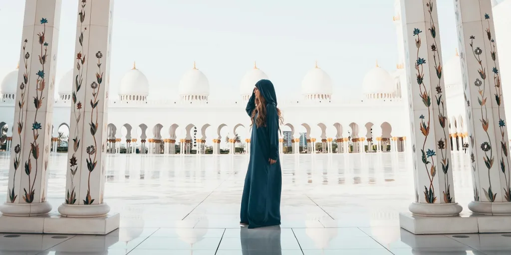
To breathe new life into core colors like black, white and neutrals, retailers should focus on reworking these timeless hues in fresh fabrications and silhouettes that align with seasonal trends. While these shades are enduring staples in any wardrobe, updating them with interesting textures and surface treatments can make them feel novel and exciting for the A/W 24/25 season.
One effective way to enhance the visual and tactile appeal of these classic colors is by incorporating luxe finishes like metallics and satins. High-shine elements add a glamorous touch to partywear, while subtle sheen can elevate everyday pieces. Sheer fabrics and delicate laces are also great options for injecting depth and dimension into black, white and neutral garments.
When it comes to knitwear and separates, retailers can experiment with cozy, textured materials to give these core colors a more dynamic look. Fuzzy wools and brushed jerseys not only provide warmth for the colder months but also create an inviting, touchable quality that customers will love. These plush fabrications work particularly well for loungewear and casual styles that prioritize comfort and ease.
Embrace the versatility of ground coffee brown
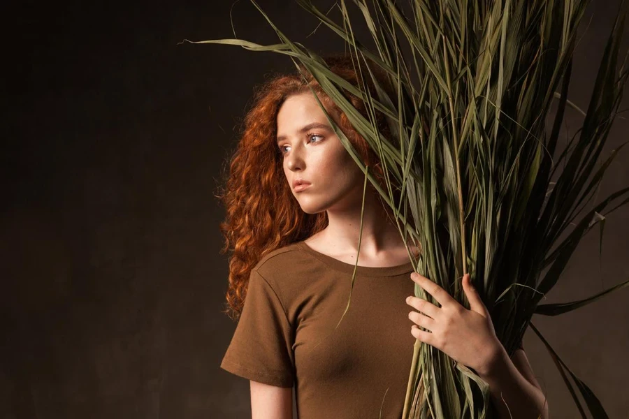
Ground coffee brown emerges as a key color for A/W 24/25, thanks to its warm, rich tone and adaptable nature. This versatile shade has long-term appeal across multiple categories, making it a smart investment for retailers looking to create cohesive collections with broad customer reach. The hue’s inherent depth and natural appearance lend it a luxurious quality that elevates both casual and dressy styles.
One of the most impactful ways to incorporate ground coffee brown is through leather and leather-alternative outerwear. Classic silhouettes like aviator jackets, trenches and oversized coats feel fresh and modern in this earthy shade, which highlights the material’s supple texture. Retailers can also extend this color to accessories like belts, bags and boots for a coordinated look that reads as sophisticated and effortless.
To showcase the versatility of ground coffee brown, retailers should explore pairing it with a range of complementary hues. Crisp white provides a clean, sharp contrast that feels especially relevant for early autumn, while denim shades offer a casual, laid-back vibe. For a bolder statement, combining this rich brown with vivid blues like cobalt or teal creates an eye-catching color story that appeals to fashion-forward customers.
Elevate looks with barely-there greys

Subtle, barely-there greys offer a fresh alternative to traditional neutrals for the A/W 24/25 season. These hushed tones convey a sense of calm and simplicity that resonates with customers seeking respite from the chaos of everyday life. By incorporating pale greys into their collections, retailers can tap into the growing desire for minimalist, understated elegance that still feels modern and relevant.
One of the most effective ways to employ these soft greys is through occasionwear and elevated separates. Fluid fabrics like silk, chiffon and lightweight wool in whispery grey hues lend a sophisticated air to dresses, blouses and trousers. These delicate shades work particularly well for event dressing, offering a chic, ethereal alternative to stark black or white.
For a more contemporary take on city dressing, retailers can explore incorporating pale greys into tailored pieces like blazers, vests and wide-leg pants. The muted tone adds a sense of refinement to these classic silhouettes, making them feel both timeless and of-the-moment. Styling head-to-toe grey looks in varying shades and textures creates a striking, monochromatic statement that exudes quiet confidence.
Capitalize on chalk’s minimalist appeal
Chalk white emerges as a key neutral for A/W 24/25, offering a versatile foundation for minimalist looks with enduring appeal. This soft, creamy hue provides a sense of warmth and ease that contrasts beautifully with the season’s deeper, more saturated colors. By incorporating chalk white into their collections, retailers can capitalize on the growing trend towards pared-back, timeless pieces that prioritize functionality and longevity.
To maximize the commercial potential of chalk white, retailers should focus on applying this hue to simple, understated silhouettes that showcase its versatility. Classic styles like crisp button-downs, tailored trousers and streamlined knitwear feel fresh and modern in this calming shade. These easy-to-wear pieces form the backbone of a well-rounded wardrobe, making them a smart investment for customers seeking to build a cohesive, mix-and-match capsule.
Retailers can also leverage chalk white to infuse a sense of elegance and refinement into their offerings. Unadorned slip dresses, fluid blouses and sculptural outerwear in this creamy neutral exude a quiet luxury that appeals to customers with a discerning eye for quality and craftsmanship. By focusing on premium materials and clean lines, retailers can create elevated essentials that feel both timeless and indulgent.
Appeal to youth with gender-inclusive gelato pastels
Gelato pastels have emerged as a major color trend for S/S 24, and their popularity shows no signs of waning for the A/W 24/25 season. These soft, muted hues offer a fresh, youthful take on traditional winter colors, with a gender-inclusive appeal that makes them versatile and widely marketable. By incorporating shades like creamy mint, pale lavender and soft peach into their collections, retailers can tap into the demand for cozy, comforting colors that evoke a sense of nostalgia and simplicity.
One of the key strengths of the gelato pastel palette is its ability to transcend categories and work across a wide range of styles. These gentle hues lend a romantic, dreamy quality to flowy dresses and skirts, while also adding a touch of softness to sporty separates and casual knitwear. By applying these colors to a mix of fabrics and silhouettes, retailers can create a cohesive, multi-dimensional color story that appeals to a broad customer base.
To maximize the youth appeal of gelato pastels, retailers should focus on creating playful, mix-and-match looks that showcase the colors’ versatility. Styling shades like soft yellow and pale pink together creates a sweet, feminine vibe, while combining mint and lavender feels fresh and unexpected. Retailers can also experiment with tonal dressing, layering different variations of the same pastel hue for a monochromatic look that feels modern and trendy.
Achieve earth-inspired hues with pink neutrals
Pink neutrals emerge as a key color story for A/W 24/25, offering a warm, natural take on earthy hues that feels both modern and timeless. These soft, dusky shades range from pale rose to deep terracotta, providing a versatile palette that works across a wide range of categories and styles. By incorporating pink neutrals into their collections, retailers can tap into the growing desire for grounding, nature-inspired colors that evoke a sense of comfort and stability.
One of the strengths of pink neutrals is their ability to add depth and dimension to classic silhouettes. Tailored pieces like blazers, trousers and coats feel fresh and contemporary in shades of blush, adobe and cinnamon. These warm, inviting hues soften the crisp lines of suiting, creating a more relaxed, approachable look that works for both casual and dressy occasions. Retailers can also use pink neutrals to update traditional outerwear styles like pea coats, parkas and puffers, giving them a modern, feminine twist.
For a more ethereal take on the trend, retailers can explore incorporating pink neutrals into lightweight, translucent fabrics like chiffon, organza and tulle. These delicate materials lend a romantic, dreamy quality to dresses, blouses and skirts, making them ideal for special occasions and holiday dressing. Layering sheer pink neutrals over darker, more saturated hues creates a striking contrast that adds depth and visual interest to the look.
Enliven pieces with vibrant pollen yellow
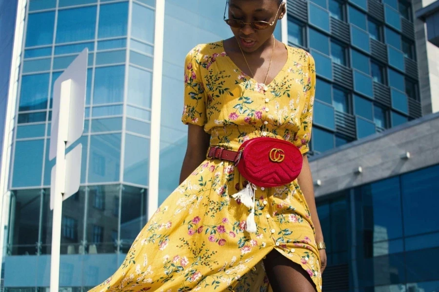
Vibrant pollen yellow bursts onto the scene for A/W 24/25, injecting a cheerful, energetic vibe into the season’s color palette. This bold, saturated hue offers a welcome contrast to the more muted, understated tones that typically dominate the autumn and winter months. By incorporating pollen yellow into their collections, retailers can create a sense of excitement and optimism that resonates with customers seeking to brighten their wardrobes and their moods.
One of the most impactful ways to use pollen yellow is as a statement color for cozy, tactile knitwear. Chunky sweaters, cardigans and vests in this vivid hue become instant outfit-makers, adding a pop of sunshine to classic jeans, trousers and skirts. Retailers can also experiment with incorporating pollen yellow into outerwear pieces like puffer jackets, wool coats and rain slickers, creating a striking visual contrast against the season’s darker, more subdued hues.
For a more fashion-forward approach, retailers can explore using pollen yellow to enliven tailored separates and dresses. A sleek, minimalist blazer or shift dress in this bold hue feels both modern and sophisticated, while still maintaining a sense of playfulness and creativity. To balance the intensity of the color, retailers should consider pairing pollen yellow with crisp, clean neutrals like white, ivory and soft grey.
Pollen yellow also lends itself well to retro-inspired styles and prints. Sixties-esque floral patterns, psychedelic swirls and mod color blocking all feel fresh and contemporary when rendered in this vibrant, sunshiny hue. By combining pollen yellow with other warm, autumnal shades like burnt orange, forest green and deep burgundy, retailers can create a rich, nostalgic color story that taps into the season’s cozy, comforting vibe.
Use flame red as a seasonal accent

Flame red emerges as a powerful accent color for A/W 24/25, bringing a sense of warmth and vitality to the season’s palette. This rich, vibrant hue adds a touch of drama and excitement to even the most basic pieces, making it an essential tool for retailers looking to create compelling, eye-catching collections. By incorporating flame red strategically throughout their offerings, retailers can tap into the shade’s ability to energize and elevate classic autumn and winter styles.
One of the most effective ways to use flame red is as a punctuation mark against a backdrop of core neutrals like black, white, camel and grey. A bold red sweater or coat becomes an instant focal point when paired with sleek, monochromatic separates, while a simple red accessory like a scarf or handbag can transform an understated outfit into a head-turning look. Retailers should consider offering a range of flame red pieces across categories to allow customers to easily incorporate this impactful hue into their existing wardrobes.
Flame red also lends itself well to the season’s key textile trends, particularly plush, cozy fabrics like wool, cashmere and mohair. A sumptuous red knit or a luxurious red coat feels both indulgent and irresistible, tapping into the desire for comfort and warmth during the colder months. To maximize the impact of these pieces, retailers should focus on simple, timeless silhouettes that allow the color and texture to take center stage.
Explore the versatile blue color family
The blue color family takes center stage for A/W 24/25, offering a wide range of versatile, wearable shades that work across categories and styles. From deep, inky indigos to soft, muted chambray, these blues provide a calming, reassuring presence that resonates with customers seeking stability and tranquility in uncertain times. By incorporating a variety of blue hues into their collections, retailers can create a sense of cohesion and continuity that feels both timeless and of-the-moment.
One of the key strengths of the blue color family is its ability to adapt to different aesthetic preferences and occasions. Classic navy and denim blues remain staples for workwear and casual dressing, lending a crisp, polished look to tailored separates and leisurewear alike. For a more elevated approach, retailers can explore incorporating rich, saturated blues like cobalt, sapphire and royal into eveningwear and special occasion pieces, creating a striking, sophisticated statement.
Soft, muted blues like dusty blue, mineral blue and cool-toned grey-blue offer a more understated take on the trend, ideal for creating a sense of calm and relaxation. These gentle hues work particularly well for knitwear, loungewear and casual separates, tapping into the growing demand for comfort and ease. To create a cohesive, tonal look, retailers can experiment with combining different shades of blue within a single outfit, playing with texture and proportion to add visual interest.
The blue color family also lends itself well to print and pattern, particularly classic motifs like stripes, plaids and checks. By updating these timeless patterns in fresh, modern blue hues, retailers can create pieces that feel both nostalgic and contemporary. For a more daring approach, retailers can explore incorporating abstract prints, watercolor effects and ombré techniques in shades of blue, creating a sense of depth and movement that adds a touch of artistic flair to the season’s offerings.
Tap into timeworn mid-tones for a vintage vibe
Timeworn mid-tones emerge as a key color story for A/W 24/25, tapping into the growing desire for vintage-inspired pieces with a sense of history and character. These muted, slightly faded hues evoke a feeling of nostalgia and authenticity, as if each garment has been lovingly worn and passed down through generations. By incorporating shades like dusty rose, sage green, and subdued gold into their collections, retailers can create a sense of warmth and familiarity that resonates with customers seeking comfort and connection in their clothing.
One of the most effective ways to capitalize on the timeworn mid-tone trend is through the use of authentic, heritage-inspired fabrics like washed denim, faded corduroy, and brushed flannel. These tactile, lived-in textures lend themselves naturally to the season’s key silhouettes, from oversized shirts and jackets to relaxed trousers and skirts. By focusing on quality construction and thoughtful detailing, retailers can create pieces that feel both timeless and relevant, with a subtle nod to the past.
To create a cohesive, vintage-inspired color story, retailers should consider combining different timeworn mid-tones within a single look, playing with tone-on-tone layering and subtle contrast. A faded denim jacket paired with a muted olive green shirt and dusty rose trousers creates a harmonious, effortless ensemble that feels both stylish and approachable. Retailers can also experiment with mixing timeworn mid-tones with classic autumnal hues like burgundy, mustard, and rust, creating a rich, inviting palette that captures the essence of the season.
Timeworn mid-tones also offer an opportunity to incorporate retro-inspired prints and patterns into the mix, from faded florals and subdued plaids to abstract geometrics and folksy embroideries. These subtle, understated motifs add a touch of visual interest and depth to the season’s key pieces, without overwhelming the soft, muted palette. By balancing these vintage-inspired elements with clean, modern silhouettes, retailers can create a look that feels both fresh and timeless, with enduring appeal.
Conclusion
In conclusion, the A/W 24/25 color palette offers a rich, diverse range of hues that capture the essence of the season, from grounding earth tones and soft neutrals to vibrant pops of color and vintage-inspired mid-tones. By strategically incorporating these shades across categories and styles, fashion brands and designers can create collections that feel both timeless and of-the-moment, resonating with consumers seeking comfort, versatility, and self-expression in their clothing. As we look ahead to the coming season, it’s clear that color will continue to play a vital role in shaping the fashion landscape, offering endless opportunities for creativity, innovation, and connection.