The S/S 22 palette blends the demand for uniqueness with the allure of the familiar, with colors that create calmness, comfort, and hope in what will be a wary market. This article will help you choose the best global colors to introduce to the market to expand your business. Let’s get started.
Table of Contents
Choosing the right tones
Shades to carry in spring/summer 2022
Elementary color choices for spring/summer 2022
Choosing the right tones
Anxiety has become the norm today due to global distressing events, and consumers are typically warier. Home-wear and furnishings will be a stronger focus, meaning more demand for products that convey a sense of calm and delight for this S/S 22.
This color standard is evaluated in the global color article, which includes a range of adaptive and commercial tones that will appeal to a variety of people.
The palette has been divided into two moods in prior seasons: one with more subdued and grounded colors and another with more enhanced natural colors. The following are the most important takeaways:
- Choose colors that will last: over 30% of the S/S 22 colors are repeats from past seasons, reflecting a more conservative trade environment. Now is the time to create a robust palette to safeguard your supply network and increase resilience. Consumers prefer consistency, so it’s critical to make color choices that are reliable and long-lasting.
- Utilize the refreshing and energizing effects of warmer hues and the soothing appeal of more vibrant colors to improve the well-being of your customers. Earthly tones will be nutritious and relaxing.
- Consider your primary market while choosing colors. The disruption of the Pandemic will enhance an emphasis on localism, so use colors that are related to your primary market. You may, for example, work with local farms or eateries to use food waste as a source of plant-based colors.
- Incorporate joy: Under challenging circumstances, customers will want upbeat, cheerful designs and experiences, so utilize mood-boosting colors in surroundings, products, and packaging.
Shades to carry in spring/summer 2022
Globally trending color palette
There are two color palettes for S/S 22, the enhanced nature and everyday pleasure.
Enhanced nature
Warm hues energize and invigorate the body and mind, while more relaxed, soothing colors offset them in this mood-boosting palette. The most vibrant colors, especially in a digital environment, can elicit sensations of delight and pleasure, while the palest hues are cleansing and peaceful.
Everyday pleasure
The hues in this palette are gentler, flattering, and have a grounded, soothing appeal. There are no sharp contrasts here, just a well-balanced mix of warm, earthy tones and more relaxed, darker shadow colors.
Primary tones trending globally
The S/S 22 palette’s ten primary colors serve as a basis, and it’s anticipated that these commercial and traditional neutrals will be especially vital in a cautious trading environment.
Sepia, a deep trans-seasonal brown, Golden Harvest, a warm beige, and clay, a light summer taupe, are all new additions for S/S 2022, and they’ll look great with the baked pastels.
Hues that uplift clothing style
Pinks are more prevalent in the S/S 22 color palette than more variegated reds, ranging from intense to subtle hues.
Greens come in a wide range of tones, from near-black to nearly brilliant mild, while blues come in a wide range of shades, from turquoise to darker, more conventional shades.
Elementary color choices for S/S 22
Association with olive oil
Due to its relationship with nature, green will remain one of the most significant hues on the spectrum for S/S 22. This color did well in women’s high-end retailers in 2019 and is expected to transition in S/S 22 to nourishing, plant-based dyes that will engage consumers seeking a tranquil, balanced lifestyle.
Olive oil is a closet essential, and its color evokes a timeless, reassuring, and trans-seasonal tone that will be crucial in a market that is becoming more cautious.
This color is appropriate for all aspects of fashion, beauty, and home design. As practical, functional dressing develops traction, it will be especially relevant for men’s and women’s clothing.
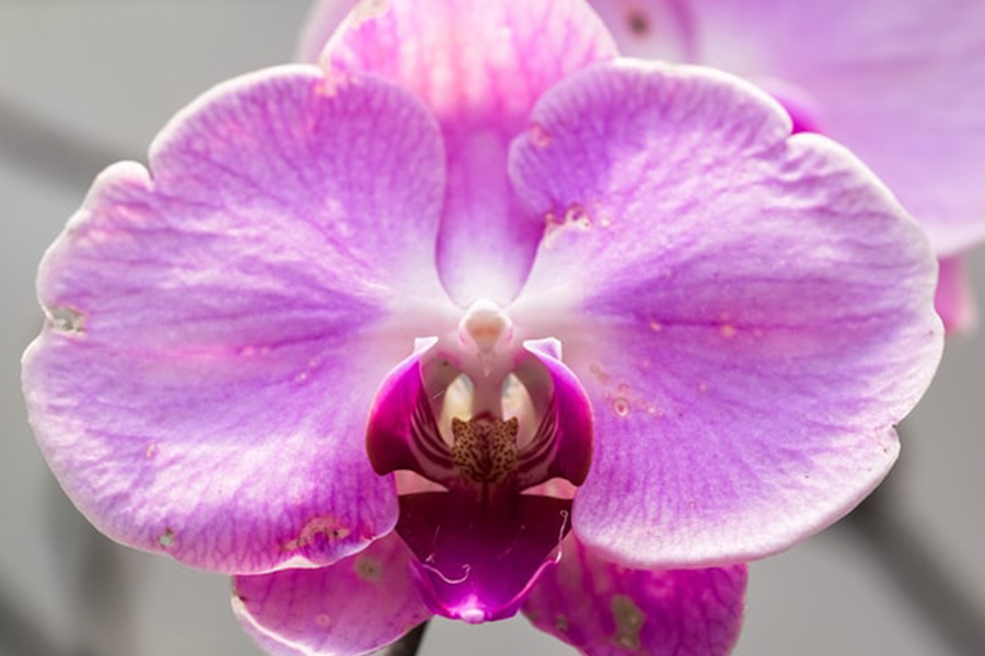
Introducing the shade of orchid flowers
For S/S 2022, pink will shift to a vivid magenta with a hint of blue. An orchid bloom’s robust and hyper-natural nature will reverberate across seasons and content and function well in real-life and digital settings.
This exciting, brilliant pink will have significant appeal in a difficult moment, generating sentiments of enthusiasm and vigor.

The color of orchid blossoms is adaptable enough to be used in fashion, beauty, and home design. Due to its eye-catching intensity, this brilliant shade is already being utilized for active clothes and event wear. It’s expected to be trendy in the cosmetics business.
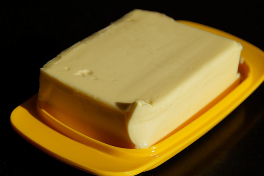
Butter tone makes yellow popular
Yellow has risen in popularity over the previous three years, but it requires careful consideration.
It’s predicted that pastel lemon would evolve into the warm, rich shade of golden cob for A/W 21/22 and that yellow would retain its underlying warmth but evolve into the softer, more mellow shade of butter for S/S 22.

This color is now making waves in the premium women’s wear market, and its popularity in interior design is on the rise. It will be especially relevant in hospitality and outdoor venues as well as loungewear, casualwear, and children’s clothing.
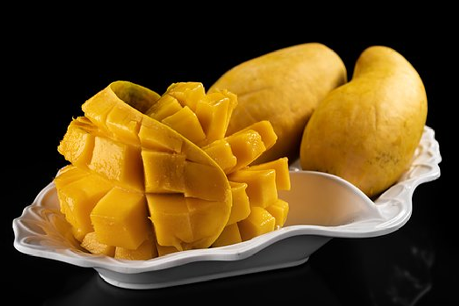
Mango sorbet may be a new addition to color choices
For S/S 22, orange will play a more significant role, with mango sorbet taking center stage. This yellow-hued orange infuses the seasonal palette with a sense of energy and light and appeals to a yearning for energizing brights that promote health and happiness.

Mango sorbet has become a directional color for swimwear and vacations, and it makes a swift transition to activewear, outdoor clothes, and accessories. This color works as a surprise off-kilter brilliant against an olive, cream, or blue background in womenswear.
Atlantic blue to add a touch of nature
Blue has steady popularity throughout industries and product sectors because of its dependable and trustworthy appeal.
Classic colors with a green tint have been predicted for the past five seasons, and Atlantic blue will continue over our A/W 21/22 palette to become a key color in S/S 22. It has a homey, welcoming aspect, contributing to the growing emphasis on sustainability and localism.

Slow fashion manufacturers, particularly those dying with natural indigo, have already adopted Atlantic blue. This is a perfect blue for menswear, an essential core for womenswear, and a creative tone for cosmetics.
Conclusion
You should know the colors that most people are drawn to improve and expand your business; everyone has a favorite color. You may be confident that your business will thrive if you keep all of the colors covered in this article in mind.


