Imagine your e-commerce website as a bustling marketplace. You’ve got great products, but how do you convert those leads into buyers? That’s where conversion rate optimization (CRO) comes in. CRO is all about making your website work smarter, not harder.
CRO is a step-by-step approach to improving the customer experience, from when they land on a page to the final checkout. E-commerce businesses use CRO to test different layouts, personalize the shopping experience, and even fine-tune the checkout process. It’s not just about the initial sale, though.
Besides making customers happy, CRO can boost loyalty and keep shoppers returning for more. Big e-commerce companies have seen amazing results after implementing these strategies. With mobile optimization and fancy analytics tools, you can keep fine-tuning your website and watch those sales climb.
Table of Contents
Metrics to help measure e-commerce conversions
How to improve your e-commerce site’s CRO
Understanding user behavior
Website performance and ease of use
Effective use of marketing tools
Crafting compelling product pages
Summary
Metrics to help measure e-commerce conversions

You could employ these four key metrics to measure e-commerce conversions effectively:
1. Bounce rate
The bounce rate is simply the proportion of people who enter the site and immediately leave without browsing additional pages.
For instance, a high bounce rate of 70% on a product page may indicate that the page is irrelevant or has poor usability. You can lower it by improving the quality of product descriptions or decreasing page load time.
2. Exit rate
This is the percentage of visitors who leave a particular page without navigating to any other page. If the exit rate on the checkout page is high, say 50%, there’s a reason to worry, and it could be due to the lengthy account creation process a customer has to complete before checking out.
3. Click-through rate (CTR)
CTR is the number of users who click a link divided by the total number of users. For example, a 2% CTR for email product links may imply that the subject lines or offers are not interesting enough. One of the true-and-tested ways of increasing the CTR is by A/B testing different elements.
4. Average page depth (pages per session in Google Analytics)
It represents the number of pages read on average per visit. When the average page depth is low (around 1.5), then users aren’t navigating the entire e-commerce site. The most reliable remedy here is enhancing internal linking or product recommendations to boost engagement.
How to improve your e-commerce site’s CRO
Here are a few solid hacks for e-commerce conversion rate optimization and customer retention.
Understanding user behavior
1. Analyzing the customer journey
The customer journey in e-commerce is a guide from the start to the purchasing stage. This implies that by mapping the journey, one can identify areas of potential drop-off. For example, you may find that 40% of users abandon their carts when the shipping charges are displayed.
As such, one could solve the problem by including free shipping thresholds or having a clearer initial cost list. Tools such as Google Analytics can help find common user pathways.
If this kind of behavior is common and users frequently move between the product page and the size guide before making a purchase, enhancing the visibility of size information could be helpful.
2. Utilizing heat maps and session recordings
Heat maps depict user interactions and show how people use a particular element on your site. They could show users’ propensity for clicking what is, in fact, a non-clickable element.
For instance, a CXL case study found that users frequently clicked product images with the anticipation of expanding them—an aspect that boosted conversions by 56% following the provision of this functionality.
Session recordings offer a site’s exclusive, real-world perspective by providing a bird’s-eye view. For example, users may be frustrated by a complicated form in a checkout process, which prompted a simplification that boosted easier checkouts by 20%.
3. User feedback
Direct user feedback is invaluable. This may involve conducting a survey to determine whether customers find your size chart confusing, which leads to more returns.
A detailed chart and incorporating fit tips from previous buyers could reduce the rate of returns. Reviews can also point to problems, such as frequent complaints about slow delivery.
Website performance and ease of use
1. Page load speed

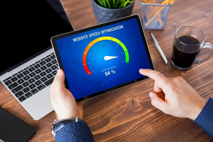
If your website takes more than three seconds to load, customers will likely get frustrated and leave before checking out. Those high-resolution product photos might be slowing things down.
Image optimization techniques make them load lightning-fast without sacrificing quality. Shoppers want to zoom in on every detail with smooth transitions between product pages. Your website’s code might seem gibberish, but tools like WP Rocket or W3 Total Cache are here to help.
Also, using a CDN lets your website’s content get delivered geographically closer to your users, making it load in a flash no matter where they are in the world.
2. Mobile responsiveness

These days, everyone’s shopping on their mobile phones. For this reason, if your website isn’t mobile-friendly, it’s like having a store with a giant “Closed” sign for half your customers!
Mobile-responsive designs are seamless for any screen size while offering a smooth shopping experience. Since Google loves mobile-friendly websites, they end up bagging a higher ranking in search results.
3. Navigation and user interface
A website with confusing navigation is like a maze with no exit. Streamlining navigation and user interface (UI) design is about making it easy for customers to find what they want.
Crystal-clear menus, intuitive search functionality, and strategically placed calls to action (CTAs) are your guiding lights, effortlessly guiding users through the shopping journey.
To make your site more responsive, usability testing helps identify any roadblocks, allowing you to refine your website’s navigation and UI for maximum ease of use.
Effective use of marketing tools
1. Optimizing landing pages

Shoppers dread a blurry product image. They want to see it up close, zoom in on the details, and maybe even watch a video showing it in action. In other words, you need to use high-quality visuals and detailed descriptions.
It’s like having your product showcased, letting customers get a real feel for your offering. And don’t forget the compelling copywriting, as it’s your product’s friendly salesperson.
It highlights the cool features (the things that make it unique!), addresses any questions customers might have, and builds trust so they can feel confident about their purchase.
2. A/B and multivariate testing
Your e-commerce strategy should be more like a science experiment. A/B and multivariate testing are your lab tools for experimenting with different page layouts, CTAs, product images, and pricing strategies.
You can make data-driven decisions to improve your conversion rates and overall website performance by testing variations and analyzing the results.
Crafting compelling product pages
1. High-quality visuals and descriptions
High-quality visuals and detailed descriptions are the spotlight for your products. Professional product photography, zoom functionality, and even video demonstrations can showcase features and benefits in a way that static images simply can’t.
Compelling copywriting acts as your product’s narrator—highlighting unique selling points, addressing potential customer concerns, and building trust to help them make informed purchasing decisions.
2. Leveraging customer reviews and testimonials

Positive reviews don’t just appear out of thin air. Sometimes, customers just need a little nudge. We can send friendly follow-up emails after someone uses our services, reminding them to share their experience.
Offering a small incentive (like a discount on their next purchase) can also help to sweeten the deal. Be a good listener, actively moderate, and respond to all feedback, good or bad.
Thank happy customers for their kind words, and address any concerns quickly and professionally. It shows you care about their experience and builds a real community around your brand.
3. Calls to action
CTAs are the final nudge on your website—the persuasive reminder that prompts users to take a specific action, like adding an item to their cart or making a purchase. Clear and relevant CTAs, such as “Add to Cart” or “Buy Now,” guide visitors toward your desired outcome.
To ensure your CTAs stand out and drive clicks, use contrasting colors, clear and compelling copy, and persuasive language. A/B testing different variations allows you to pinpoint the most effective elements: the ideal wording, placement, and design features—to maximize conversions.
Summary
With the right tools and hacks, conversion rate optimization (CRO) could turn those window shoppers into paying customers. For starters, optimizing your online store for a seamless user shopping experience is all about optimizing it.
To convert visitors into customers, you’ll need to analyze where users are coming from, experiment with different styles, and refine every stage of the process—from when the user lands on a product page to when they click the ‘Buy Now’ button.
Most importantly, by prioritizing mobile-first design and ultra-fast loading speeds, your visitors enjoy a great experience regardless of their device.


