The Spring/Summer 22 (S/S 22) collection for kids’ fashion addresses the special needs of customers trying to get back to normal. If you’re looking to stock your inventory with the latest fashion trends, you can go for something familiar as the markets are still sensitive but with subtle hints of freshness.
The S/S 22 kids’ palette blends welcoming and fresh hues with everyday colors, keeping in mind a sensitive market. They are also suited for other seasons, be out relaxing pastels or digital-inspired designs. The palette also prescribes keeping eco-friendliness in mind and opting for more natural colors and natural dye alternatives. Read on to explore the latest color trends for kids’ fashion and make the right choice.
Table of Contents
Overview of the color forecast for kidswear
Kids’ color palette for Spring/Summer 22 collection
Top trending colors for kidswear
Kidswear for relaxing and refreshing summers
Overview of the color forecast for kidswear
The S/S 22 kids’ colors lean towards friendly colors that inspire a feeling of calmness and warmth. They use familiar and welcoming shades to ease the minds of children and parents. Unlike past seasons, this palette is divided into two moods—one with intense natural hues and the other with more comforting and subtle tones.
1 Continue cross-seasonal palettes:
Colors show an improved focus on cross-seasonal and gender-neutral garments. More than 30% of colors on the palette continue from past seasons to smoothly transit, keeping the trading landscape in mind.
2 Include joyful colors:
Impactful tones that are eco-achievable symbolize a hopeful future and perform well in the commercial market.
3 Use calming colors:
Visually grounding colors create relaxing and healing looks, such as pastels based on healing gemstones and cleanliness.
4 Use responsible dye techniques:
Present the many advantages of undyed or neutral garments and the use of green ingredients such as food waste.
Kids’ color palette for Spring/Summer 22 collection
The S/S 22 kids’ color palette prescribes two separate themes:
Enhanced nature uses organic and impactful color tones that are popular both online and in physical markets.
Everyday pleasure uses warm colors, with a wide choice of pinks and yellows. Both of the themes can be combined to complement each other in a visual sense.
Top trending colors for kidswear
The carefully chosen core colors form the base for the kids’ palette, with timeless old favorites that a sensitive audience should well receive. Many such colors carry over from legacy collections and are presented in a fresh look.
Relaxing pastel shades for tranquillity
Where to focus?
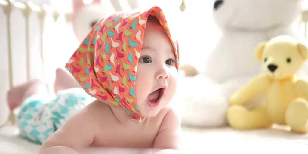
Warm and full colors that offer a sense of relaxation will serve as the basis for kidswear palettes, showcasing the universally suited pastels. In addition, organic features will propagate buyers’ newfound concern regarding cleanliness, spreading over all ages and genders.
How to use them?
Use the spectrum of pastels to design head-to-toe looks mixed with neutrals and a subtle hint of Turquoise Tonic. This will be a popular choice for lightweight and cozy knitwear.
Rich colors for the feeling of joy
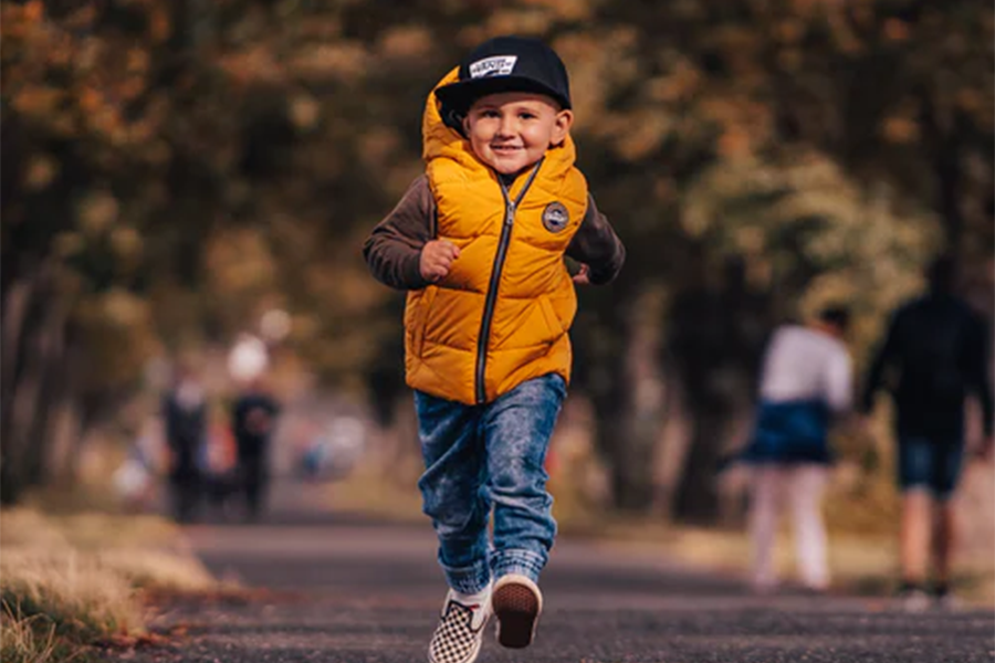
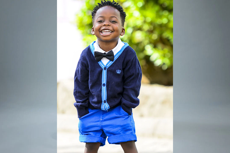
Where to focus?
Consumers want a motivating and happy mindset using colors that inspire joy, making hopeful and rejuvenating tones important for the kidswear.
How to use them?
When choosing a clothing line for kids, look for nature-inspired bright colors on the garments to promote a sustainable mindset. Fun colors such as yellow, orange, or blue can mix well and create an energetic look.
Nostalgic pinks with neutrals to stay grounded
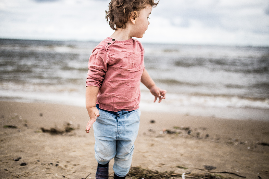
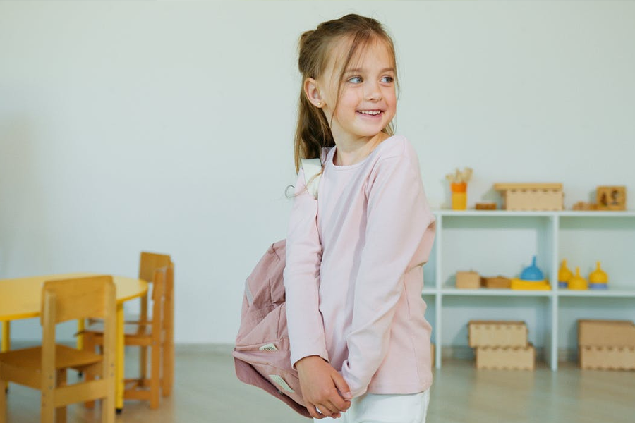
Where to focus?
Time-tested classic colors will be all the more important as a sense of familiarity inspires homeliness. This vision expands on the palette’s range of neutral themes.
How to use them?
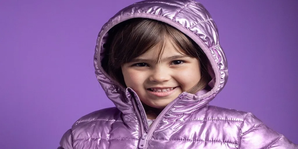
Go for wholesome pinks combined with rich cross-season browns to restock your inventory for sportswear, and accessories, modernized with a metallic touch.
Vibrant pink for digital stories
Where to focus?
Cyber-led colors need to be stepped up as buyers go further into online gaming. Esports is set to reach heights with a major boost thanks to people being stuck at home and idling during lockdowns.
How to use them?
Select garments based on the palette’s digital brights range with sharp hyper-natural, metallic colors.
Retro palettes with energetic orange
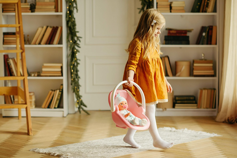
Where to focus?
Classical vintage tones that inspire nostalgia are essential for products. As a result, nostalgic colors are set to be popular in fancy garments.
How to use them?
The interesting commercial looks using citrus brights will introduce freshness to cool and retro designs.
Nautical-inspired color palettes with a soft edge
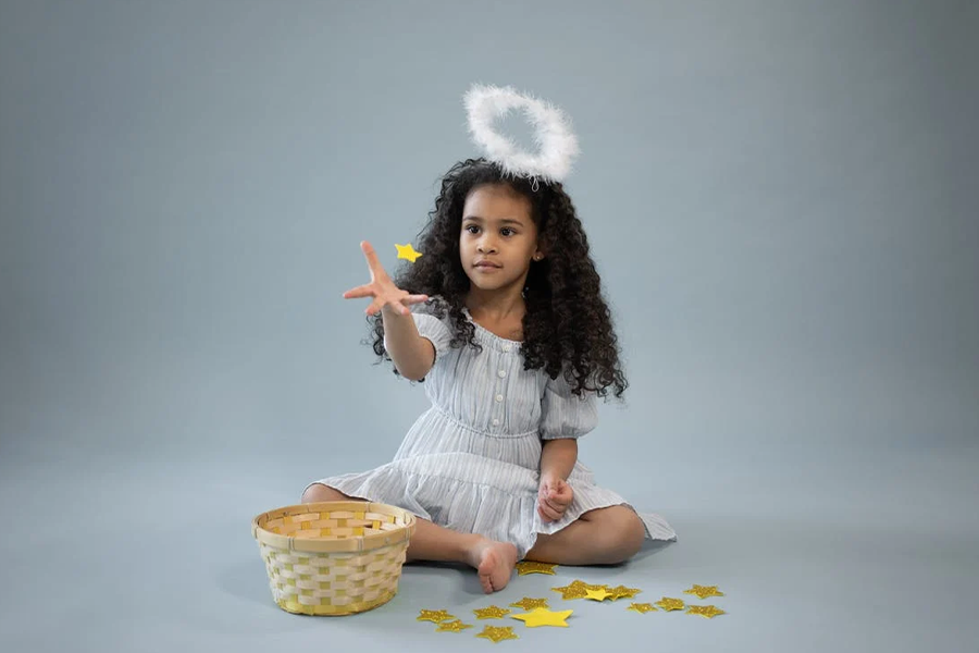
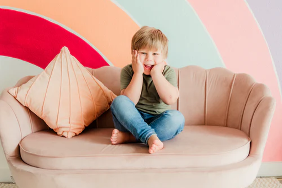
Where to focus?
The sensible approach to neo-classical nautical themes is to add soft, flowery tones. The garden-inspired designs help establish a connection with nature.
How to use them?
Introduce uplifting shades to a pastel-tinted palette that is grounding and calm to your product portfolio.
An earthy outdoor palette for sportswear
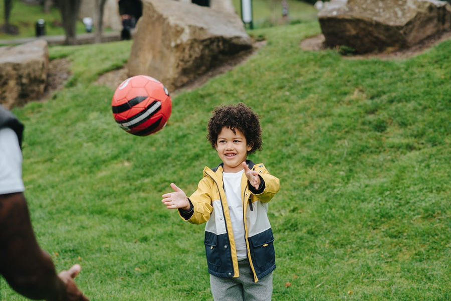
Where to focus?
The nature-inspired earthy colors bank on the momentum of garments meant primarily for outdoor wear, and sportswear buyers are naturally drawn to them. However, with a sensitive market, innovation can take place by combining it with retro tones.
How to use them?
Update your inventory for sportswear with athletic brights combined with warm neutrals and pastels.
Sampling hues from different eras
Where to focus?
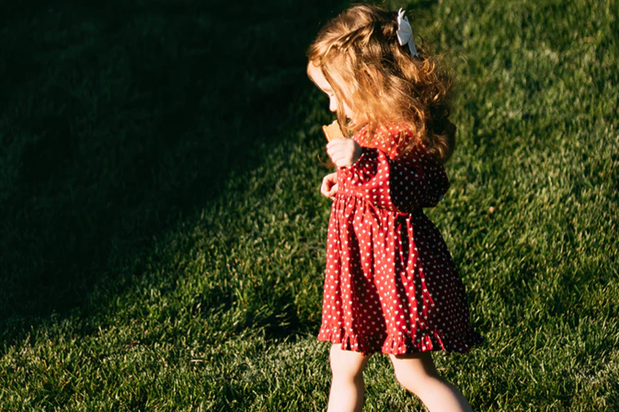
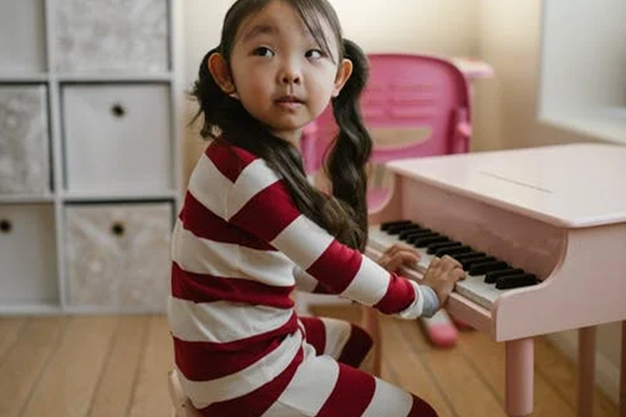
This season will observe nostalgia and hope as key drivers, which is reflected in the palette. When stocking up your kidswear inventory, you can consider mixing themes across different eras and come up with exciting collections for your customers.
How to use them?
This color palette is quite full of variety and can cross over multiple themes. Combine hyper-natural tones, for example, with baked pastels, and you get a new collection.
Kidswear for relaxing and refreshing summers
The general theme for the season is familiarity and mix and match. As a result, the palette combines neutrals with contrasting colors to give a refreshing do-over to classics. A range of colors from the kids’ palette will inspire nostalgia with a hint of freshness like the retro palette. The tones are welcoming and familiar, sometimes with bright, joyous highlights.
Customers looking for timeless colors or a touch of new trends will find something here. If you’re planning your summer line for kids, this palette will guide you through the trends.
