Are businesses not generating enough conversions on their sales pages? Or perhaps, like many new marketers, business buyers are pondering, “What exactly is a sales page?” If retailers aim to boost their sales and revenue, they must understand how to craft and enhance their sales pages.
That’s why this article is dedicated to guiding businesses through the process! By the end, they will be equipped with the knowledge to write a high-converting sales page, ensuring their business remains profitable and continues to grow. Throughout, business buyers will receive proven strategies and see examples of effective sales pages to inspire your website.
Table of Contents
What are sales pages, and how do you optimize them?
11 steps on how to create a sales page that will convert customers
Final words
What are sales pages, and how do you optimize them?
Sales pages are super important for convincing people to buy stuff. They’re the first thing consumers see when they check out a product online. These landing pages give potential customers all the information they need to decide if the purchase is worth it or not.
More importantly, if businesses don’t set up their sales pages correctly, they could end up wasting money on marketing without making sales. Thankfully, retailers can optimize their sales pages with clear buttons that say things like “Buy Now” or “Learn More.” Its consumers know what to do after visiting the sales page.
Businesses should also share links to their sales pages on social media and in emails to help guide potential customers to them. Sales pages are like a business’s secret weapon in marketing. They give them a simple way to show off products and make it easy for people to buy them. A good sales page can help retailers sell more and make more money.
11 steps on how to create a sales page that will convert customers
A great sales page has a few key elements that make it perfect. It should have an attention-grabbing headline, subheading/descriptive text, a CTA button, and visual elements blended beautifully to make customers think, “I have to buy that.” However, getting these elements right is the area that deserves more attention. Here are 19 steps to help create a sales page that wins customers.
Step 1: Know the target audience
Before businesses start crafting the perfect sales page, they must know the basic details of their target audience. This information includes what they look for when buying similar products or services. One of the best ways to get this insight is by creating a customer avatar or buyer persona.
It’s like making up a character who represents the ideal customer. Although the buyer persona is not a real person, businesses can create them using real information they gather from sources such as:
- Surveys from your customers
- Data available on the retailer’s website
- Stats from social media
- Other online research
Once businesses have their buyer persona, they will know what influences, bothers, challenges, and motivates their potential customers. This information helps them write copy that speaks directly to them. Then, retailers can use all this information in their writing to ensure their audience is the right target.
Here’s a great example of a buyer persona for a fitness app:
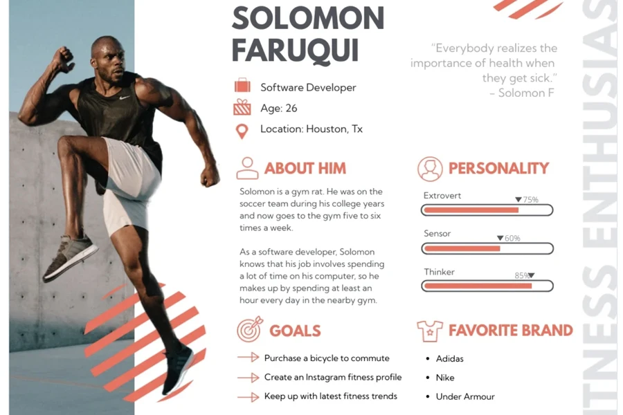
Note: Businesses can add as many criteria as they want to their buyer persona. It must capture everything they picture in their target audience.
Step 2: Create a value proposition
When businesses know their target customers, it helps them explain why their product or service is perfect for them. This explanation is what experts call a “value proposition.” It informs people what benefits they’ll receive and what problems businesses will solve for them.
The value proposition should also show that the offered benefits are worth more than they will pay and emphasize how much better they are compared to those offered by the competition. Nevertheless, the value proposition should be short and sweet—a single sentence or a brief phrase is enough to convey the message. This step sets the tone for the rest of the sales page’s writing.
Here’s an example of great value proposition for the fitness app example above:
“Your Personalized Path to a Healthier, Happier You, Without Breaking the Bank or Your Schedule.”
Another popular site, Optinmonster, uses the following as its value proposition:
“The Powerful Customer Acquisition & Lead Generation Software… Without the High Costs”
Step 3: Get the price right
Before businesses start writing, there’s one more thing to figure out: the price of their product or service. Price is often a major concern for potential buyers. To overcome this, service providers need to make the cost seem reasonable compared to the value they get.
Here are some effective strategies:
- Offer multiple pricing options
- Use descriptive names for each price level to help customers choose
- Set prices that end in 9, as research shows this attracts more buyers
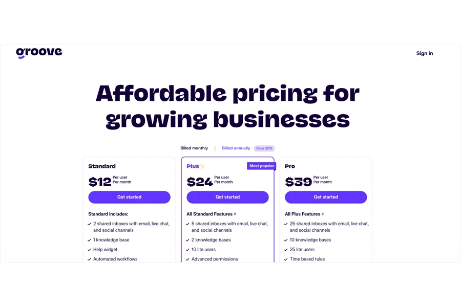
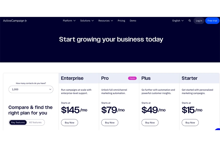
Here are examples of businesses that use these pricing strategies:
Step 4: Choose the right length
Once businesses understand the first three steps (i.e., the target audience and what they offer), it’s time to write the perfect sales page. But the next question that pops up is, “How long should it be?” The answer is as long as necessary to get the job done.
The length depends on the brand’s product and how its visitors react. Businesses can usually use either long or short copy (or a combination of both) for their sales pages. Long copy addresses more customer concerns and explains complex products or services.
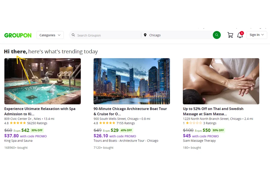
But if brands can make their point quickly, keep it short. For example, Groupon doesn’t waste time explaining and jumps straight to the offers.
Even long sales pages mix short and long sections. Short copy at the top with a call to action (CTA) targets those already convinced.
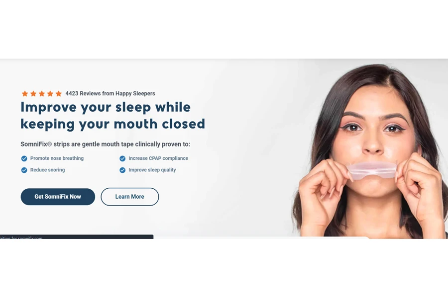
Then, long copy further down helps persuade the undecided and includes additional CTAs. For instance, Somnifix’s landing page starts with a brief copy and then provides more details as the visitor scrolls, including testimonials, recommendations, and a final CTA.
How do businesses decide which type of sales page length works best? The best way is through A/B testing. It will help brands discover which sales pages convert best, allowing them to improve or rework where necessary.
Step 5: Craft the perfect headline and subheadings
Now that the first 4 steps are out of the way, businesses are ready to start the writing process. The first thing they must do is create the headline. The headline is arguably the most important part of any sales page.
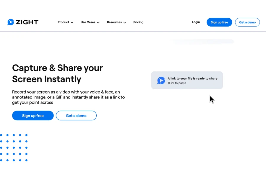
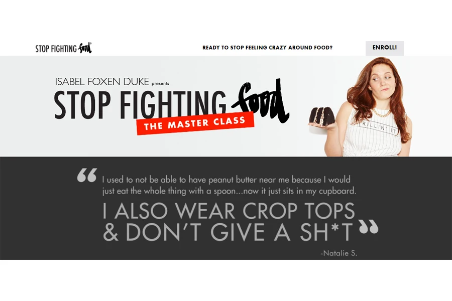
If the headline is not good, businesses can forget about their chances of retaining visitors—they will leave quickly. Great headlines are short and clear. For example, this health and wellness masterclass’s sales page uses a simple but bold headline. It gets straight to the point.
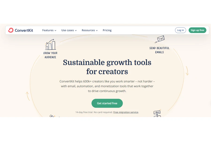
Sometimes, sales pages need a subheading to give more context, especially if the message is more complex. For example, Converkit uses a big headline and a subheading to provide extra information.
Pro tip: If businesses want to level up their headline game, they can use head analyzers. These tools give scores, with most offering tips on how to improve and get better headlines. Some top options include Capitalize My Title and OptinMonster’s headline analyzer.
Step 6: Describe the product
Now, it’s time to explain the product’s purpose and function. Here, businesses highlight the visitor’s main problems and show how their product solves them. The more specific and unique the description, the better. Detailed descriptions of each feature help convince shoppers to buy and can also improve the brand’s SEO ranking.
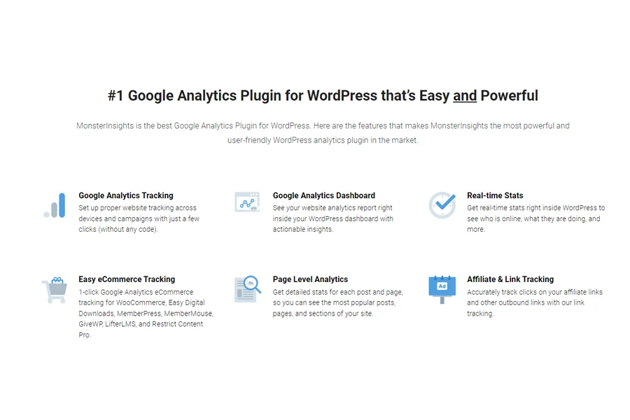
For example, MonsterInsights’s sales page does a great job of showcasing the key features that users want.
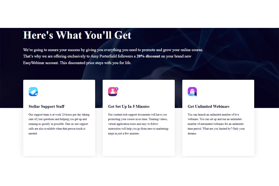
Another brand, Easy Webinar, does the same with its features. This section shows everything visitors can gain by subscribing to their services:
Pro tip: When businesses highlight the ins and outs of their services, it gives potential customers more confidence. Just remember to provide all the services promised without exaggerating anything.
Step 7: Highlight the benefits
Businesses can’t write a sales page that converts if they don’t understand the differences between features and benefits. Remember that visitors care more about what the product will do for them than its technical details. That’s why effective sales pages highlight benefits over features.
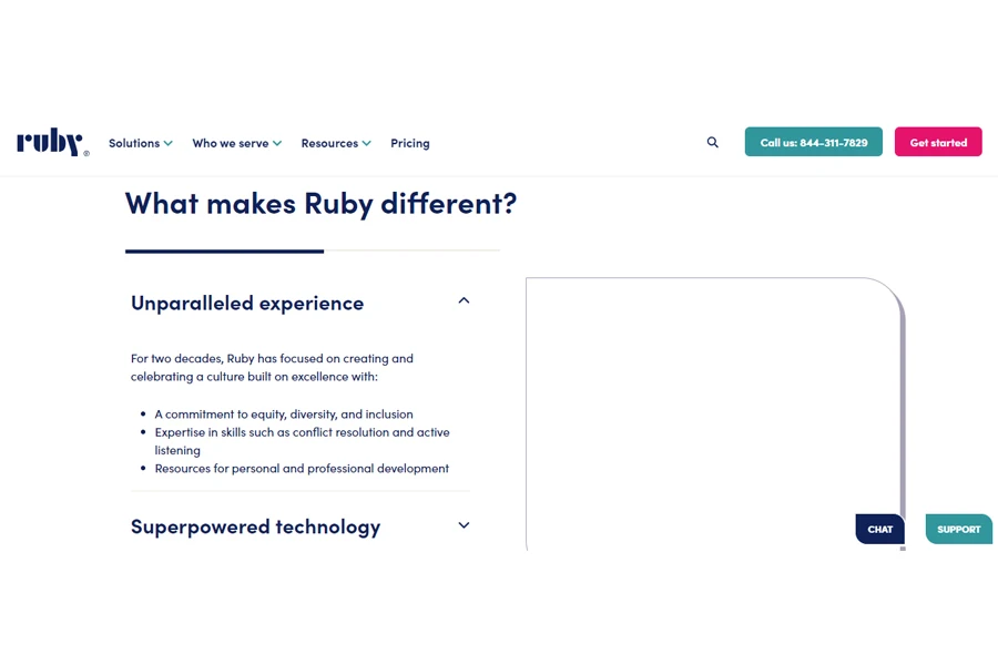
Most sales pages present benefits as bullet points. For example, Ruby uses categories and clear bullet-point lists to show what makes them different.
However, businesses can go further by explaining the benefits. These don’t usually need bullet points, but they shine more light on what brands are offering. For instance, Wix uses eye-catching imagery while using this tactic. See the example below:
Pro tip: Always dig deeper. Will the product save clients time, money, or effort? And then, what will they achieve with that saved time, money, or effort?
Step 8: Use social proof to raise trust
Trust is crucial for sales. Did you know that 90% of consumers buy only from businesses they are loyal to? Furthermore, 81% of consumers prefer brands they trust when shopping. Here’s how to build trust on any sales page:
- Provide proof for any claims you make.
- Highlight testimonials from satisfied customers.
- Include social proof, such as social media mentions and expert endorsements.
- Offer a money-back guarantee for peace of mind.
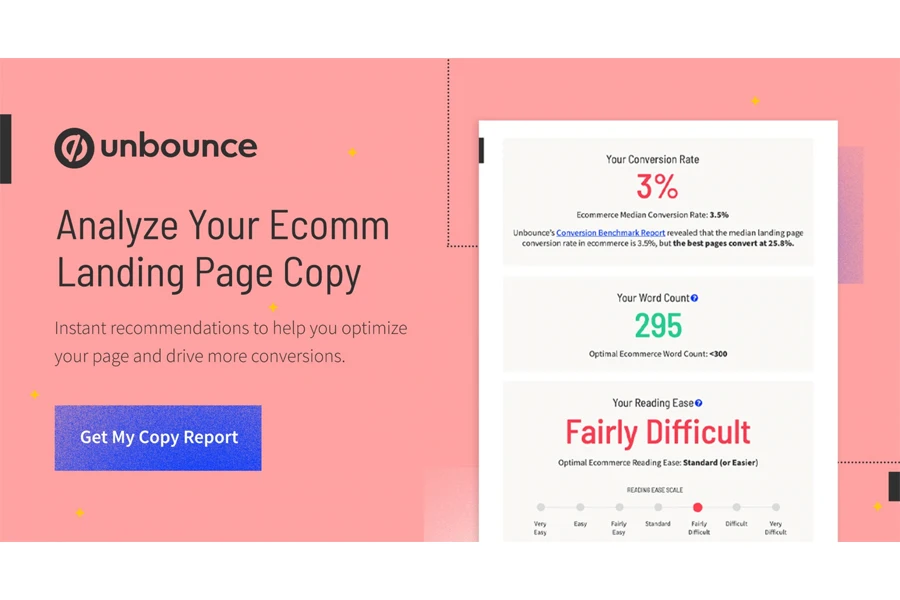
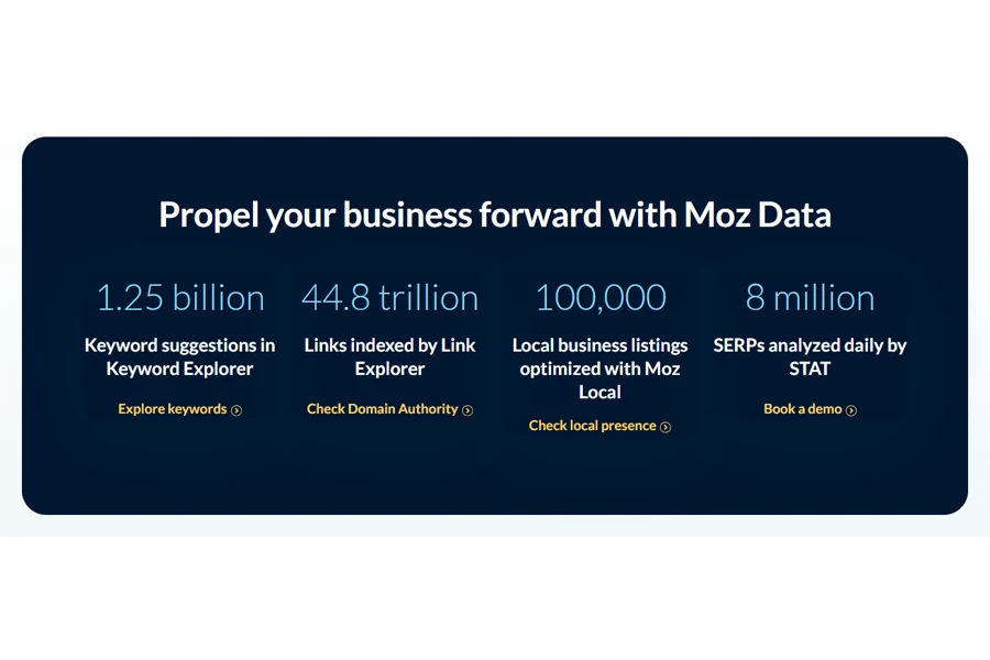
Moz Data, for example, showcases key stats on its sales page to build trust.
To boost trust even more, use TrustPulse. TrustPulse adds recent activity pop-ups to business sites, showing when others have signed up or made purchases. This kind of social proof can instantly build trust. Even TrustPulse’s sales page has this feature, as seen below:
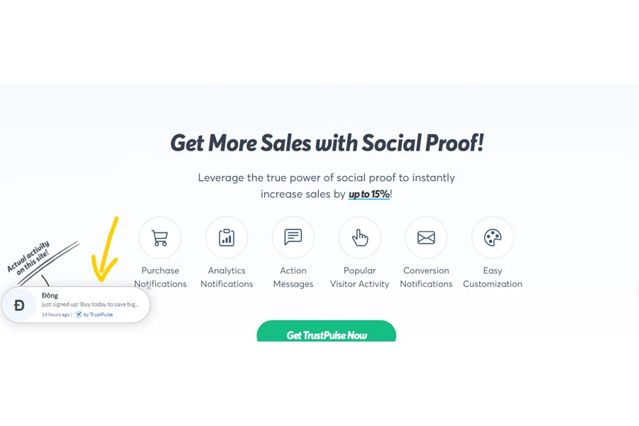
Adding TrustPulse can increase business website conversions by up to 15%. OptinMonster also uses these pop-ups and states they have seen impressive results. A small addition of social proof, like TrustPulse, can lead to big improvements in sales.
Step 9: Add visuals
Is the writing process over? Well, don’t round up yet. A sales page is never complete without some visuals. Even still images can grab attention and guide readers’ focus to the most important parts of the page.
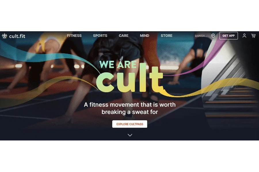
However, brands can take it further with video. Studies show that 90% of marketers say videos have given them impressive ROI. A smart tactic is to have a video pop up at the right moment. See how Cult uses visuals to its advantage:
Step 10: Make the copy scannable
Once the content is ready, businesses must ensure it’s easy to read. One key design tip for online copy is to make it scannable. How? Break up the text so readers can easily skim the page without feeling overwhelmed.
Nevertheless, always avoid large blocks of text. Businesses can also divide the sales page into manageable sections to make it more scannable. Usually, the best sales pages include:
- A mix of short and long lines
- Many short paragraphs
- Bullet-point lists
- Subheadings
- Quotes
Brands can also use design elements like boxes and outlines to highlight important points. Additionally, ensure the font is easy to read, especially on small screens. Google suggests a minimum font size of 16px. For font ideas, check out this list of readable and web-safe fonts to ensure your sales page is scannable.
Step 11: Don’t forget the call to action (CTA)
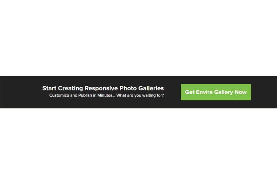
Every sales page needs a clear call to action (CTA) to be effective. Visitors want to know, “What’s in it for me?” The CTA provides a great chance to remind them of what they can benefit from. After all, the final sentence seals the deal. For example, Envira Gallery’s sales page does this well. Its call to action highlights how publishing is fast and how their product showcases photos, all in one concise sentence next to the CTA button.
Final words
That’s it! These tips reveal how the most successful sites craft and design their sales pages. All businesses have to do is apply what they’ve learned and create super-convincing sales pages that convert. But before that, here are a few extra things to note.
Brands must ensure they use the right language for their copy (i.e., address consumers with personal pronouns), remove distracting elements, leverage urgency (e.g., countdown timers or limited stock), place multiple calls to action, and prioritize responsive designs with dynamic layouts. These extra tips, combined with the 11 discussed above, will help make an unbeatable sales page!