Every company on Twitter has the same features at its disposal to create a standout profile.
Here are those features:
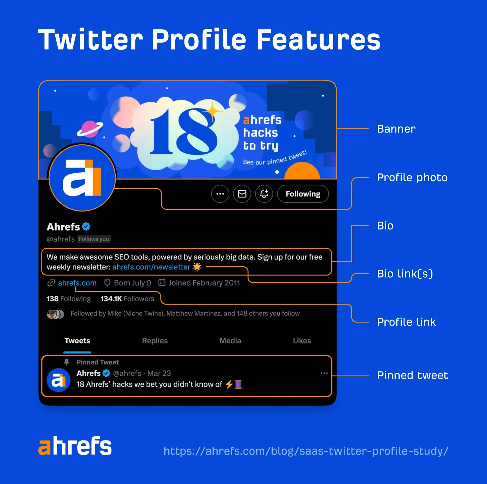
But how many SaaS companies make use of them all? And are they using them well?
To find out, we studied the Twitter profiles of 100 SaaS companies.
SIDENOTE. Here’s the full company list if you’re curious.
Let’s start at the top.
Table of Contents
Banner
Profile photo
Bio
Bio link(s)
Profile link
Pinned tweet
Banner
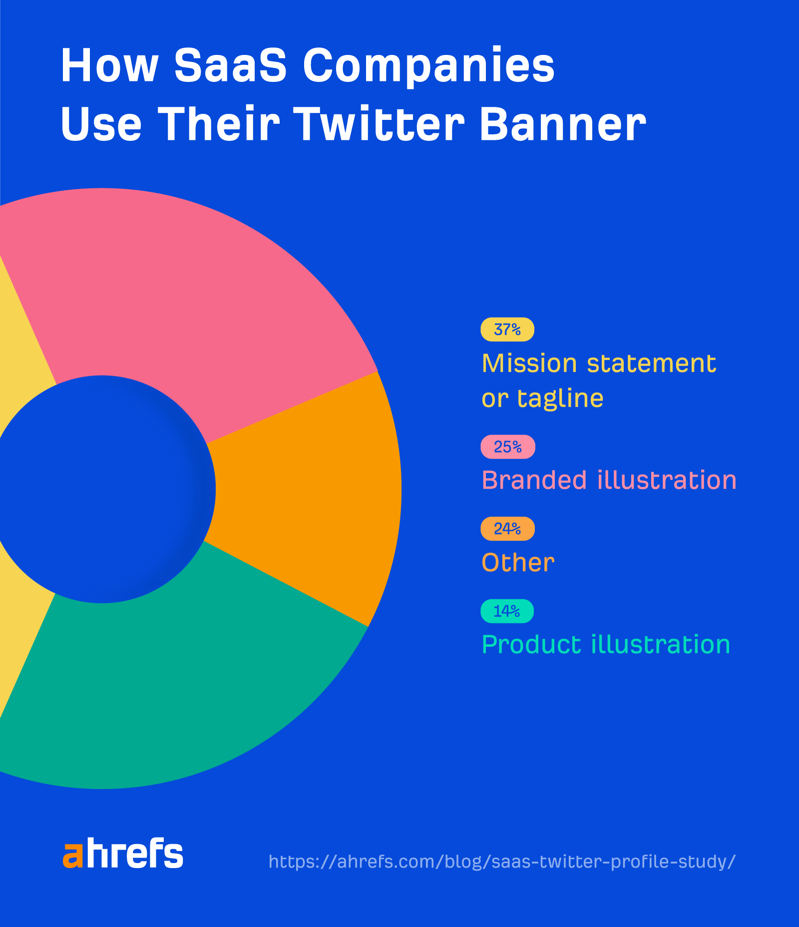
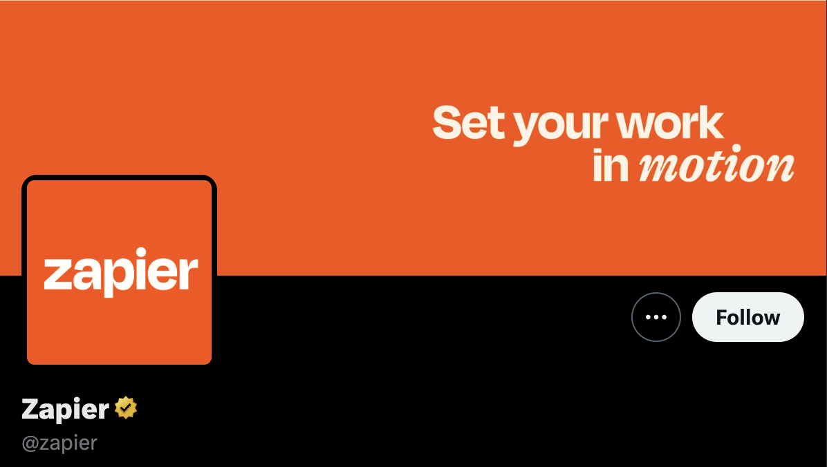
37% of SaaS companies feature their mission statement or tagline in their banner, making it the most popular option.
Here’s a super clean example from Zapier:
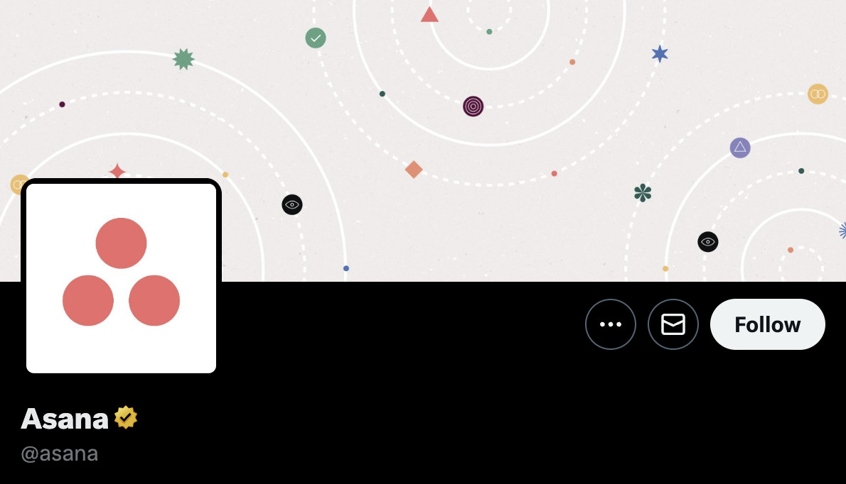
The next most popular option (25%) is a branded illustration, like this one from Asana:
Product illustrations are also a relatively popular choice, with 14% of SaaS companies opting for them.
Here’s an example from InVision:
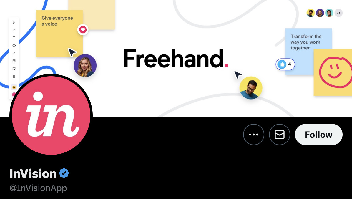
This demonstrates how its collaboration features work without falling into the trap of showing cluttered screenshots of the literal UI.
Unfortunately, while these kinds of banners work well on desktop, they’re rarely great on mobile.
For example, much of InVision’s banner is obfuscated by the notch and UI elements on my iPhone:
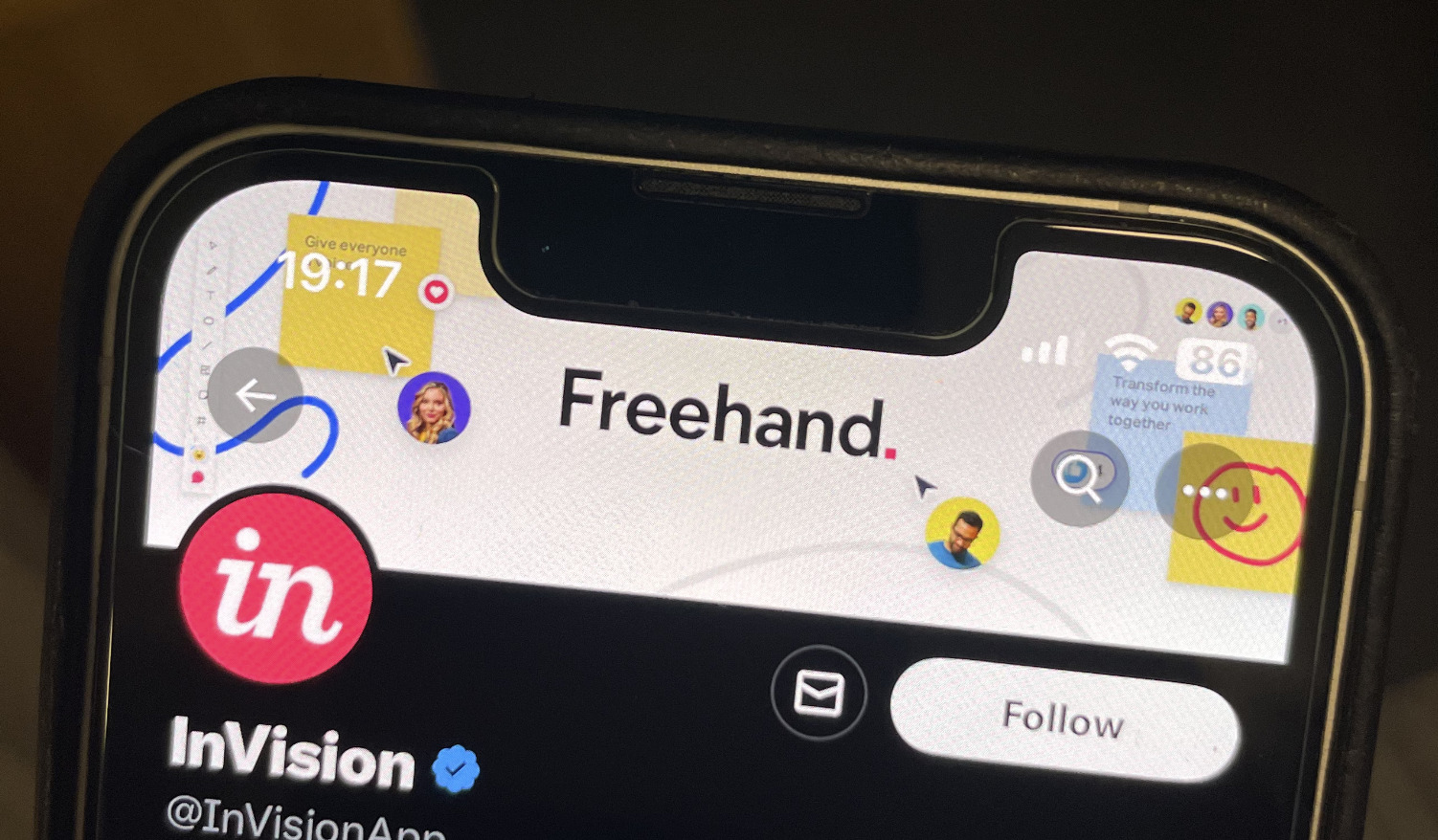
Even without the obfuscation, the product text is super tiny and hard to read. This issue is magnified for SaaS companies that use their literal product UI.
Case in point, Linear:
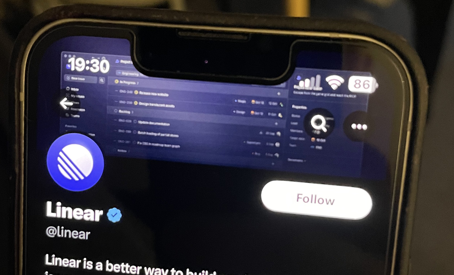
These are things we’re always conscious of when designing banners for our profile, as you can tell from the mockup below:

As for the remaining 24% of SaaS companies, we saw everything from, um, nothing…
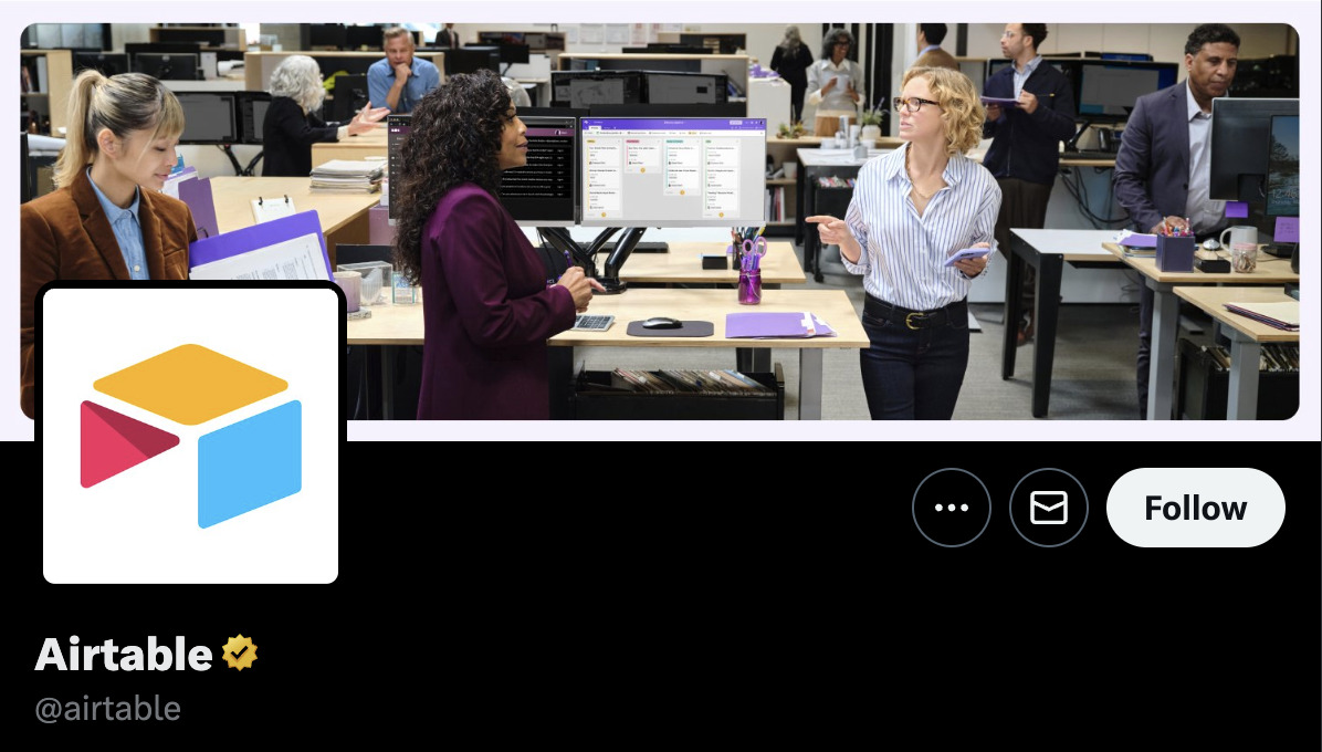
… to generic stock photography (seriously, Airtable, what is this all about?)
… to folks with Swiss roll hair rollers (is this how you capture the millennial market? *takes notes*):
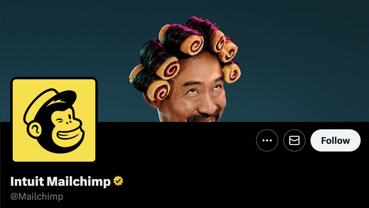
SIDENOTE. Mailchimp’s banner is actually from its brand ad campaign.
Bland, boring, and zany examples aside, one interesting trend I noticed is that many companies don’t just set a banner and forget it. They swap it to coincide with new feature releases, events, new industry awards, new content, open job positions, etc.
Here are a couple of examples:
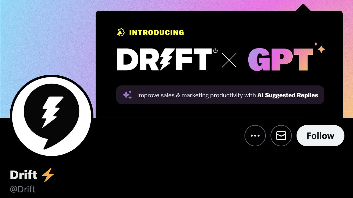
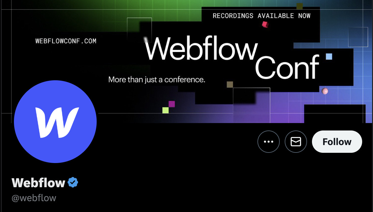
Given the number of profile views SaaS companies like Drift and Webflow likely get, this makes a lot of sense.
In fact, this is something we do too.
Here’s our banner promoting our list of Ahrefs hacks:

KEY TAKEAWAYS + OUR ADVICE
- 62% of companies feature a mission statement, tagline, or branded illustration – These are all good choices for a “default” Twitter banner. They help reinforce your brand identity and tell potential followers what you’re all about.
- 14% of companies feature their products – It makes sense to swap out your “default” banner for this to coincide with product announcements. Just remember to design them with mobile UIs and notches in mind.
- 24% of companies feature something else – It’s probably best to avoid zany and vague banners unless you’re a household brand or are trying to tie your Twitter presence to an advertising campaign. However, it makes sense to showcase time-sensitive things like upcoming events, awards you’ve won, job positions, etc.
Profile photo
100% of SaaS companies feature their logo (or some variation) here.
Big surprise, right? So why am I even bothering to mention it?
The answer is that I want to draw your attention to a mistake some brands make, which is being hell-bent on using their full text-heavy logo.
Don’t get me wrong. There’s nothing wrong with including your full logo when it has a short “horizontal length.”
Take Wix, for example:
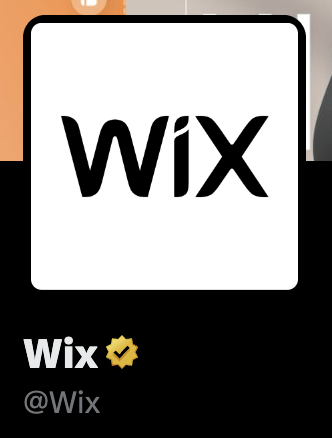
This works just fine. It’s easy to read and recognize on desktop and mobile—even in the small feed icons:

But this works less well for brands with logos with a wider “horizontal length.”
Case in point, Talenox:
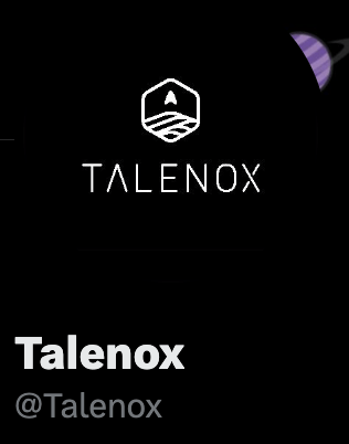
This is virtually impossible to read on mobile and doesn’t grab your attention in the feed:

I can’t help but feel the icon alone would be much better at grabbing your attention.
Here’s a mockup:

Interestingly, this is a lesson learned from personal experience. We used to have our profile photo set to our “full width” logo, but we soon realized our mistake and changed it to the custom branded icon you see today:

KEY TAKEAWAYS + OUR ADVICE
- 100% of SaaS companies set their profile photo as their logo – You probably should too. Just make sure to use an icon from your logo or a shorter version if it’s text-heavy.
Bio
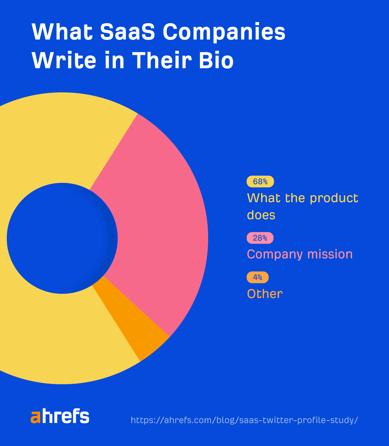
Most companies (68%) use their bio to reflect what their product or service does.
Here’s an example from Mailchimp:

Even if you knew nothing about Mailchimp before coming across its Twitter profile, you’d end up with a pretty good idea about what it’s selling from its bio alone.
But what about everyone else?
Well, 28% of companies use it to state their company mission.
Here’s an example from Asana:

If you’re none the wiser about what Asana actually is or does after that, join the club. And this isn’t even vague compared to some. Check out Cialfo’s:

Luckily, the final 4% of companies are being a bit more creative. They seem to either highlight what to expect from following them like BrightLocal or opt for a pure fun approach like Shopify.


(I like how BrightLocal notes “Tweets by Jenny.” Definitely adds a personal touch!)
KEY TAKEAWAYS + OUR ADVICE
- 68% of companies explain what their product or service does – This is always a safe bet that helps potential followers understand what you’re all about.
- 28% of companies state their mission or tagline – This is probably not the best choice unless you’re already a household name and it’s more important to convey a “message” than what you do.
- 4% of companies use their bio for something else – I’d avoid the zany “fun” bios unless you’re a household name. They’re vague and unhelpful in most cases. As for telling potential followers what they can expect from you, that makes sense—especially if you only post very specific things on Twitter like product updates.
- Personal touches are… a nice touch – Hardly any SaaS brands do this, but I think adding “Tweets by [name]” is a great way to humanize your brand (assuming the tweets are actually by one person, of course).
Bio link(s)
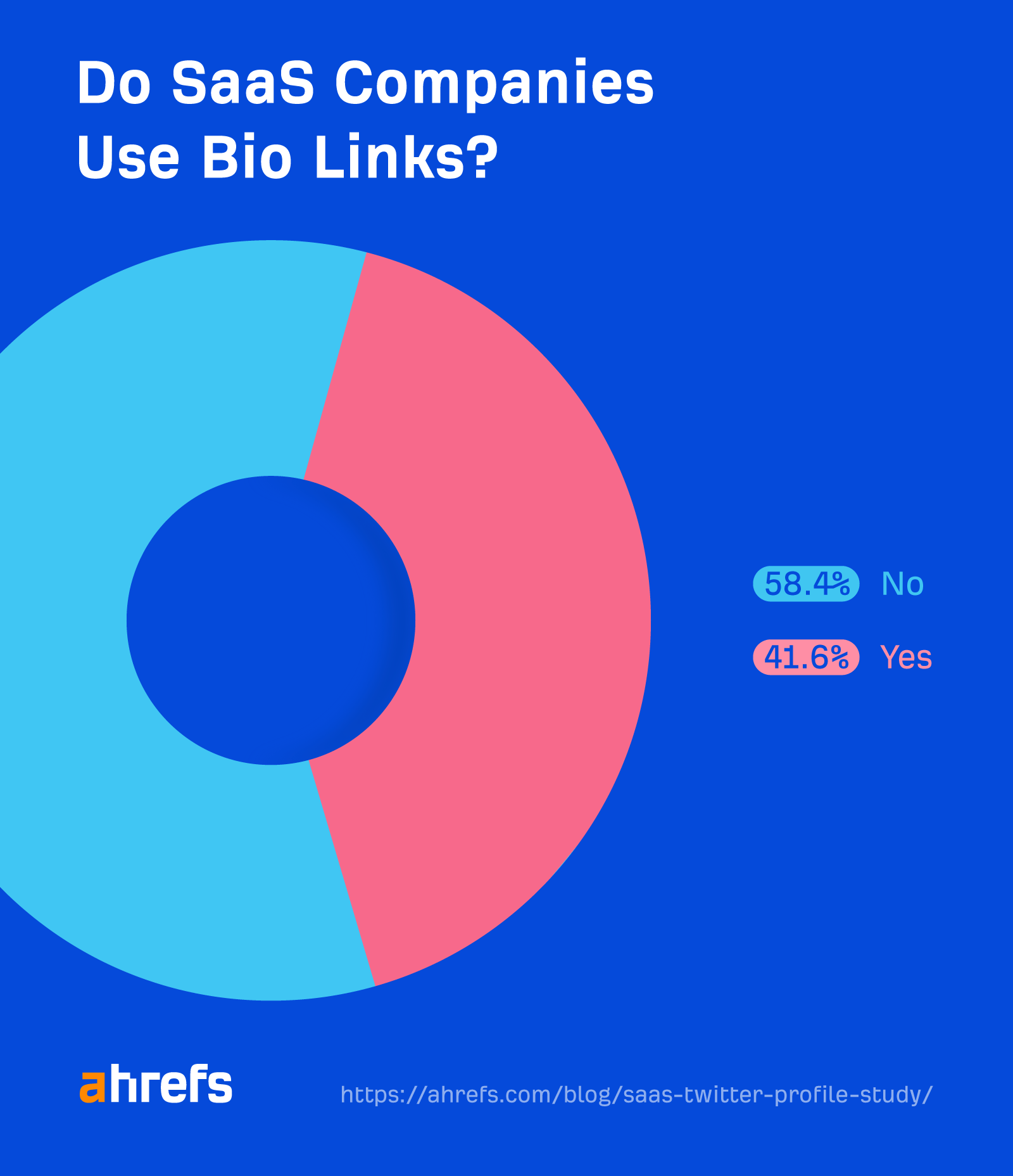
Most SaaS companies (58.4%) don’t utilize bio links.
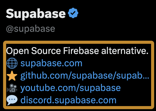
Here’s what we mean by bio links, by the way:

They’re the ones that are actually in the bio (not the dedicated “website” link).
Basically, any URL or Twitter handle (e.g., @ahrefs) you mention in your bio automatically gets turned into a link.
For example, here’s me setting up my bio…

… and the result:

But of those that do use them, what do they use them for?
Here’s the data:
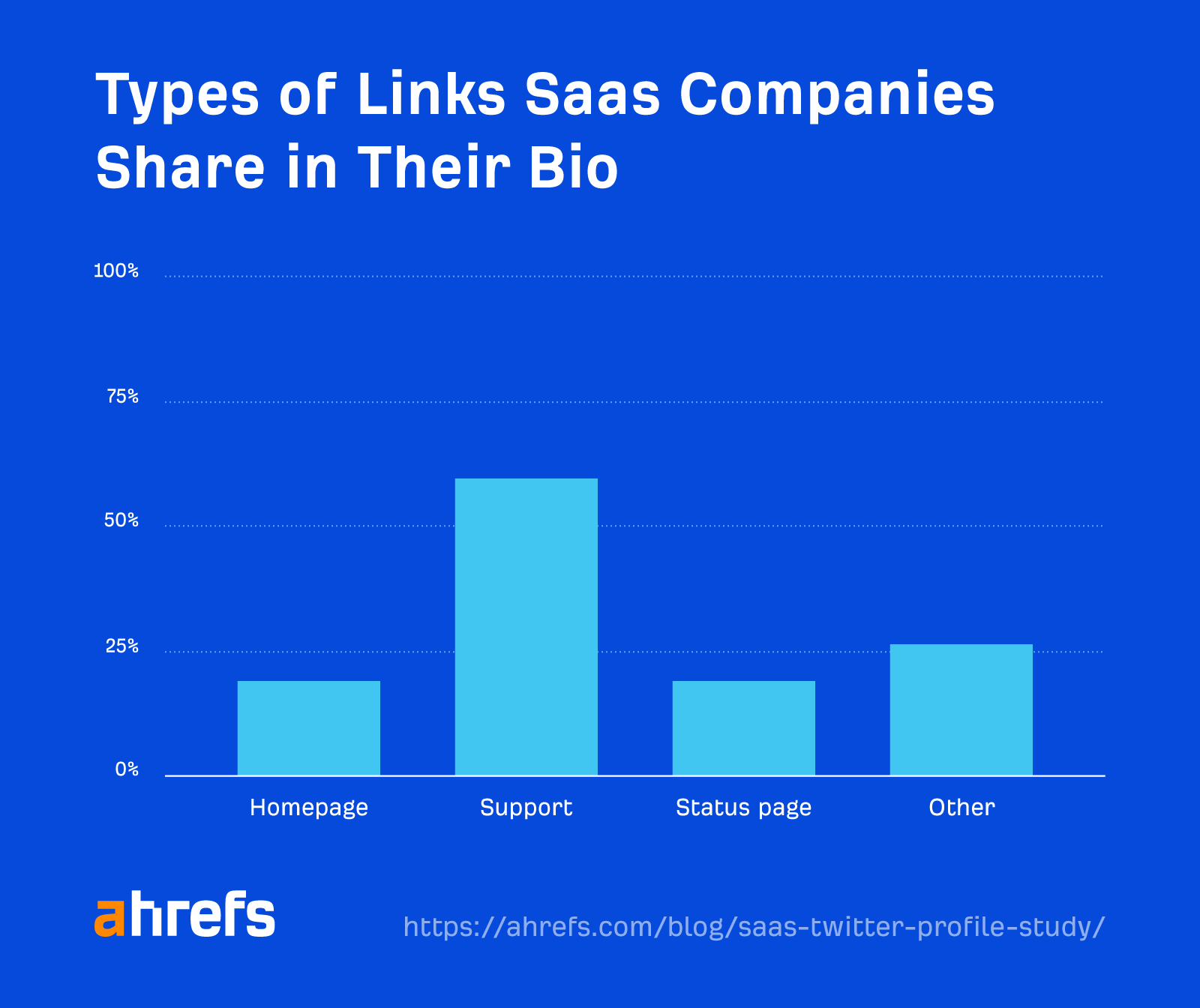
SIDENOTE. These don’t add up to 100% because some companies include multiple links.
60% of SaaS companies include support links.
These are either links to dedicated support Twitter profiles (e.g., @asksalesforce)…

… website support hubs

… or both:

19% of brands link to a status page or profile:

Interestingly, most of the brands doing this are project management (Airtable, Monday, Miro, etc.) or community apps (Slack, Circle, etc.). Given how much it can impact your day when these kinds of tools go down, that makes perfect sense.
19% of brands link to their homepage:

(Given that the homepage link is almost always duplicated in the profile link, this seems like a waste of space to me. I’m not sure why it’s so common.)
And the final 26% of brands link elsewhere, such as to a newsletter signup page…

… their social profiles and communities
… or even branded hashtags:

Initially, I thought the branded hashtag was a bit of an odd choice for quite a small brand. However, it actually makes sense, as it’s basically a feed of success stories (big and small) from customers who love the software.
Here are a couple of examples:
KEY TAKEAWAYS + OUR ADVICE
- 58.4% of companies don’t utilize bio links – This is a waste. Every company has something it could promote here.
- 60% of companies link to support pages or profiles – Given that frustrated customers often take to Twitter
to complainfor support, this seems like an effort to move the conversation somewhere less public. That makes sense, especially as customers are probably going to get faster responses elsewhere anyway. - 19% of companies link to a status page – This seems like a great way to reduce the number of support requests during outages.
- 19% of companies link to their homepage – This seems like a waste of space, as most profiles have a homepage link in the website link section.
- 26% of companies link elsewhere – Newsletter signup pages, communities, and jobs pages are all popular options that make sense. I’d stay clear of branded hashtags unless you’re promoting them elsewhere. Otherwise, I doubt they’ll get much engagement.
Profile link
Believe it or not, 7% of companies don’t have a profile link.
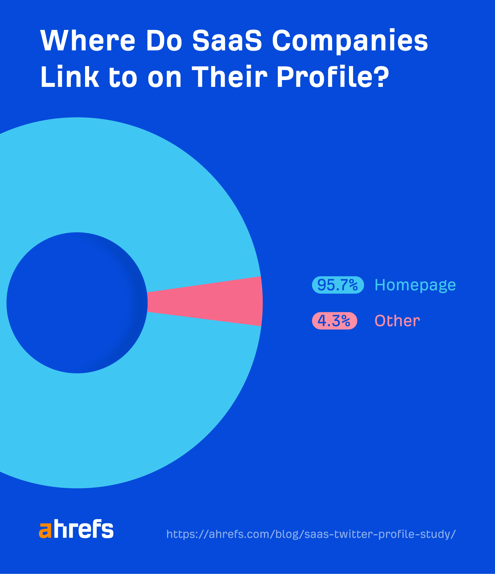
Of those that do, 95.7% link to their homepage.
This makes sense. It’s the obvious place to link to and probably the best one to direct followers to learn more about your product or brand.
Most of the remaining 4.3% link to a Linktree (or another similar alternative):

This approach seems more common with individual “influencers,” but I think it can also work well for SaaS companies.
Yotpo is a good example. Its Linktree links to:
- Jobs page – Makes sense. If you like a brand enough to follow it on Twitter, there’s a chance you might be interested in working for it.
- Blog post – Specifically, one that explains the benefits of “zero-party data,” which is what its product helps business owners collect.
- Landing page – This is for its “brand accelerator program” (an initiative to help black-owned small businesses grow).
- Press release – This talks about how it made Forbes’ list of the top 100 private cloud companies.
- Homepage – Ah… we got there eventually!
SIDENOTE. The page also links to a campaign to “nominate an amazing woman in ecommerce,” but it’s a 404.
KEY TAKEAWAYS + OUR ADVICE
- 95.7% of companies (if they have a profile link) link to their homepage – I’d recommend this for pretty much every SaaS company too. It’s a solid choice and helps potential followers learn more about what you do.
- 4.3% link elsewhere – Mostly to a Linktree (or similar). This is a fine choice if you want to promote multiple things to followers, like job openings and awards.
Pinned tweet
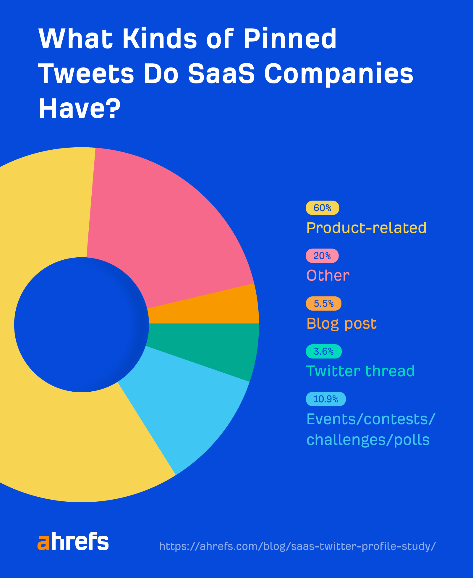
Only 55% of SaaS companies use the pinned tweet feature.
Most of those that do (60%) feature a product-related tweet.
Here’s an example from Intercom:
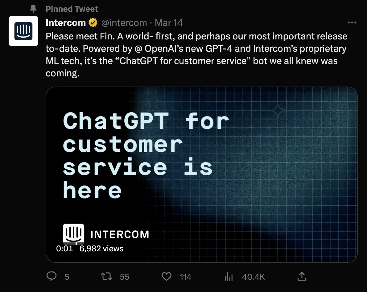
Interestingly, I spotted a lot of brands using videos for this. This makes sense, as there’s really no better way to demonstrate a product feature or explain what your software does. It also allows you to fit more information into your tweet than you’d be able to with 280 characters.
SIDENOTE. The tweet character limit for Twitter Blue subscribers is technically 4,000. However, a) not all brands have Twitter Blue and b) 4,000 characters are apparently between 571 and 1,000 words on average—who in their right mind wants to read that much copy in a plain text tweet?
10.9% of brands feature an event, contest, challenge, or poll.
Here’s an example from Litmus:
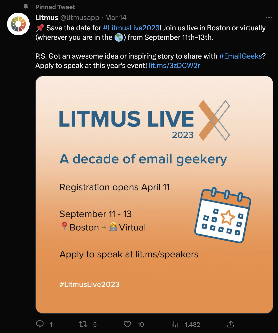
Obviously, these aren’t just “set it and forget it” pinned tweets. Once the event, challenge, contest, or poll is over, brands swap them out for something else.
What else?
Blog posts and Twitter threads are common, with 5.5% and 3.6% of brands respectively showcasing these in pinned tweets.
Here are a few examples:

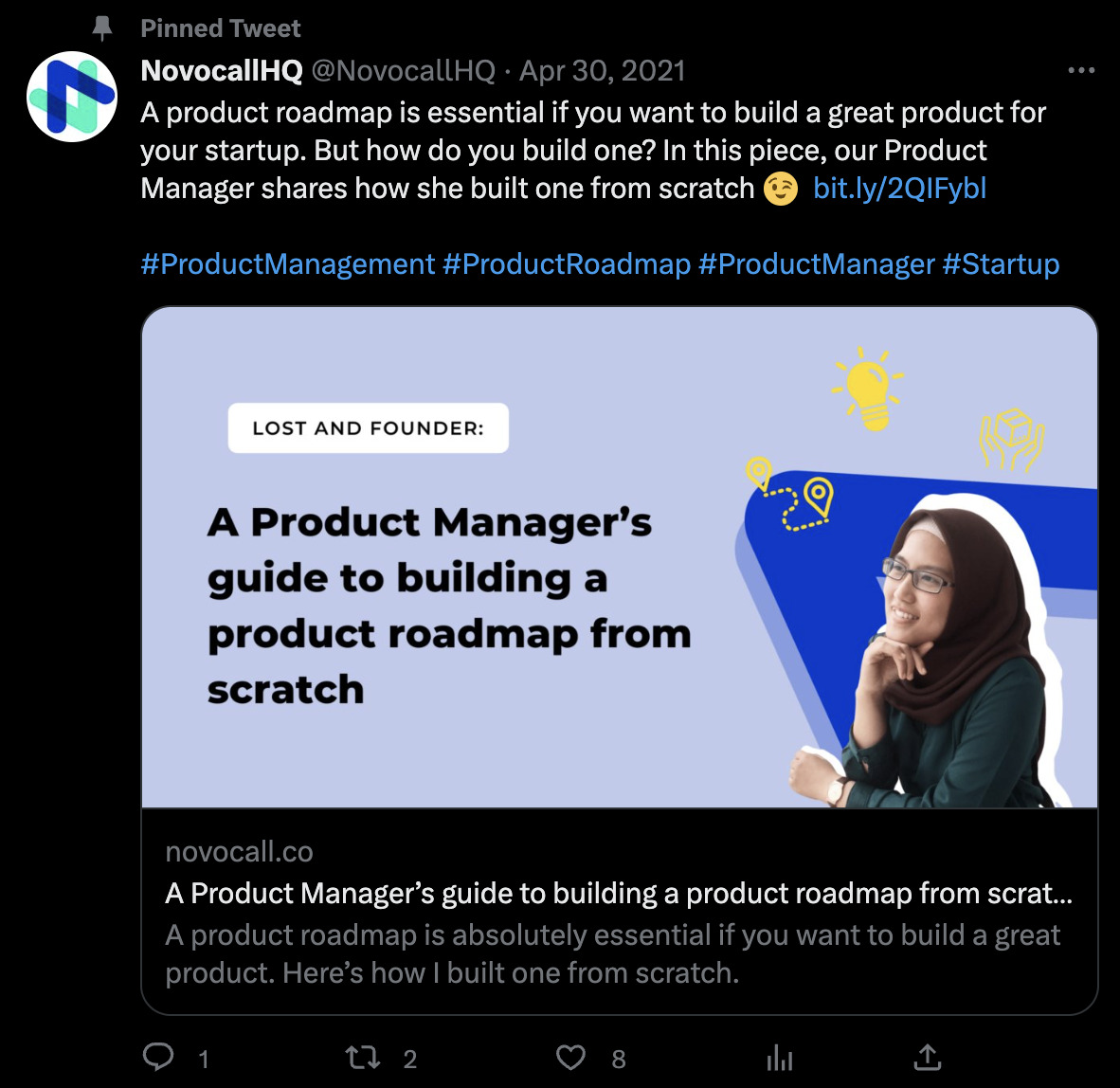
Given that Twitter users almost certainly prefer native content, you’re probably better off turning a blog post you want to promote here into a thread instead. You can always promote the blog post at the end.
This is precisely what we did for our current pinned tweet:
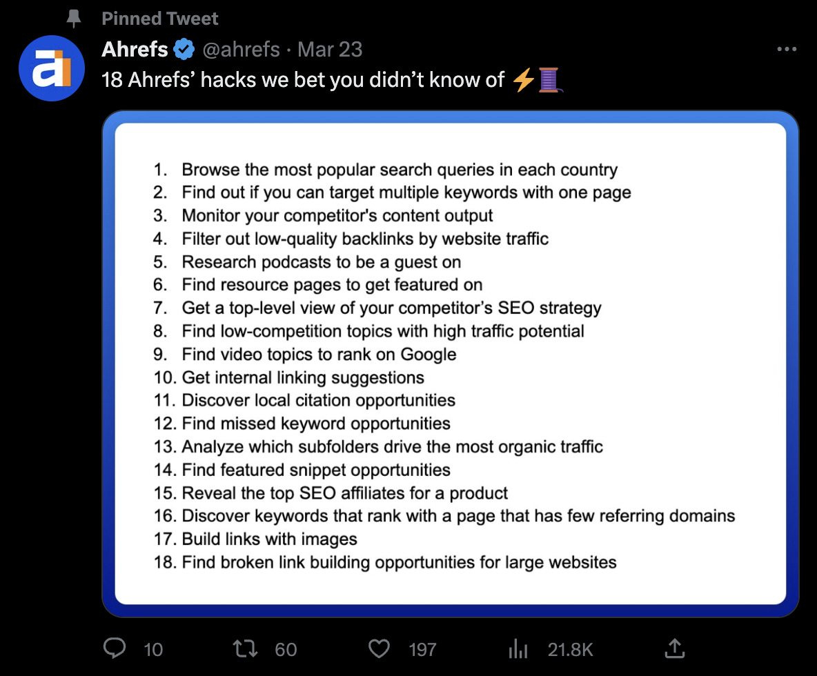
These 18 hacks began life as a blog post. But we knew we’d likely get way more engagement by turning them into a Twitter thread.
We then promote our newsletter at the end of the thread:
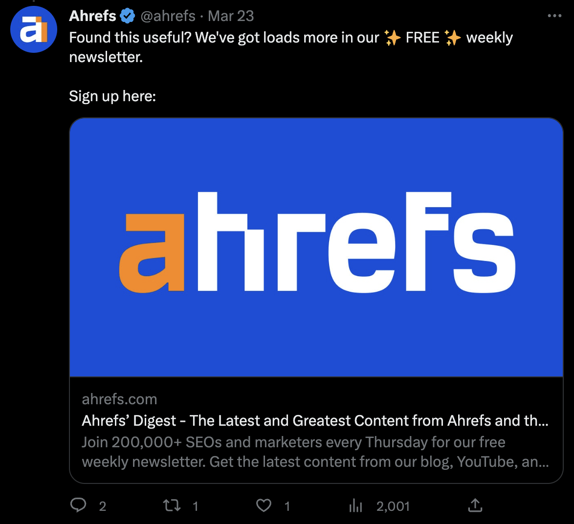
The remaining 20% of SaaS companies feature other things, like awards they’ve won…

… rebrand announcements

… and white papers:

I think these all make sense—except for white papers.
Even if you’re targeting enterprise customers, I just can’t see many people browsing Twitter and thinking “Oh, cool—a white paper! I’ll download that right away!”
KEY TAKEAWAYS + OUR ADVICE
- 45% of companies don’t have pinned tweets – Don’t be one of them. Pinned tweets are a useful way to highlight import updates, campaigns, and initiatives.
- 60% of companies have product-related pinned tweets – This is a safe bet, but I think it’s best to use an engaging format like video if possible. This also extends the amount of information you can put in your pinned tweet beyond the 280-character limit.
- 10.9% of companies feature events, contests, challenges, or polls – This makes sense, as you usually want to draw as much attention to these types of events as possible in a limited period of time.
- 5.5% of companies feature blog posts – I would avoid this, as I think few Twitter users want to consume content off the platform.
- 3.6% of companies feature threads – I think there are too many threads on Twitter, but they’re obviously popular so… what do I know? Either way, this is another good way to effectively extend the 280-character tweet limit.
- 20% of companies feature other things – Awards, announcements—basically whatever they want to draw attention to at the moment. Just don’t try to force users to download white papers; I really don’t think anyone on Twitter wants that.
Final thoughts
How you set up your company’s Twitter profile depends on the impression you want to make and the things you want to promote. Just make sure to utilize all the features Twitter gives you to create a standout profile.
If you’re short on time, here’s our best advice to get your profile up and running fast:
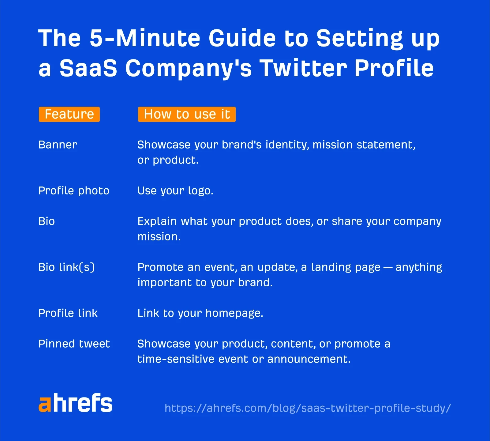
Source from Ahrefs
Disclaimer: The information set forth above is provided by Ahrefs independently of Alibaba.com. Alibaba.com makes no representation and warranties as to the quality and reliability of the seller and products.
