In online shopping, where every click holds the potential for a transaction, the importance of calls to actions (CTAs) cannot be overstated, steering potential customers through the intricate journey from exploration to conversion.
Whether you’re a seasoned ecommerce professional looking to fine-tune your approach or a newcomer seeking to understand the magic behind CTAs, this blog will help you write prompts that increase your chance of making sales.
Table of Contents
What are CTAs
Understanding CTAs in ecommerce
Crafting effective CTAs
Placement of CTAs
Analyzing and measuring effectiveness
Main takeaways
What are CTAs
CTAs, or calls to action, are prompts or directives designed to encourage a specific response or action from the reader. This makes them a crucial element in online communication and marketing strategies.
The effectiveness of a CTA often depends on its clarity, relevance to the content, and how well it aligns with the user’s journey or intent. A well-crafted CTA can significantly impact user engagement, conversion rates, and success in achieving specific business objectives.
Understanding CTAs in ecommerce
In ecommerce, CTAs are crucial for guiding website visitors and potential customers through the sales funnel. They are designed to prompt an immediate response, leading to a conversion or sale. They can take various forms, including buttons, links, images, or text, and are strategically placed within web pages, emails, advertisements, and other digital content.
For example, some oft-seen CTAs related to ecommerce are “Buy now” or “Add to cart.”

Crafting effective CTAs
Writing effective CTAs for ecommerce involves creating compelling and persuasive messages that encourage users to take specific actions, such as buying and browsing products or signing up for newsletters.
Below are some tips to help you write effective CTAs for ecommerce:
1. Be clear and concise
Use straightforward language that clearly communicates the desired action. For instance, a direct “Buy now” button for product pages prompts users to purchase. Avoid unnecessary jargon or ambiguity, ensuring that users understand precisely what is expected.
You can further eliminate uncertainty – thus building trust and confidence in the user journey – by clearly indicating the outcome that will arise after clicking a CTA. Whether it involves a secure checkout, a satisfaction guarantee, or a trial period, users should know what to expect once they click through.
2. Create a sense of urgency
Infusing urgency into CTAs can drive immediate action. Phrases like “Limited-time offer” and “Shop now” create time-sensitive appeal, motivating users to promptly take advantage of exclusive deals. This urgency captures the user’s attention and encourages them to make quicker decisions, benefiting the conversion process.
3. Highlight benefits
Clearly articulating the benefits associated with a CTA can enhance their effectiveness. For instance, a CTA reading “Subscribe for exclusive discounts” emphasizes the advantage of exclusive access to special offers, encouraging users to opt in for a more rewarding shopping experience.
4. Use action verbs
Starting CTAs with dynamic action verbs prompts immediate engagement. A CTA such as “Discover our latest collection” utilizes the verb “discover” to invite users to actively explore new offerings. Action-oriented language instills a sense of movement and motivates users to initiate the desired action.
Other useful verbs include: “explore,” “get,” and “claim.”
5. Personalize when possible
Personalization adds a tailored touch to CTAs, making them more relatable. Tailor the language to resonate with specific demographics or preferences. Personal pronouns like “your” or “you” add a personalized touch, making users feel directly addressed.
Consider a personalized CTA like “Your customized deals await – shop now,” which acknowledges the individual user and entices them with customized offerings. This approach fosters a connection, increasing the likelihood of engagement. This can be particularly effective on social media and in email marketing.
6. Create a visual hierarchy
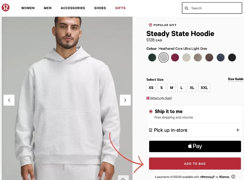
Leveraging a visual hierarchy ensures that CTAs stand out effectively. For instance, using a contrasting color for the “Add to cart” button on a product page creates a visual focal point. The strategic placement and design considerations guide users’ attention, making it easier for them to proceed with their purchase.
7. Tailor to the stage of the funnel
Customizing CTAs based on the user’s position in the sales funnel is critical. A CTA like “Explore our bestsellers” directs new visitors to popular products, facilitating initial engagement. Meanwhile, repeat customers may respond well to a loyalty-focused CTA such as “See exclusive rewards for our valued customers.”
Placement is important because a person is at a different stage of the funnel when browsing social media than when they’re on your website.
Recognize the prevalence of mobile users and ensure that your CTAs are optimized for smaller screens. Prioritize mobile-friendly design to maintain clarity and ease of interaction. Also, consider the mobile context and keep your CTA messages concise for effective engagement.
Placement of CTAs
CTAs are strategically placed throughout an ecommerce website to guide visitors through the sales funnel and encourage specific actions contributing to the conversion process.
Here are common locations where CTAs are typically placed in ecommerce:
Product pages
“Add to cart” button: The ease of finding the ‘Add to cart’ button is increasingly important in ecommerce, where sales are often predicated on the buyer being able to pay and checkout as quickly as possible. Note: You don’t have to use ‘Add to cart’ specifically – as long as the action is clear and concise, you can be creative!
Homepage
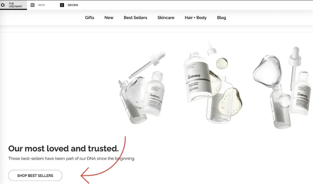
Promotional banners or sliders: These are like the flashy billboards of the digital shopping world. They feature CTAs for special offers, new arrivals, or featured products.
Featured product CTAs: Direct links or buttons for popular or promoted products that give customers a shortcut to things that catch their eye and increase the likelihood of purchase.
Shopping category pages
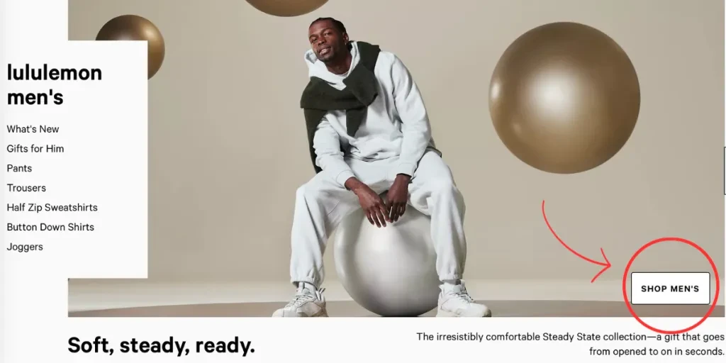
“Shop now” or “Explore” buttons: These buttons invite users to explore products within specific categories. For example, Lululemon “men’s” category features several CTAs, such as “Shop men’s” at the top of the page, which redirects to all products in the men’s category.
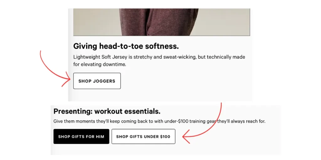
Further down the page, additional CTAs redirect to specific sub-categories within the men’s section, such as “Shop joggers” and “Shop gifts under $100.”
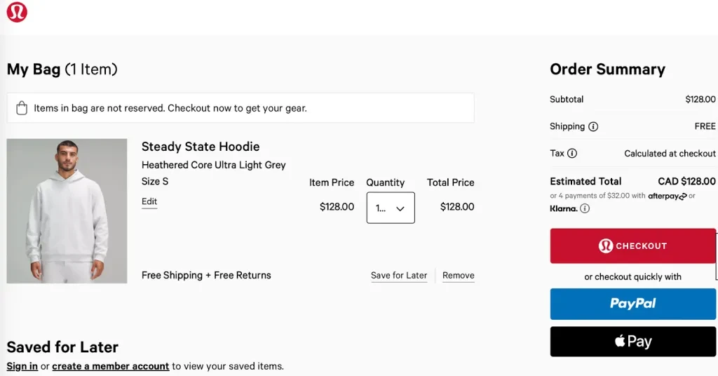
Shopping cart and checkout page
“Proceed to checkout” button: Once the customer has made their selections, this CTA prompts them to proceed with the purchase process.
“Place order” or “Complete purchase” button: This is the final CTA to ensure customers finalize the transaction and confirm the order.
Header and footer
“Sign up” or “Log in” links: These encourage user registration or login for personalized experiences. As you can see in the example below, Sephora even added an additional note urging users to sign in to get free shipping, increasing the chances of new customers signing up.
Contact or support CTAs: If potential customers need support or have questions before purchasing, it’s essential that users can access customer support or assistance easily.

Pop-ups and banner advertisements
Exit intent pop-ups: When users attempt to leave the site, exit intent pop-ups offer discounts or incentives to keep the customer online. This could also include emails sent to customers who have expressed interest in a product but have yet to check out.
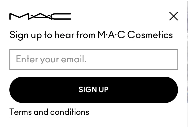
Subscription pop-ups: These pop-ups encourage users to subscribe to newsletters for updates and promotions.
CTAs in ads: CTAs can also be placed on external websites or platforms to attract traffic to specific product pages. These CTAs must direct potential customers to a particular and appropriate page on your website (often a product page) based on the content of the ad.
Thank you page
Post-purchase CTAs: The sales journey doesn’t have to end at checkout. A post-purchase CTA can invite customers to explore related products or share their purchases on social media.
Emails, newsletters, and social media
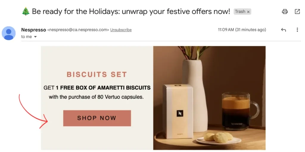
CTAs are also crucial in email newsletters and on social media. In emails, the CTA should direct readers and potential customers to specific pages on your website that align with the content of the email. For example, if you’re answering possible customer questions, you may want to direct them to a specific blog post, while if you’re offering a discount, you’ll want to lead them to product pages.
On social media, CTAs can look different depending on the platform. Some social media channels have shopping features that can incorporate “Shop now” buttons, while others easily allow the sharing of links to product pages or blog content. When sharing content, information on products, and deals on social media, be conscious of how users will interact with the content so as to write more effective CTAs.
The placement of CTAs should align with the user’s journey and intent, providing clear directions and opportunities for engagement at different stages of the ecommerce experience.
Analyzing and measuring effectiveness
Analyzing the effectiveness of CTAs is crucial for optimizing the performance of an ecommerce website or digital marketing campaign. Understanding how users interact with CTAs provides valuable insights into the user journey and identifies areas for improvement.
Analyzing CTA performance provides concrete data for decision-making. Whether it’s adjusting the wording, changing the design, or tweaking the placement, data-driven decisions help optimize CTAs for better results.
How to measure CTA effectiveness
- Click-through rate (CTR): CTR measures the percentage of users who clicked on a CTA compared to the total number of users who viewed it. A high CTR indicates that the CTA is compelling and engaging.
- Conversion rate: The conversion rate measures the percentage of users who completed a desired action after clicking on a CTA. This could be purchasing, signing up for a newsletter, or filling out a form.
- Bounce rate: Bounce rate indicates the percentage of users who leave the website after interacting with a CTA without further engagement. A high bounce rate may suggest that the CTA or landing page needs improvement.
- Heatmaps and user recordings: Heatmaps show where users click on a webpage, providing insights into which CTAs attract attention. User recordings allow you to see how individual users navigate and interact with CTAs.
- A/B testing: Conduct A/B tests by creating variations of CTAs and comparing their performance. Test elements such as wording, color, size, or placement to determine which versions resonate better with your audience.
Main takeaways
Remember, you will want to analyze user behavior through every step of the conversion funnel, from clicking on a CTA to completing the desired action. Identify drop-off points and optimize CTAs at each stage to improve the overall conversion process.
Regularly analyzing the effectiveness of CTAs and iterating based on the findings is an ongoing process that contributes to the continuous improvement of your e-commerce strategy. It ensures that your CTAs remain relevant, compelling, and aligned with your audience’s evolving needs and preferences.
For more tips on how to optimize your ecommerce experience, browse related blogs on Alibaba.com Reads.


