True wireless Bluetooth headphones (TWS) have evolved over the past almost 8 years since the introduction of the first AirPods, transforming from a less popular product category to a necessity that almost everyone needs. Around me, it’s very common for my peers to use Bluetooth headphones.
However, many only learn about these features for the first time when I ask them if they know how to use their wireless headphones to switch between songs, adjust the volume or turn on the noise-canceling feature.
Some people only know the basics—like a single tap to pause and a double tap to skip to the next song—but can’t remember more advanced controls. Others find these operations so cumbersome that they simply pull out their phones instead.
Earbud Controls Are Becoming More Abstract
This is the first-generation Samsung Galaxy Buds, and it was also the first TWS earbuds I ever used.

My interaction with it was limited to putting it in my ears and pairing it with my iPhone. Until one day, my finger accidentally brushed the outside of the earbud, and I heard a “beep.” I realized that the music that was playing had paused.
While I was delighted to discover this new function, I also felt it was worth complaining about. Without reading the manual, who would have guessed that this glossy surface was actually a touch control area meant for user interaction?
Similarly, the first two generations of AirPods had the same operation problem, but AirPods Pro and AirPods 3 switched to a press interaction design and added a “groove” on the earbud stem, making it intuitive to press.

The newly launched Samsung Galaxy Buds 3 series, despite its exterior design causing some controversy that even Samsung’s chairman wasn’t too happy about, has a newly added headphone stem design that offers users new ways to operate the device such as pinching and sliding.
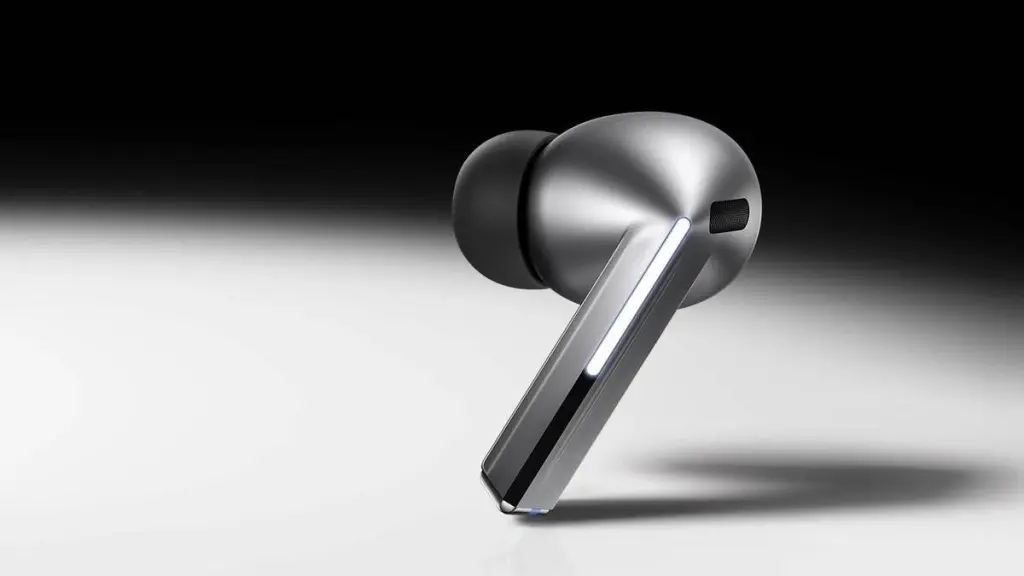
Last month, when a colleague attended Samsung’s launch event and tried on the Galaxy Buds 3, he discovered that the new “blade” design was not just about aesthetics. Unlike the traditional cylindrical wedge shape, it instinctively made him use two fingers to swipe for interaction.
He also mentioned that with many TWS earbuds from other brands, it was only after a long period of use that he realized he could swipe to adjust the volume.
At least now, many TWS earbuds have a small groove to remind users that they can interact with the device. However, headphones are designed to be more complex to operate.
I’ve been using the Sony WH-1000XM3 headphones for several years. If I hadn’t specifically searched for it, I would have never thought that the smooth surface of the right earmuff not only allows for taps but also swipes. A colleague just told me that I can also “cover” the earmuffs to temporarily enable ambient sound.

Another major issue with the XM3 is that both the noise-canceling button and the power button are located on the left earmuff and have similar elongated shapes.
After prolonged use, muscle memory develops, but when you first get the headphones or after they’ve been idle for a while, pressing these out-of-sight buttons feels like a gamble every time.
Each of the thousand headphone manufacturers has its own interaction methods, making it difficult for users to switch between different headphones seamlessly. One brand may require a single press to play music, while another may need a single-tap, and some only require a double-tap.
Since most people today use their tech products straight out of the box, instruction manuals are mainly used for pairing. Complex and hard-to-remember gestures are often forgotten, leading users to eventually pull out their phones and revert to intuitive visual controls.
This reminds me of the “power button” on smartphones. In the past, pressing this button once would lock or wake the screen, and long-pressing would turn off the device—actions that were universally understood by users.
Now, a double-tap might bring up the camera or wallet, a triple or quintuple tap might trigger an emergency call, and long-pressing might bring up the power menu or the voice assistant, or sometimes nothing happens at all. Want to power off the device? You might need to use the volume buttons in combination.

As devices become more streamlined with fewer buttons and more integrated designs, the user experience is becoming increasingly “counterintuitive.”
Dyson’s OnTrac over-ear headphones are extremely comfortable to wear, but if you want to toggle noise-cancellation, you have to forcefully tap the back of the earmuff twice with two or more fingers. The success rate isn’t high, and I eventually found that slapping the earmuff twice with my open palm worked almost every time.
Regardless of the method, the noise and disturbance created for your head and ears nearly negate the benefits of ergonomic design.
Sony’s WF-1000XM5 earbuds require you to “tap four times to adjust the volume,” making one wonder if the product manager actually used the product themselves.

Invisible Interactions
Nearly 10 years ago, there was an innovative device that came out

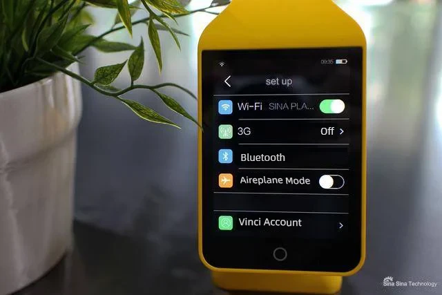
This device, named “VINCI Smart Headphones,” was created by a Chinese startup. Visually, it looked like a pair of headphones with a smartphone screen on the outside of the right earmuff. It could connect to the internet and even perform tasks like selecting songs and recording. The team claimed it was “a product from another dimension.”
However, by 2018, the team had almost vanished, and the reason is likely apparent.
The eccentricity of the VINCI Smart Headphones highlights the essence of headphone interaction: This device, which sits on both sides of your head and out of sight, relies entirely on memory and intuition for interaction. The more “intuitive” it is, the closer this “invisible” interaction gets to being excellent.
One of the most intuitive interaction designs, in my opinion, is this:

Whether you want to make quick adjustments or precise controls, a dial can achieve it with different degrees of rotation. This is also why it has been so closely associated with audio equipment.
The Microsoft Surface brand is well-known, but you might not be aware of another “Microsoft-branded” product—the Surface Headphones:

The Surface Headphones series may not stand out in many aspects, but it ingeniously turned the left and right earmuffs into dials. These dials not only control the volume but also adjust the level of noise cancellation, achieving an intuitive interaction that pays homage to old radios and audio equipment.
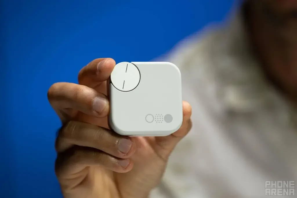
The dial itself can also function as a button. For instance, the dial on the AirPods Max and the CMF Buds Pro charging case can perform basic operations like adjusting the volume and can also be pressed to play or pause, making it much more intuitive than tapping a smooth surface.
Meanwhile, the aforementioned Dyson OnTrac features an even more creative interaction design, equipped with a small joystick. You can move it left and right to switch songs, up and down to adjust the volume, and press it to pause/play.
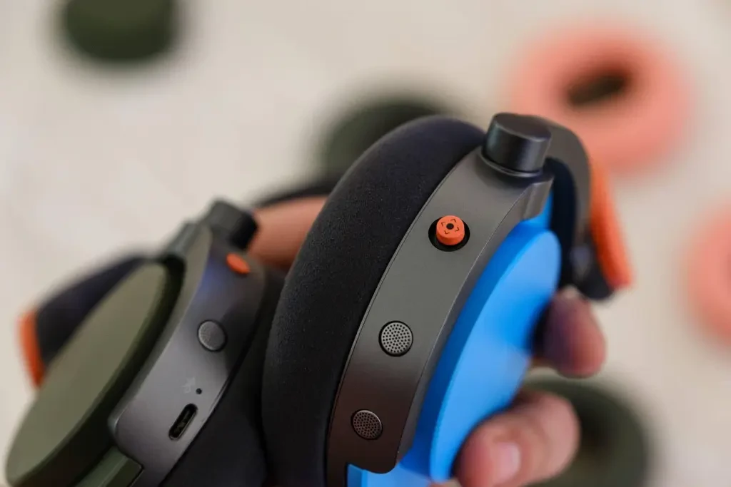
This joystick cleverly leverages our existing knowledge from using media players—”the left button is for the previous track, the right button is for the next track,” and “up is to increase, down is to decrease”—reducing the learning curve for users.
The latest Sonos Ace headphones have a “slider button” design that’s somewhat similar. Although it can’t skip songs left or right, other operations are similar to the Dyson OnTrac.

In reality, to make “invisible” interactions work well, it essentially comes down to two factors: “form” and feedback through sound and touch.
The form is easy to understand. For example, the wedge-shaped design of the Samsung Galaxy Buds 3 series mentioned earlier is more conducive to guiding users to interact than the smooth surface of previous generations.
The elongated power button and circular dial on the AirPods Max also allow for blind operation, so users don’t need to remember which button corresponds to which function.

Perfecting the feedback of interactions might be an even greater challenge for manufacturers.
The AirPods Pro, which are too small to include a motor for tactile feedback, rely solely on a confusing sound cue to simulate the feeling of a button press on a flat surface. After some time, I realized that the AirPods Pro don’t actually have physical feedback for pressing.
The noise-cancellation toggle on Dyson’s OnTrac, despite its flaws, uses a sound similar to pulling out or pushing in a cork from a sealed container. This unique feedback is more intuitive for users than a typical “beep.”
In the age of touchscreens, tapping and swiping have become ingrained in our DNA as interaction methods, but when it comes to “invisible” interactions on the sides of our heads, buttons and tactile simulations may still be necessary to create a comfortable experience.
The Best Interaction May Be No Interaction
For TWS wireless earbuds, their ultra-compact size limits the number of buttons, creating significant challenges in interaction design.
Apple may have recognized this, as there have been rumors that Apple is exploring the integration of cameras into AirPods to enable gesture controls and environmental awareness.
The greatest advantage of TWS earbuds like AirPods is their “seamlessness”: within the same ecosystem, users don’t need much interaction; just put them in when needed, and they can transition seamlessly between devices, ready to play.
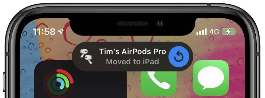
With the sensing capabilities of infrared cameras and microphones, combined with machine learning across various scenarios, future AirPods might become even more seamless, automatically adjusting the volume and noise cancellation based on the environment, further reducing the need for interaction.
For instance, in a crowded subway, the active noise cancellation level could be increased, while simultaneously enhancing the volume of subway announcements. At home, the noise cancellation could be turned off, and the volume lowered to protect your ears.

These functions may not necessarily require a new infrared camera. The geofencing and scenario recognition features on current smartphones could easily sync with headphones.
For example, when you arrive at the airport, your phone automatically pushes boarding passes and flight times; couldn’t your headphones automatically maintain strong noise cancellation during the flight? Or when you arrive at the cinema, they could automatically switch to weak noise cancellation, acting like Loop earplugs.
With manufacturers increasingly focusing on AI-powered scene recognition, after reading users’ emails and schedules, it could naturally learn users’ headphone habits in different scenarios and achieve more personalized automatic adjustments. The smarter Siri in iOS 18 will learn user information and truly understand personal intent
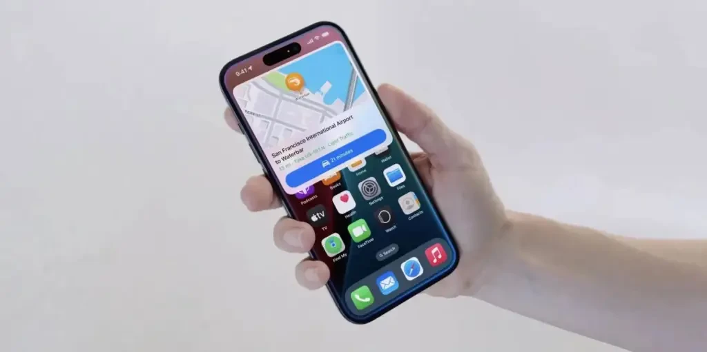
Perhaps, instead of easily summoning ChatGPT, truly intelligent headphones should focus on seamlessly completing the interactions users desire, which is the best kind of “interaction.”
Source from ifanr
Written by Serena
Disclaimer: The information set forth above is provided by ifanr.com, independently of Alibaba.com. Alibaba.com makes no representation and warranties as to the quality and reliability of the seller and products. Alibaba.com expressly disclaims any liability for breaches pertaining to the copyright of content.


