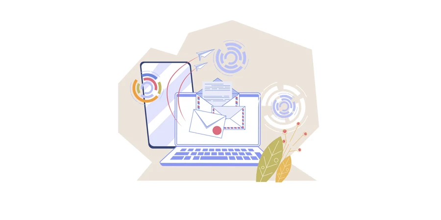
Email continues to be one of the best performing marketing channels, especially when approached strategically.
This includes giving careful attention to your email design, ensuring it grabs reader attention and is easy to read even at a glance.
Your email design — which includes factors such as color choices, fonts, and CTAs — significantly influences email effectiveness.
Given the multitude of considerations, choosing a great email design for your business can be challenging.
Explore this article for 15 tailored email design examples across various industries. This will help you discover the right fit for your email marketing requirements.
In this post:
What goes into the best email design?
Email design examples
Summary
What goes into the best email design?
The content in your email is important. However, how you express it is equally crucial.
Consider the following key factors:
- Responsive design: Ensure your email design adapts to different devices and screen sizes. This is crucial as many people access emails on mobile devices.
- Branding consistency: Maintain consistency with your brand elements, including colors, logo, and overall visual style. This fosters brand recognition and trust.
- Engaging visuals: Incorporate relevant and high-quality images to enhance visual appeal. You could also include short videos and GIFs for diversity.
- Clear calls-to-action (CTAs): Include a clear and compelling call-to-action that guides recipients on what to do next. Use action-oriented language and create powerful CTAs that visually stand out.
- Accessibility: Ensure your email design is accessible to individuals with impaired vision. This includes using alt text for images and designing with considerations for color contrast.
- White space and readability: Avoid clutter and use ample white space to enhance readability. Break content into scannable sections with headings and bullet points.
- Legible fonts: Choose fonts that are easy to read on various devices. Maintain a good balance between font size, style, and line spacing to further enhance readability.
Email design examples
Here are some email design examples worth taking inspiration from:
- Amundsen Sports
- Baking Steel
- To’ak Chocolate
- Island Olive Oil Company
- Elder Statesman
- Maison Balzac
- Ruggable
- Stumptown Coffee Roasters
- Inglot Canada
- ReMarkable
- Fly By Jing
- Asphalte
- Snif
- Art of Play
- WP Standard
1. Amundsen Sports
Kicking off our collection is an email design by Amundsen Sports. This classic promotional email aims to enlighten recipients about the appeal of one of its products. The objective is simple: to direct them to the product page and boost sales.
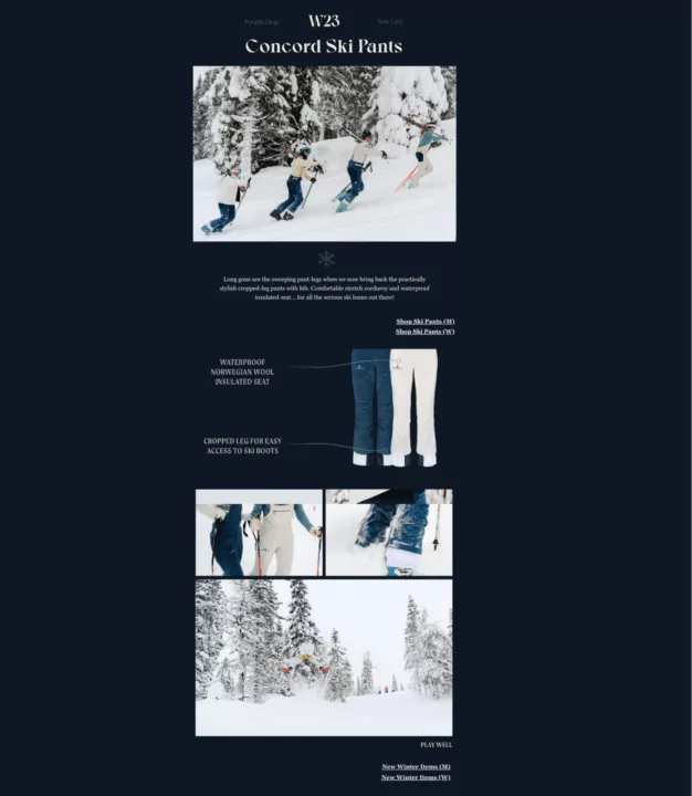
Why this is a great email design example:
- The email uses only two colors — dark blue and white. This contrast facilitates clear comprehension and engagement with the content.
- Distinct product visuals are accompanied by labels to emphasize key features.
- The images feel dynamic and feature people in action. This allows recipients to vividly perceive the product’s value.
- The copy is short, clear, and to the point.
How you can improve this email design:
- Transforming CTAs into buttons, rather than text links, to increase their visibility.
- Including your logo will align the design more closely with your brand identity.
- Adding links to your social media accounts could enhance connectivity and engagement.
2. Baking Steel
Baking Steel’s email is a unique take on an event invitation. It serves a dual purpose. First off, it invites users to an online event for pizza and food lovers. Secondly, it conveniently links to relevant products through embedded links.

Why this is a great email design example:
- Multiple CTAs are strategically placed throughout the email, ensuring they stand out effectively.
- The use of vibrant colors, particularly the attention-grabbing yellow, immediately captures attention.
- Clever copywriting, including the incorporation of puns. There’s also an emphasis on words like “FREE” while the phrase “last event of 2023” creates a sense of urgency.
- Compelling images of the end product, a delicious, cheesy pizza, to entice users.
How you can improve this email design:
- Consider making the content more concise and digestible for a better reading experience.
- Include social media links or contact details for recipients with queries about the online event.
3. To’ak Chocolate
Next on our list of email design examples is another promotional one. However, this one emphasizes educating about the product. The design is clean and earthy, perfectly aligning with the product itself — chocolate crafted from ethically sourced cacao.
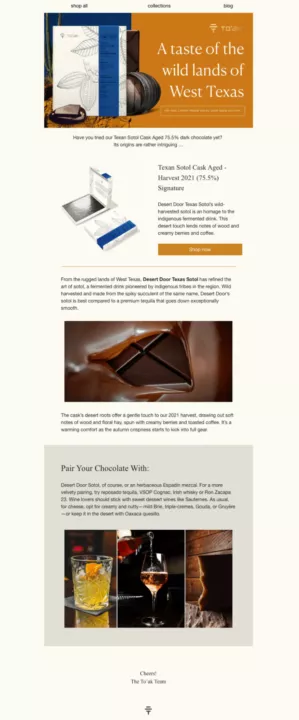
Why this is a great email design example:
- The design’s minimalism keeps the recipient from feeling overwhelmed.
- Earthy colors not only align with the brand but also provide a visually soothing experience.
- High-quality images of the chocolate, paired with beautifully crafted copy.
- Recommendations on complementary foods, accompanied by visuals, add value to the content.
- Links to the blog and the complete collection are conveniently placed at the top of the email.
How you can improve this email design:
- Consider increasing the font size slightly for improved accessibility.
- Enhance the visibility of the CTA button. You can do this by increasing its size or making it more prominent.
4. Island Olive Oil Company
As marketers, we know the importance of creating lasting first impressions. Island Olive Oil Company does a great job at welcoming new subscribers. The email clearly outlines expectations, introduces the company, and provides a 10% discount code.
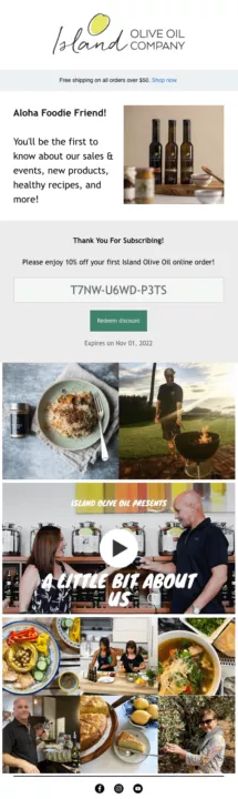
Why this is a great email design example:
- The copy is simple, friendly, and clearly communicates what recipients should expect.
- Clear indications of discounts, promotions, and prominent CTA buttons, including expiry dates when applicable.
- Social media icons are prominently featured at the end of the email.
- High-quality visuals offer a glimpse into the company’s offerings and its people.
How you can improve this email design:
- Incorporate personalization, such as addressing the recipient by name, for a more impactful connection.
- Welcome emails should include contact details for easy access to assistance.
- Include a clear and easy-to-find option for subscribers to opt-out if they wish. This is one of the most important email marketing best practices.
5. Elder Statesman
Recognized for its chic clothing, Elder Statesman delivers a stylish and attention-grabbing email. The email, both colorful and humble, successfully presents its 2023 holiday collection. Serving as a promotional email, it cleverly infuses a seasonal touch into its content.
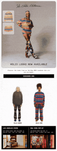
Why this is a great email design example:
- The dynamic GIF effectively showcases both the overall look and individual products.
- Contrasting outfits on a white background, and a black background with colorful images create a visually appealing design.
- The email is concise, getting straight to the point without unnecessary fluff.
How you can improve this email design:
- Enlarge the texts to enhance readability and accessibility.
- Include pictures of people wearing the clothes in real-life situations, to add authenticity and relatability.
Related content:
How to insert a GIF into an email: The full guide
6. Maison Balzac
Maison Balzac excels in minimalist email design. It showcases an image of an elegantly set dinner table with its glassware and tableware. This subtle yet effective approach provides recipients with a glimpse into the brand’s products.
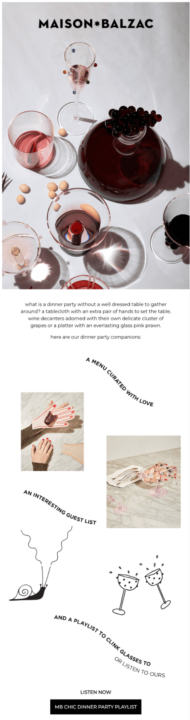
Why this is a great email design example:
- There’s ample white space, which directs focus to the showcased products.
- Short, easily readable copy enhances the user experience during quick scrolls.
- It employs a limited color palette consisting of black, white, and shades of pink. This creates a cohesive and stylish aesthetic.
- In a way, the email tells a story with the help of well-curated copy and graphics.
- The email includes a dinner party playlist and a clear call-to-action for an engaging experience.
How you can improve this email design:
- Add essential details like contact info, unsubscribe links, and social media links to the footer.
- Include clearer pictures of the product to improve instant recognition for recipients.
Related content:
The guide to using images in your emails
7. Ruggable
Every comprehensive ecommerce email marketing strategy must address cart abandonment. This email from Ruggable is a great example in this regard. Its objective is clear-cut: to revive the interest and engagement of inactive subscribers.
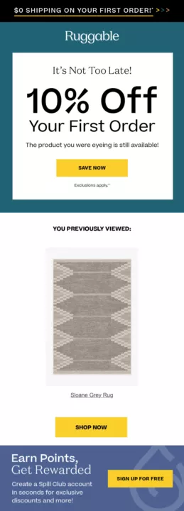
Why this is a great email design example:
- Bright yellow CTA buttons with clear fonts make them easily noticeable.
- Clear reference to the user’s previous views makes the product the central focus.
- The display of the “10% off” promotion at the start immediately captures attention, enticing recipients.
- There’s clear mention of additional perks, such as free shipping on the first order and rewards program benefits.
How you can improve this email design:
- Use the recipient’s name and personalize the content based on their past interactions.
- Acknowledge that you’ve noticed they haven’t been active recently, and express a desire to reconnect.
- Highlight the product benefits for a clearer understanding and increased motivation to make a purchase.
To engage customers who browsed but didn’t buy, explore strategies like automated product abandonment emails.
Related content:
A guide to the perfect browse abandonment email + 7 examples
8. Stumptown Coffee Roasters
To distinguish yourself in the crowded marketing landscape, creativity becomes essential. Stumptown Coffee Roasters achieves this through a fun coffee quiz. With just five questions, users get personalized coffee recommendations based on their preferences.
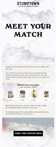
Why this is a great email design example:
- The use of bold “MEET YOUR MATCH” copy creates an immediate impact.
- Colorful visual elements like dolphins, rainbows, and cats break up the text.
- The overall design seamlessly aligns with the brand’s fun and casual voice.
- The inclusion of a prominent black CTA button ensures it cannot be overlooked.
- The copy is very compelling. It effectively addresses the challenge of choosing the right coffee.
How you can improve this email design:
- Consider toning down the layout for a less busy appearance. This will minimize potential distractions for recipients.
- Incorporate essential elements like the brand’s logo, contact information, or social media links.
Related content:
Email marketing automation: Explanation, strategies, & tools
9. Inglot Canada
For cosmetic brands, emphasizing visuals is often highly effective, and with good reason. One of the best email design examples in this context is Inglot Canada. In a promotional email, the brand showcases a variety of liquid lipstick shades to engage and inform recipients.
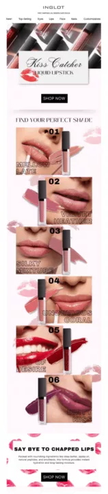
Why this is a great email design example:
- The use of a limited number of colors creates a visually cohesive and appealing design.
- The header communicates that the brand offers products for the eyes, face, and nails. This expands awareness beyond lip products.
- The inclusion of close-up, high-quality images provides a great view of each color.
- A brief note at the bottom informs recipients about the ingredients of the products, adding transparency.
- The presence of a clear call-to-action (CTA) button at both the start and end of the email.
How you can improve this email design:
- Introducing some white space could enhance the overall aesthetic.
- Adding captivating copy such as “SAY BYE TO CHAPPED LIPS” at the beginning to captivate recipients from the start.
10. ReMarkable
Seasonal greetings add a festive touch to emails, making it a suitable opportunity to showcase and promote products. ReMarkable does this cleverly, urging people to buy their main product now for holiday delivery. It also throws in special perks for those who do.
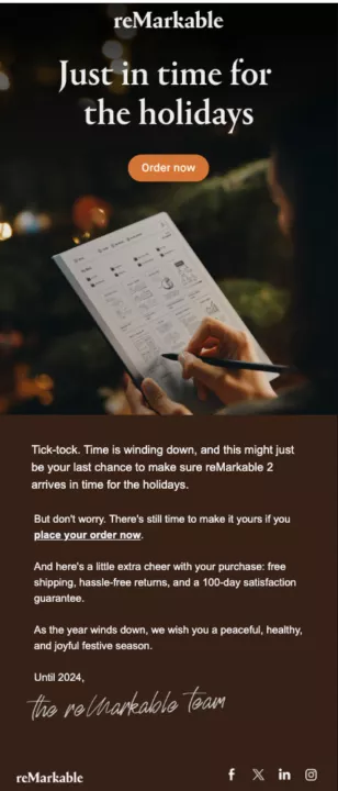
Why this is a great email design example:
- It starts with a high-quality image of reMarkable 2, providing a clear preview of the product.
- Features an eye-catching orange CTA button for emphasis.
- Neatly incorporates social icons (Facebook, Twitter, LinkedIn, Instagram) at the bottom.
- Includes a signature-like sign-off for a touch of personalization while also giving a nod to the item’s functionality.
- Enhances readability with the use of white text on dark backgrounds (brown and black).
How you can improve this email design:
- Consider using holiday-themed color schemes like green and red to enhance relatability.
- Highlight additional perks such as free shipping, hassle-free returns, and satisfaction guarantee for better visibility.
Related:
The best time to send emails (2023 research)
11. Fly By Jing
Continuing our exploration of the best email design examples, we have Fly By Jing. This brand, specializing in Chinese chili sauces, informs recipients about limited stock on certain products/bundles. The email adopts a straightforward layout, emphasizing visuals with minimal yet impactful text.
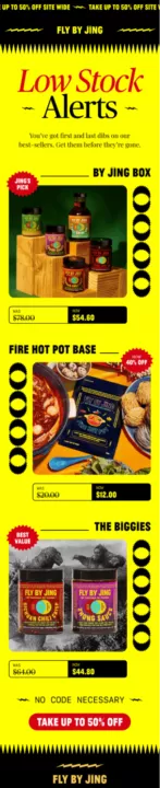
Why this is a great email design example:
- Fly By Jing’s flagship product, the chili sauce is prominently featured with graphics and colors reflecting its spicy nature.
- Important elements like the CTA button, product tags, and “low stock” notifications are highlighted in bright red.
- The overall brand exudes a quirky and funky vibe, aligning well with the email’s presentation.
- Effective emphasis on before and after prices is achieved through contrasting colors.
How you can improve this email design:
- Include brief descriptions for each product to enhance engagement and generate interest.
- Consider reducing the number of graphic elements to prevent overwhelming the viewer.
12. Asphalte
For an email that exudes clever, witty, and impactful copy, draw inspiration from Asphalte. This also stands out as one of the best clean email design examples. The email features a straightforward and essential layout that includes all the necessary elements.
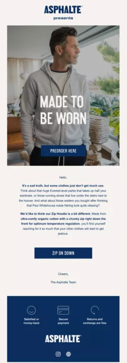
Why this is a great email design example:
- Asphalte’s key brand colors (white, gray, and blue) are used consistently.
- The introductory copy, “Made to be worn,” not only aligns with the brand but cleverly promotes the benefits of the clothing.
- Clean icons effectively convey essential information on money-back guarantees, payment options, and returns.
- The strategic use of bold text ensures that even casual scrollers can quickly grasp the main points.
How you can improve this email design:
- Provide additional details about the featured hoodie to enhance product understanding.
- Incorporate customer reviews praising the hoodie, adding social proof, and influencing potential buyers positively.
13. Snif
Red is a compelling color choice in design, evoking passion and festivity. Snif makes a bold statement by crafting its entire Christmas season promotional email in red. Despite this vibrant choice, the layout remains simple and clean. This results in a harmonious balance in the overall design.
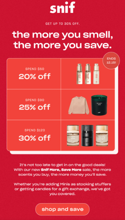
Why this is a great email design example:
- The red color effectively communicates the Christmas season promotion theme.
- The text, “the more you smell, the more you save,” conveys the promotional intention right at the start.
- The grid design facilitates easy scrolling and information digestion for recipients.
- Despite being short, the email includes crucial information. This includes discounts, validity, a CTA button, and compelling copy.
- Each element is equally highlighted, contributing to a cohesive design.
How you can improve this email design:
- Provide clearer explanations of the offer to avoid the impression that only specific products are eligible for the mentioned discounts.
- Enhance CTA visibility by using a contrasting color.
14. Art of Play
Art of Play sent out an email notifying individuals about their rewards program. The company specializes in puzzles and games, evident in their copy, colors, and graphics. The email is concise and straight to the point, explaining to users how they can accrue and redeem points.
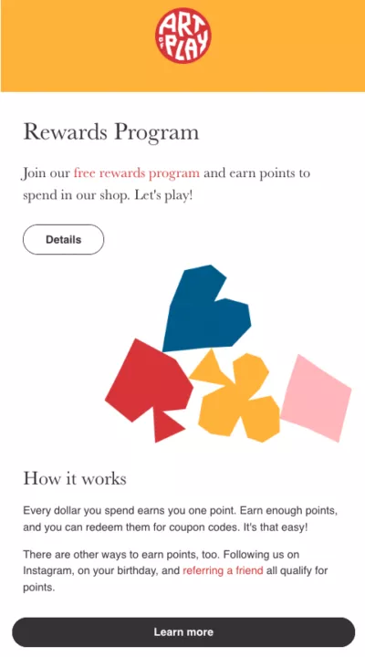
Why this is a great email design example:
- Straightforward content helps recipients to immediately understand the email’s purpose.
- Ample white space enhances readability and information absorption.
- Colorful graphics align with the brand’s products, injecting a playful element into the email.
- The CTA button is large and clear.
How you can improve this email design:
- Consider hyperlinking the Instagram account or adding social media icons for enhanced engagement.
- Include information on how to contact support for any queries, ensuring recipients have access to assistance.
15. WP Standard
The final mention in our top-performing email design examples is WP Standard. This email boasts a simple yet classy layout. It serves as an excellent source of design inspiration, especially for leveraging cross-selling with an offer.
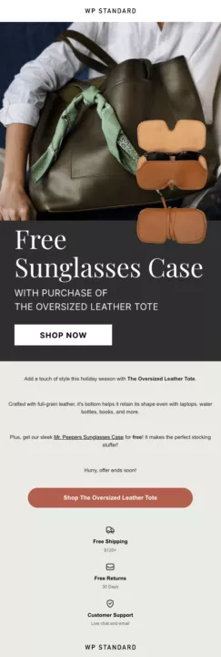
Why this is a great email design example:
- The email achieves a balanced blend of text and visuals.
- Earth or neutral colors in the email evoke a timeless, trustworthy, and visually appealing aesthetic.
- The second CTA button matches the color of the sunglass case, creating a visually pleasing effect.
How you can improve this email design:
- Incorporate information on customer support contact details for assistance.
- Introduce festive season colors like red and green for a thematic touch.
- Enhance readability by increasing the font size on the off-white section.
Summary
The success of your email marketing strategy relies on a well-planned email design. The design should reflect your brand, deliver value, and strike a chord with your audience.
Moreover, modern trends emphasize the need for appealing aesthetics and an exceptional user experience.
Achieve this through proper use of colors, white spaces, and mobile responsiveness. And for maximizing engagement, incorporate elements like personalization, powerful visuals, and compelling copy.
And remember, you can always A/B test to identify the most effective elements in your emails.
All in all, designing an email is not as complicated as it seems. Find inspiration in the 15 email design examples in this article and simplify the process using online email marketing tools.
Source from Omnisend
Disclaimer: The information set forth above is provided by omnisend.com independently of Alibaba.com. Alibaba.com makes no representation and warranties as to the quality and reliability of the seller and products.