Did you know that, with the right design, copy, and CTA, an email popup is an effective strategy to quickly grow and optimize your email subscriber list? The key is finding the right balance between user-friendliness and relevancy.
If you’re looking for great email popup examples to inspire your creativity this year, you’ve come to the right place. In this article, we’ve got insights on 24 of the best email popups we’ve seen, including what works and ways they could be better.
Let’s begin.
What are email popups?
An email popup is an element that appears in a small window or overlay of a website. Its purpose is to prompt visitors to submit their email addresses in exchange for discounts, freebies, or other promotional resources.
Your popup can be a gamified element like the popup Wheel of Fortune, a lightbox popup, or a regular slide-in popup.
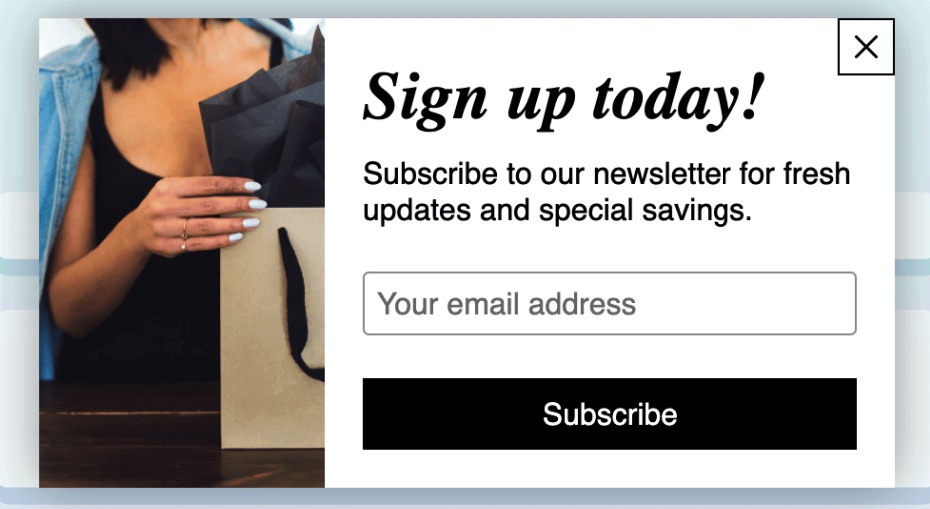
An email popup usually features a CTA, graphic image, and email capture form. This is how it typically looks:
Email popups are among the most common tools digital marketers use to grow subscriber lists. To enhance the effectiveness of your email popup, you can include lead magnets like:
- Newsletter subscriptions
- Shopping vouchers
- Discounts
- Gifts
- Exclusive access to sales
Are email popups effective?
Although they can be seen as intrusive, with strategic implementation an email popup can be an effective tool to help you generate leads for nurturing.
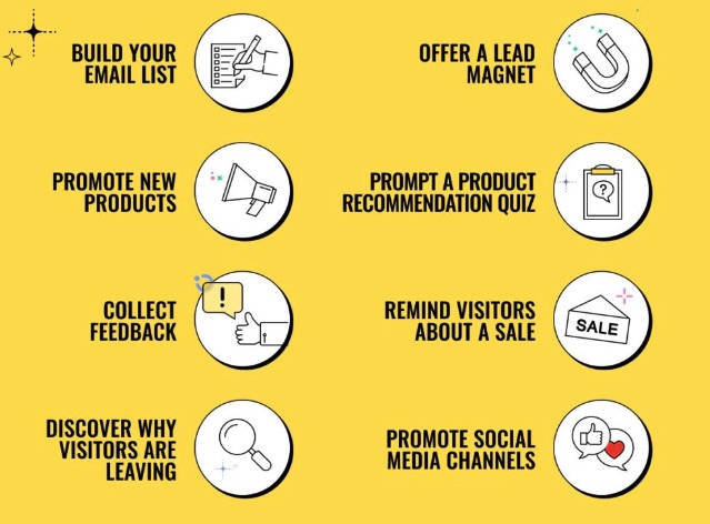
The effectiveness of your email popup signup form depends on factors like timing, design, relevance, and overall user experience. An email popup can effectively help you to:
- Encourage users to interact more with your website
- Optimize marketing efforts and significantly boost conversion rates
- Generate more leads
- Gather more information about your customers
The image below summarizes how you can use email popups to grow your business:
24 great email popup examples for 2024
Are you thinking of leveraging an email popup to boost your marketing strategies in 2024? Good call! To help, we’ve compiled a list of 24 unique email popup examples. Sit tight as we study them in detail.
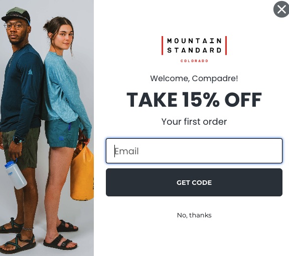
1. Mountain Standard Colorado
Mountain Standard Colorado is a brand that produces mountain-climbing gear using sustainable materials. Its email popup is functional and attractive.
Elements that work:
- The popup uses product visualization to entice visitors into signing up.
- An attractive incentive of 15% off to draw attention.
- An opt-out button so visitors don’t feel pressured to subscribe.
2. BlendJet
BlendJet incorporates an email popup with attractive discounts to drive more engagement. This email popup design is simple and effective.
Elements that work:
- This is a full-screen popup that uses contrasting colors and bold fonts to catch a visitor’s attention.
- The language is clear and easy to understand.
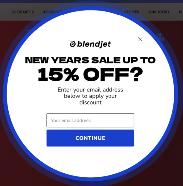
What could be improved:
- The CTA, “Continue,” is quite generic. Specific CTAs like “Get your discount” or “Give me 15% off” increase click-through rates because they inspire action.
3. Lugz
This email popup by Lugz combines an attractive discount offer with beautiful product images to compel users into action.
Elements that work:
- Keeping the image to the side and the background of the text plain draws more attention to the offer.
- It increases the chances of signups by using FOMO—promising offers that will only be sent via email.
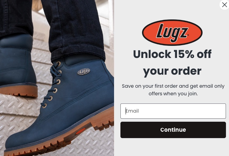
What could be improved:
- Along with an email address, asking for a name will help personalize interaction with subscribers and establish a good connection.
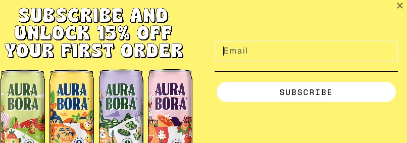
4. Aura Bora
Aura Bora sells sparkling water made from herbs, fruits, and flowers. It uses a bright yellow email popup to offer discounts.
Elements that work:
- It uses bright, playful colors to add a friendly feel that compels visitors to take action.
- It features a refreshing lineup of different products.
- Its popup timing is non-intrusive, allowing visitors to briefly scan the website before seeing a popup.
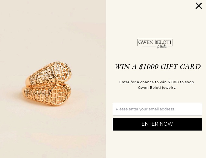
5. Gwen Beloti
Gwen Beloti sells elegant gold and diamond jewelry, and its email popup design follows this theme.
Elements that work:
- The email popup uses minimal imagery, soft colors, and a little bit of text to create a simple but effective design that draws attention.
- It features a hefty reward to get visitors to sign up.
- Its CTA, “Enter now,” is attention-grabbing.
6. SwissWatchExpo
SwissWatchExpo deals in luxury timepieces. Its email popup design features an image and text highlighted in contrasting colors.
Elements that work:
- This email popup promotes exclusivity, which triggers FOMO and prompts users to sign up.
- By using a powerful superlative expression, “Nothing but the best,” it highlights the quality of its products.
- It uses an inviting CTA: “Count me in.”
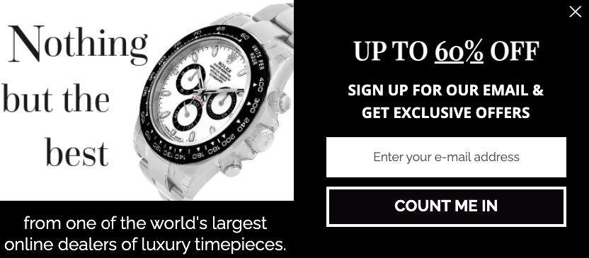
What could be improved:
- With less text, this email popup can appear less crowded, making it easier to pinpoint the CTA.
7. Fjällräven
Fjällräven is an outdoor gear company that emphasizes the use of sustainable materials. Its popup email signup is a unique combination of product visualization and catchy copy.
Elements that work:
- It presents an exclusive offer that aligns with the brand theme by using bold fonts to make it stand out.
- It includes a privacy policy check box, which shows brand credibility and transparency.

What could be improved:
- It can offer discounts to entice more visitors to sign up.
8. 100% Pure
100% Pure is a beauty and skincare brand that uses soft pastels and delicate fonts in its popup email.
Elements that work:
- It uses an attractive gift card offering to nudge visitors to increase newsletter signups.
- It allows visitors to choose what they want to see in their emails, thereby providing personalization.
- The plain white backdrop emphasizes the popup’s content and CTA.
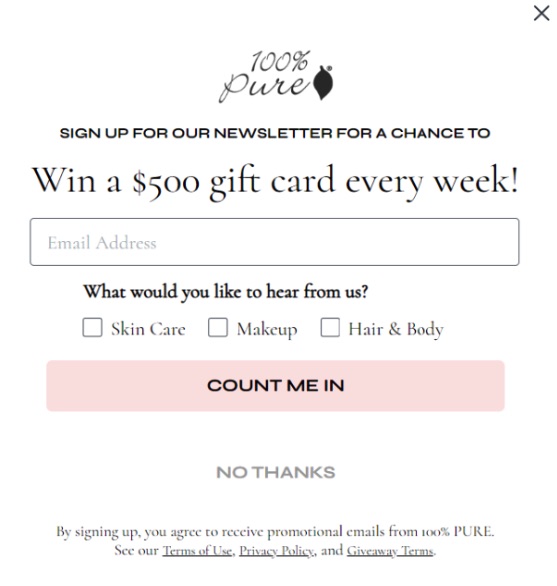
What could be improved:
- This popup email signup can be made more interesting with more colors and other visual elements.
9. Beloved
Beloved is a custom clothing brand with one of the best email popup examples. Its popup is bright, colorful, and functional.
Elements that work:
- The CTA is a bright yellow button that draws attention.
- By using phrases like “Get a discount,” it prompts visitors to submit their emails.
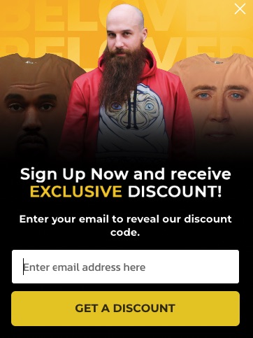
What could be improved:
- The background image above the copy uses the same bright color as the CTA, which could be distracting.
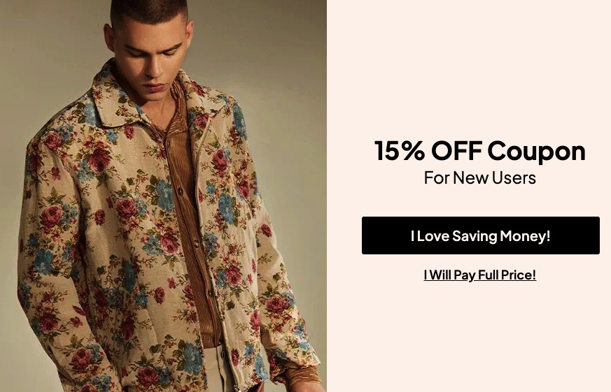
10. Zaful
Zaful’s email popup combines succinct copy with alluring imagery.
Elements that work:
- The copy is creative and uses conversational language, which makes it more relatable to visitors and increases the conversion rate.
- The offer—15% off—is highlighted in all caps, which draws attention.
- The popup features an image of their latest jacket on one side of the screen, while the other half shows a compelling CTA tapping into a powerful motivator of saving money.
11. King Arthur Baking
King Arthur Baking is an online bakeshop that provides baking-related resources. Its email popup uses a design that follows this theme.
Elements that work:
- The copy is short, catchy, and aligns with the baking theme.
- The imagery of baked goods in the background compels visitors to act.
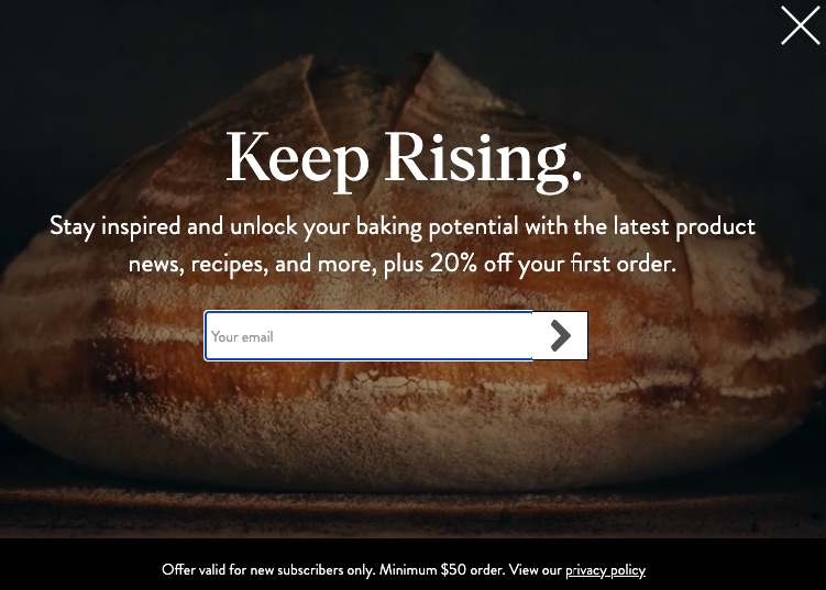
What could be improved:
- There’s no clear CTA for the discount which can only be accessed by submitting an email address.
12. CoSchedule
CoSchedule uses an exit-intent email popup to advertise a demo for its marketing suite of customizable calendars.
Elements that work:
- It uses friendly and conversational words to compel users to try their product before leaving the site.
- The bright orange CTA is a nice contrast to the plain white background, making it easier to spot.
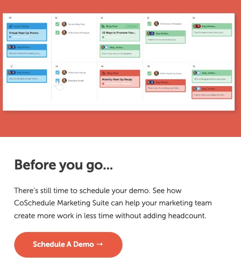
What could be improved:
- The CTA button may be misleading as it doesn’t request an email address until you click it.
13. Shinesty
Shinesty uses witty copy and attractive incentives in its popup email signup. This ensures that readers are hooked on the product and take action.
Elements that work:
- This email popup offers money to nudge visitors into submitting an email address.
- The “Hate your inbox” button plays on the user’s psychology, likely triggering an action.
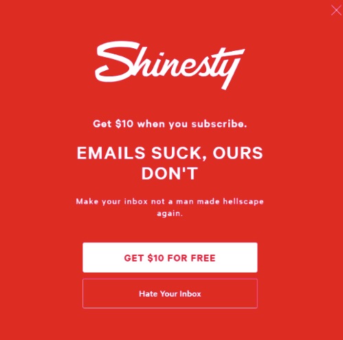
What could be improved:
- Although the red background aligns with the website’s color scheme, it could use some more images or colors.
14. Woven Store
Another email popup example is from Woven Store. This store offers accessories, clothing, and other similar products.
Elements that work:
- It uses bold capital letters to offer its discount.
- It also asks for a name, which is helpful when sending personalized emails to establish a connection.
What could be improved:
- The colors of the text and background are both light, which may make it difficult to read.
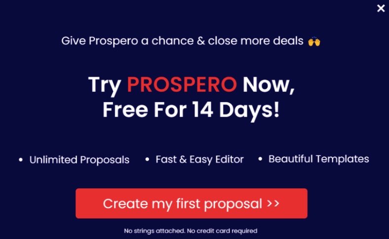
15. Prospero
Prospero’s email popup uses incentives and urgent language to prompt visitors to try its product for free.
Elements that work:
- By offering a free incentive, the email popup takes the pressure off visitors.
- It highlights the benefits of using its product in clear, short, and easy-to-read bullet points.
- It keeps the focus on its CTA by using bright, contrasting colors.
16. Nature’s Fynd
Nature’s Fynd produces microbe-based substitutes for meat and dairy. Its email popup incorporates descriptive language and visual imagery.
Elements that work:
- These three words, “Become an insider,” create a sense of community that visitors will want to be a part of.
- It paints a clear picture of its offerings and what subscribers will gain, further compelling them to action.
- The right balance between text, image, and CTA provides a simple and inviting email popup structure.
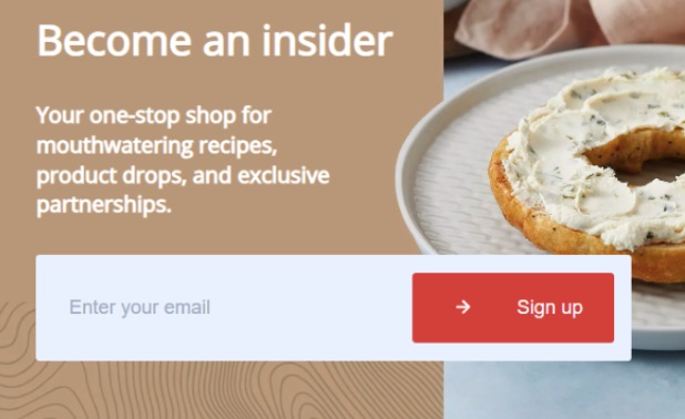
What could be improved:
- This popup could ask for a first name, so personalized emails can be sent.
17. Cult Beauty
Cult Beauty uses an email popup that showcases how to incorporate more text in your design while keeping it easy to read.
Elements that work:
- The email popup highlights a list of benefits for subscribers, including exclusive offers and rewards.
- It uses minimal graphics to keep the attention on the CTA.
- The “Shop, Earn, Redeem” text gives visitors a clear picture of their buyer journey.
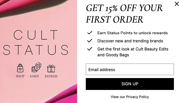
What could be improved:
- Adding a product image can be a great visual to compel visitors to sign up.
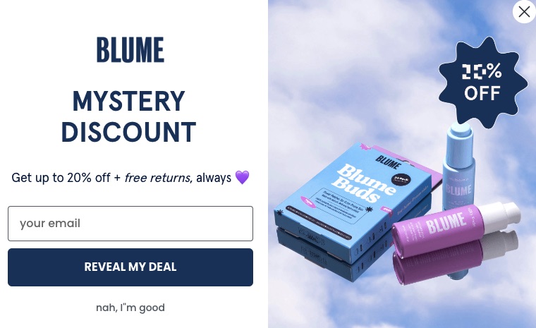
18. Blume
Blume uses soft colors and friendly language to promote its products in a visually alluring email popup.
Elements that work:
- It offers an attractive two-for-one deal with 20% off and free returns to entice users into subscribing.
- By keeping the product image to the side, it showcases its products without distracting the visitors from the CTA.
19. Big Clothing 4 U
Big Clothing 4 U produces clothing in a wide range of sizes. Its email popup further advertises its products.
Elements that work:
- It instantly draws the visitor’s eye to its discounts and offerings with bold fonts.
- The question encourages users to take advantage of the discount.
- The CTA stands out in bright orange.
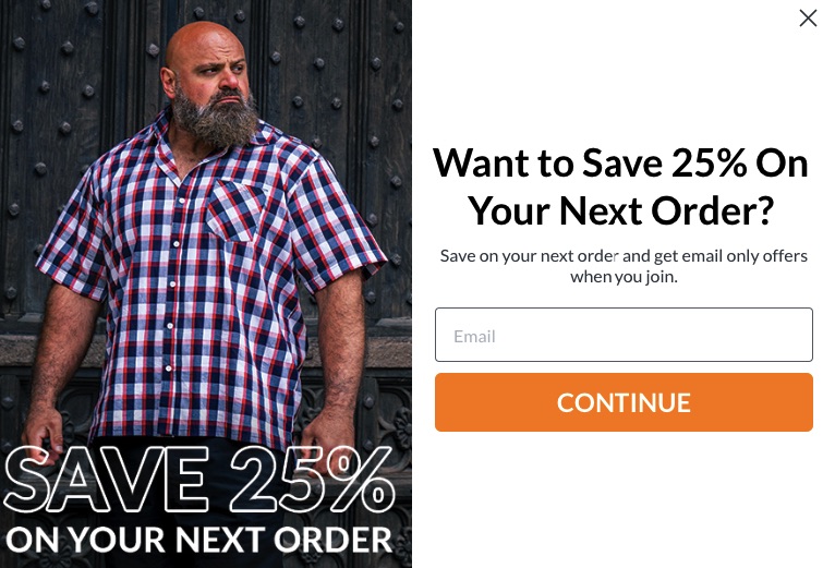
What could be improved:
- The CTA button could be more compelling than “continue.”
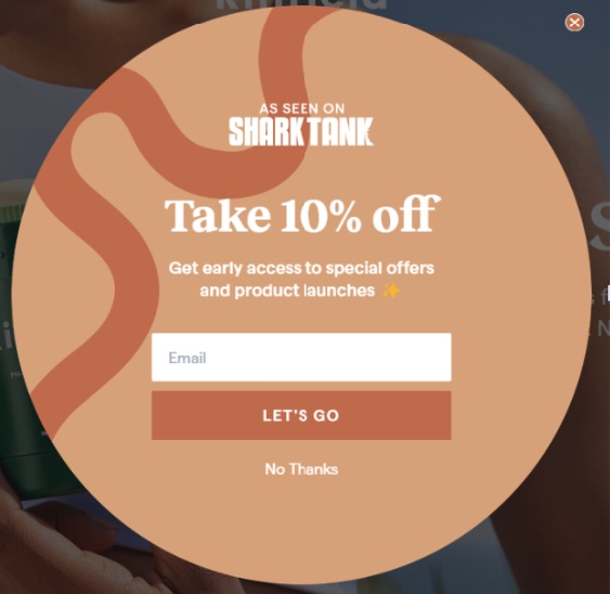
20. Kinfield
Kinfield is a personal care company that uses eco-friendly materials. Its email popup is simple yet creative.
Elements that work:
- The email popup design follows the same theme as the rest of the website, so it doesn’t feel out of place.
- It uses simple words and short, compelling copy.
- Its CTA, “Let’s go,” creates a sense of urgency in visitors.
21. Tower Paddle Boards
Tower Paddle Boards produces paddleboards of all kinds. Its email popup uses a simple and well-structured design.
Elements that work:
- The email popup offers 10% off in bold and attracts visitors to subscribe.
- When visitors can see the product in the email popup, they’re likely to make a purchase.
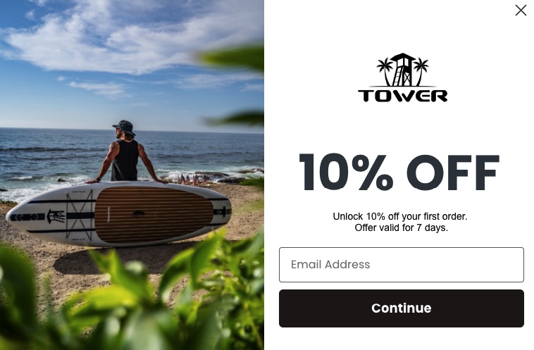
What could be improved:
- The “continue” button may not be as effective as something more action-orinted, such as “I want this.”
22. Tomtop
The email popup of Tomtop is bold, colorful, and functional. It instantly draws you in with multiple offers.
Elements that work:
- The contrasting colors make the CTA stand out.
- By using incentives and a point reward system, visitors are motivated to subscribe to gain more coupons and freebies.
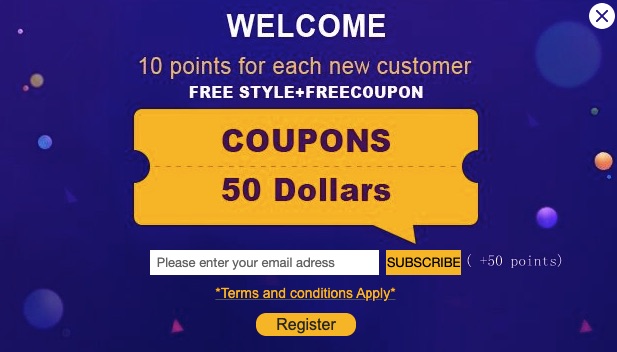
What could be improved:
- A catchier and personalized CTA would do a better job of grabbing a visitor’s attention.
- Offering too many discounts at once may be distracting and confusing to the visitor.
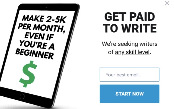
23. Smart Blogger
Smart Blogger’s email popup uses the power of minimal writing and sharp copy to grab visitors’ attention.
Elements that work:
- The text is minimal, making it easy to scan through.
- The caps lock fonts are a scroll stopper that urges visitors to take action.
- It offers incentives for writers of any skill level, thereby removing a potential barrier that may hinder visitors from signing up.
24. Wheels.ca
This email popup from Wheels.ca is one of the best newsletter popup examples to keep its customers updated with automobile resources.
Elements that work:
- The picturesque image of a car keeps the popup interesting to look at without interfering with the copy. This makes it well-structured and easy to navigate.
- Besides the email address, it requests a first and last name. Addressing customers by their name establishes a connection and increases the chances of conversion.
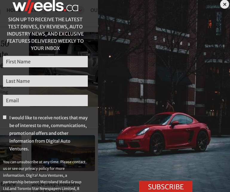
What could be improved:
- The text could be shorter. Lengthy messages might discourage visitors from going further.
Email popup best practices
When it comes to email popups, there’s a thin line between annoying and exciting. Here are some helpful email popup best practices to make your popup stand out and prompt visitors to take action.
1. CTA
Everything you do in your email popup boils down to your CTA, which is the central element of your design. It must be concise and compelling enough to lead visitors to take action.
When you’re designing a CTA, avoid fine print as much as possible. It’s harder to read and will most likely yield minimal results.
Be specific about what you’re offering. For example, a more effective CTA would be “Get the deal” rather than “Sign up” because it clearly shows why a visitor should take action.
2. Offer something valuable
Remember that an email popup comes up in the middle of browsing. If you don’t make it worthwhile, visitors might get annoyed and leave.
Make your offers so irresistible that visitors will be eager to complete signup forms and submit their email addresses.
When presenting your value offer, remember that the words you use matter. Avoid using generic words like “Subscribe.” Instead, use compelling phrases like “Get a discount” or “Save money.”
3. Make the design visually appealing
Even though you employ witty and compelling copy in your email popup, you still need to add visuals. Remember that visuals keep users engaged, causing them to stick around long enough for you to present an offer.
Avoid using over-the-top graphics or images as they can take the focus away from your CTA. Use contrasting colors to make important information stand out.
4. Optimize for mobile
Before launching your new email popup, test its appearance and functionality on both mobile devices and desktops. An email popup should provide an enjoyable user experience across various devices.
To create a seamless experience for mobile users, ensure your email popups are compatible with touch gestures. You can also go one step further by using a responsive design.
Place your email popups strategically on a mobile screen. Make sure it doesn’t block out essential content or disrupt user experience.
5. Don’t be intrusive
While you must get your reader’s attention as much as possible, you must not disrupt their navigation journey.
Include a visible ‘X’ or decline button that visitors can click to close the popup. This gives them more control over their experience.
Additionally, avoid shoving an email popup in the reader’s face as soon as they enter your website. Instead, give them a few seconds to scan through before showing a popup.
Wrapping it up
Email popups are a great way to establish first contact with your potential customers and form a long-term bond with them. They are important tools every digital marketer should leverage to build and grow a subscriber list.
We’ve curated this list to help you understand what makes an email popup work and what doesn’t. Remember to apply our expert-recommended email popup best practices and watch them help your business grow.
Source from Omnisend
Disclaimer: The information set forth above is provided by omnisend.com independently of Alibaba.com. Alibaba.com makes no representation and warranties as to the quality and reliability of the seller and products.