Many people believe that WooCommerce is exclusively for small businesses. The prevalence of this myth can be attributed to WooCommerce’s origins as a solution for small businesses and startups.
However, the reality is far more versatile. WooCommerce caters to businesses of all sizes. This is owing to its remarkable adaptability, extensive customization options, and a wide array of plugins.
Beyond its 41 official themes, WooCommerce empowers you to make your store unique. In this article, we’ll explore exceptional WooCommerce examples of online stores, many created by Omnisend customers. Start free today to see how Omnisend can help you take your omnichannel marketing strategies to the next level.
WooCommerce examples for beauty sites
Let’s look at some of the best WooCommerce website examples in the beauty industry.
Sodashi
- Headquarters: Australia
- Revenue: $2 million–$5 million
Sodashi’s homepage is clearly built around a single hero image, focusing on giving visitors a sense of their unique style rather than trying to communicate any specific information about the brand or products.
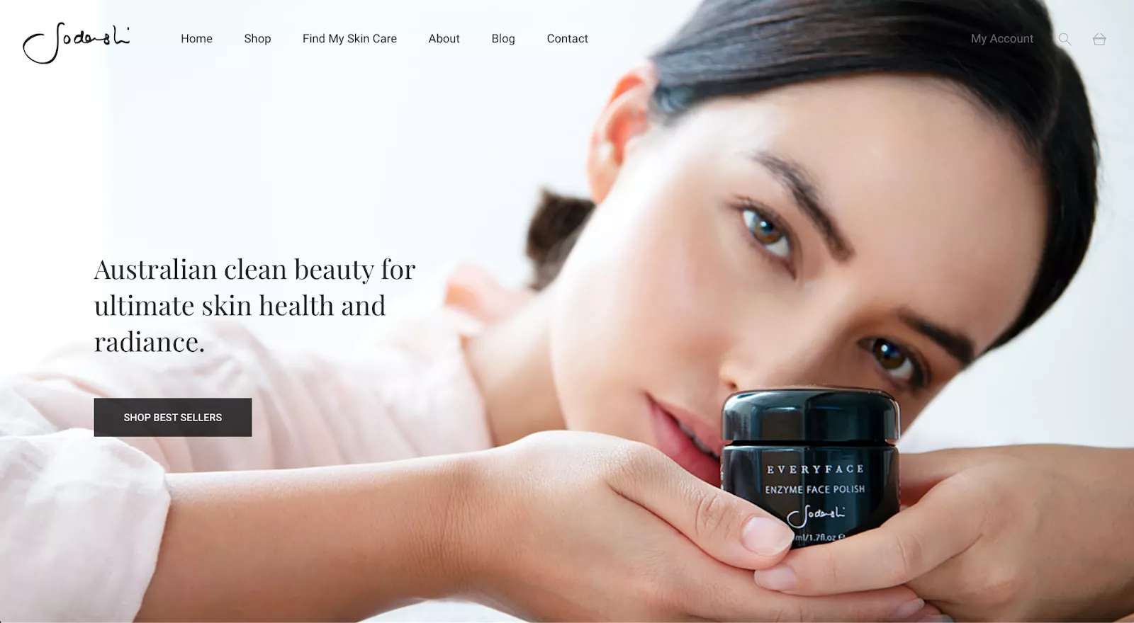
The main challenge that comes with this type of design is determining how to balance the image itself against other elements. Sodashi does a good job of highlighting the main image without distracting visitors from the rest of the site. The logo and menu items at the top-left and center of the page contrast well against the light background while maintaining the brand’s minimalist color palette.
On the other hand, it’s much easier to miss the “My Account,” search, and cart buttons in the upper-right corner. Their team went with a gray color for those elements instead of the black they used for the rest of the text—most likely due to the contrast with the model’s dark hair.
Karmin Professional
- Headquarters: California, USA
- Revenue: <$1 million
Karmin Professional is a beauty brand that offers a variety of hair products, including straighteners, dryers, clippers, and curling irons.
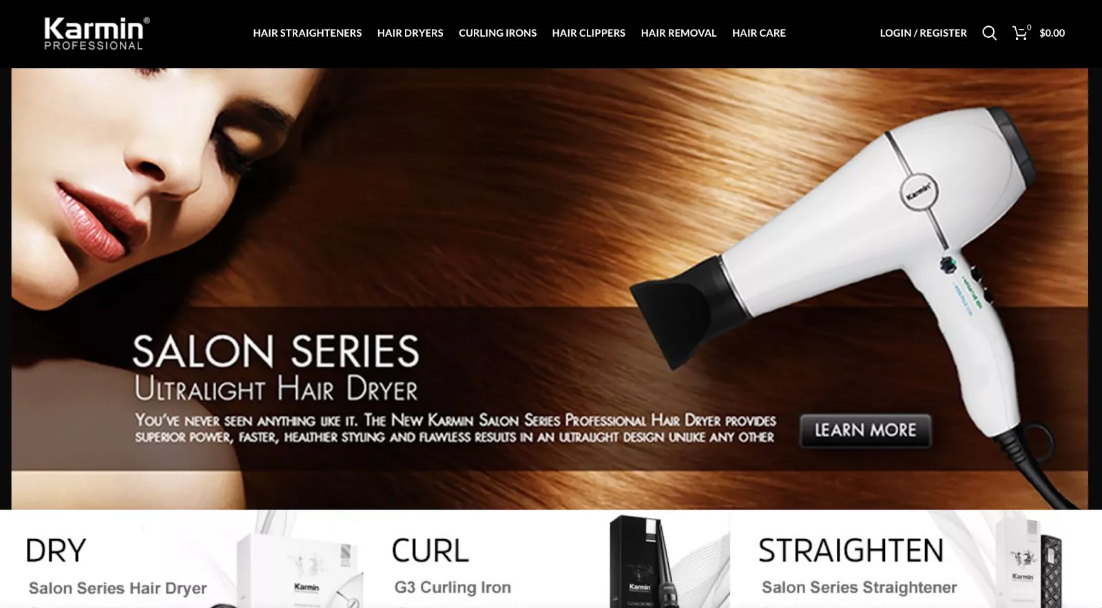
This WooCommerce store is clearly divided into categories for each sort of product, with a centerfold image highlighting one of their most popular items.
This layout makes it easy for visitors to find exactly what they’re looking for without wasting time. However, we noticed some issues with image quality, as certain product photos have lower resolution than others.
WooCommerce examples for clothing sites
Clothing is certainly one of the most popular ecommerce industries, and here you’ll find some of the best WooCommerce site examples in that category.
Amundsen Sports
- Headquarters: Norway
- Revenue: <$1 Million
Amundsen Sports is an athletic fashion brand that focuses on apparel and accessories for winter sports. Their hero image displays a varied selection of their products, including multiple items for men and women.
From the homepage, visitors can easily click through to browse either the men’s or women’s collection.
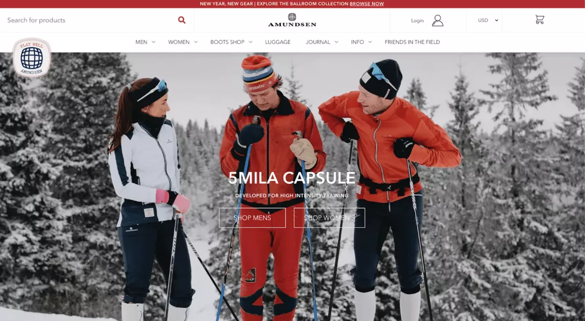
While Amundsen’s photo isn’t quite as captivating as the top hero images on this list, it’s displayed in a relatively high resolution and does a good job of letting visitors know what to expect from the brand. They use Instagram perfectly to promote their WooCommerce store.
Amundsen Sports improved its marketing automation capabilities by switching to Omnisend and integrating it with WooCommerce. Omnisend offered more intuitive workflows and automation design, enabling the creation of effective email campaigns.
👉 Read the complete case study, and learn how the brand used just three automations to boost sales substantially.
OVER
- Headquarters: Serbia
- Revenue: <$1 Million
OVER sells a wide range of clothing and accessories intended for a younger audience.
It has one of the most unique designs out of all the WooCommerce websites we’ve looked at, with a streamlined layout, limited text, and a hero image taking up about half of the screen.
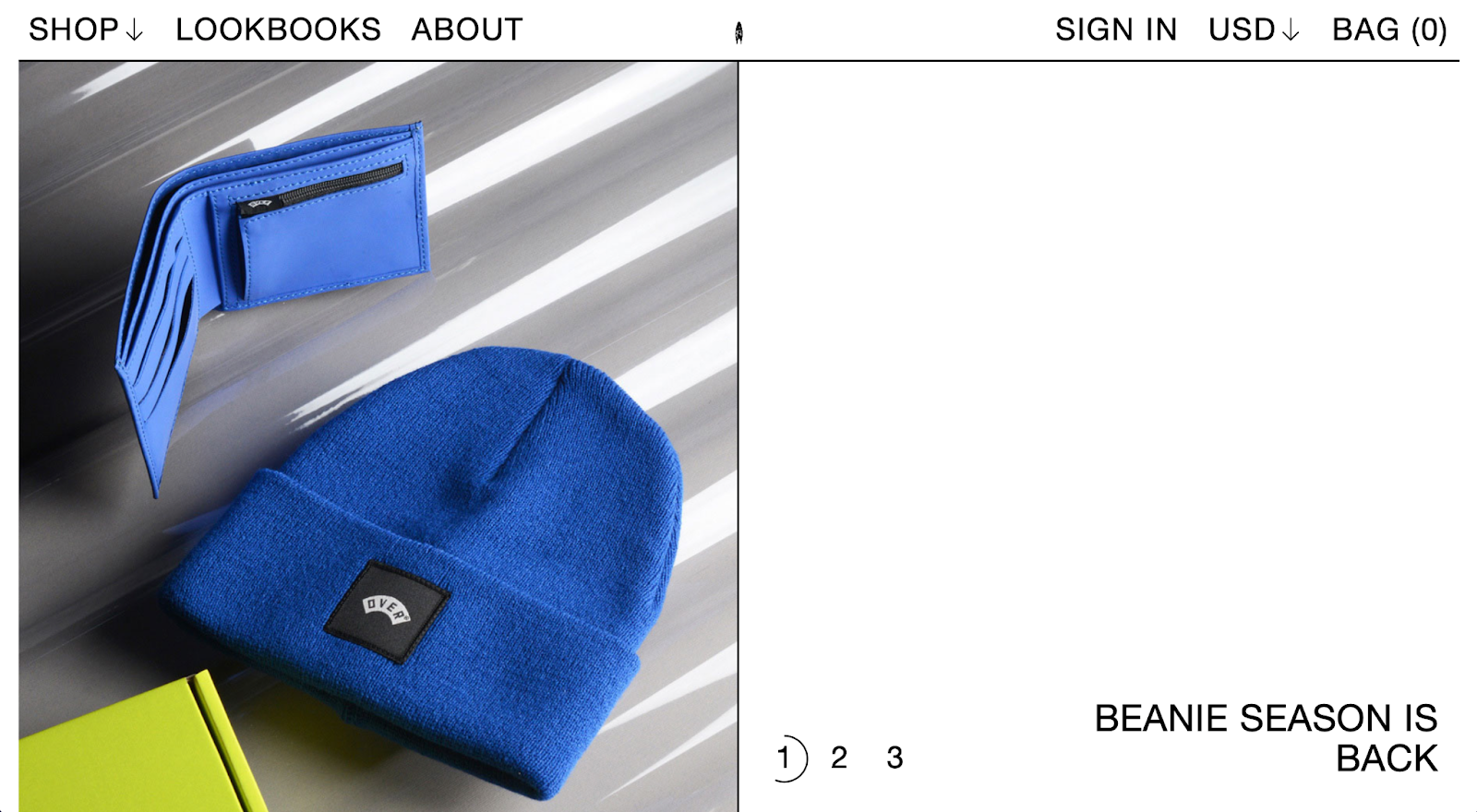
A full-width hero image might be the more conventional choice, but the size of the photo doesn’t appear to have any negative effects on their design. In fact, the smaller image seems to be even more effective in this case since it provides a narrower focus on just two products.
WooCommerce examples for accessories sites
These WooCommerce examples of accessories sites can help inspire your own—just take note of their hits, duplicate them, and avoid their misses.
April Soderstrom
- Headquarters: Massachusetts, United States
- Revenue: <$1 Million
April Soderstrom sells bracelets, necklaces, earrings, and other accessories, focusing on a style that’s fun and casual while also conveying a sense of luxury. Their homepage fits that tone and gives visitors details about a holiday gift set promotion.
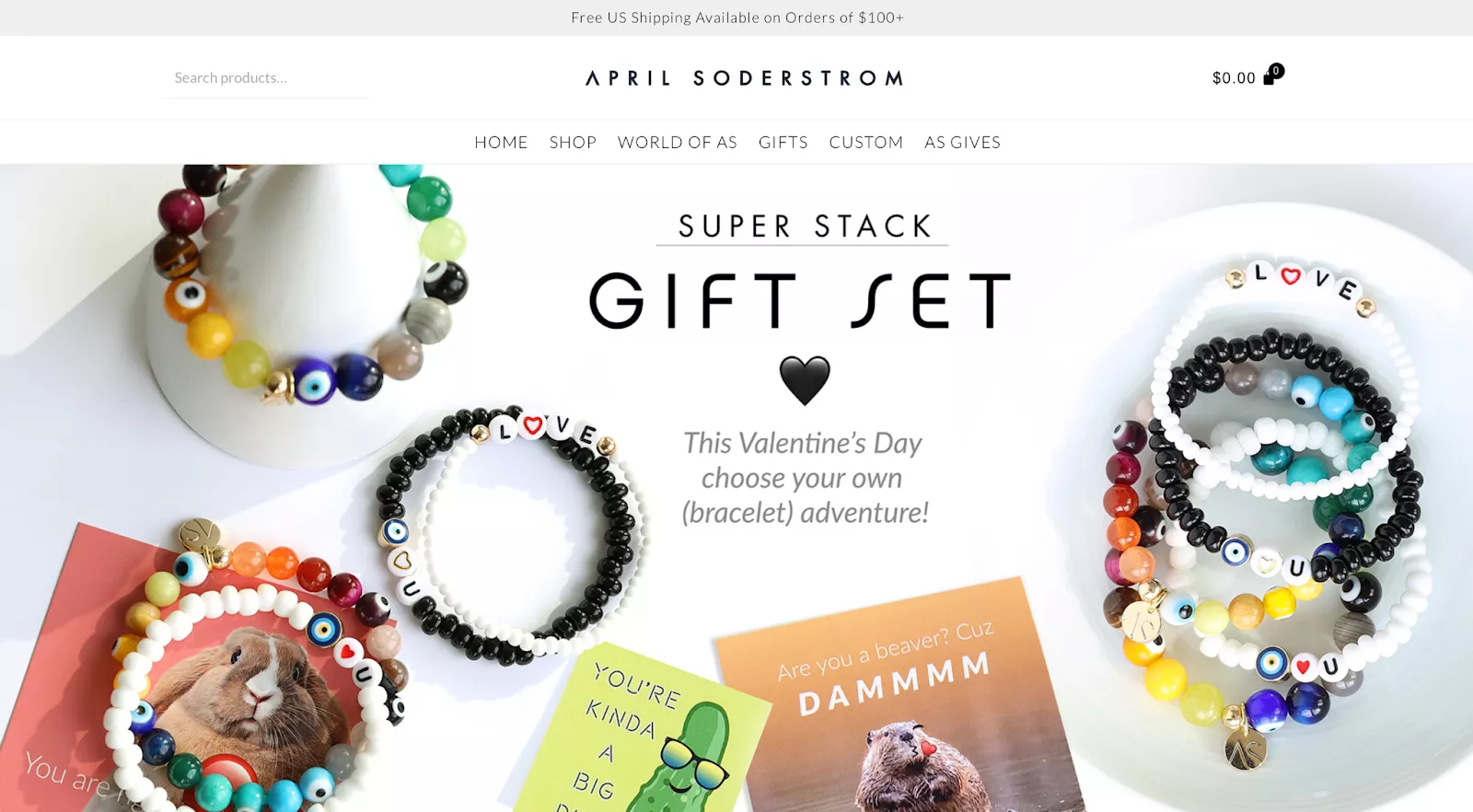
The April Soderstrom website also clearly displays their free shipping policy in a small banner at the top of the page. This gives customers important information about their order without distracting them from the rest of the site.
One potential issue with their site design is that visitors can’t see any product categories without first hovering over the “Shop” button. The hero image itself only mentions bracelets, so users who aren’t familiar with April Soderstrom may not even realize that they also offer other types of accessories.
JOCO Cups
- Headquarters: Australia
- Revenue: $2 million–$5 million
JOCO Cups is a direct-to-consumer brand that sells glasses, reusable cups, bottles, straws, and other drinking products. Their site design is somewhat similar to other DTC brands, with a minimal aesthetic based on a relatively monochrome color palette.
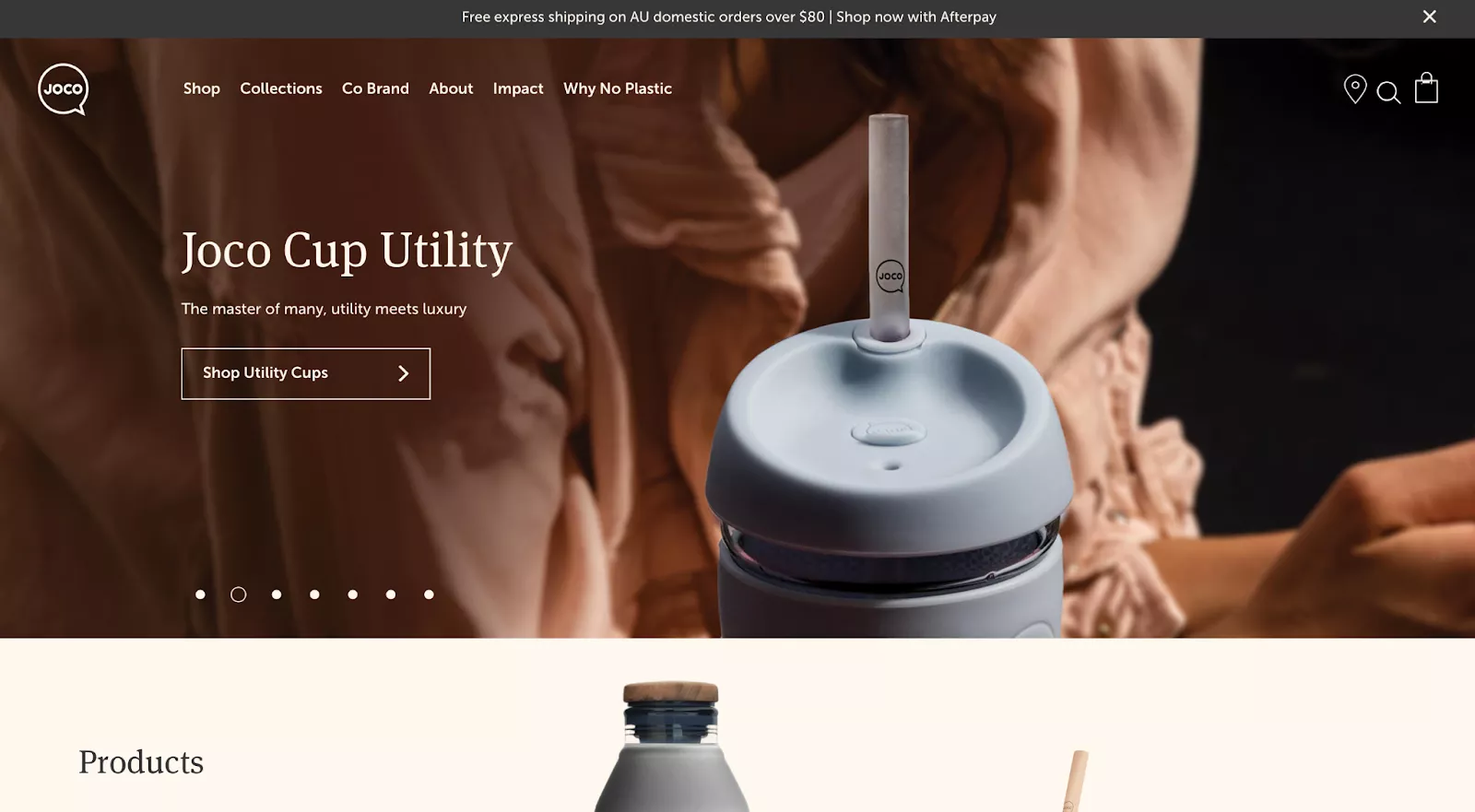
The JOCO Cups homepage slowly scrolls through hero images of some of their most popular products. Each item is displayed in a high-resolution image that fits the brand aesthetic, with a matching call to action that takes visitors to the corresponding category page.
On the other hand, we also noticed that their site has some issues with localization. Even though we were visiting their site from the US, we were shown a banner highlighting “free express shipping on AU domestic orders over $80.”
Kemo Sabe
- Headquarters: Colorado, United States
- Revenue: $50 million–$75 million
Kemo Sabe is another WooCommerce site example of a brand designing their homepage around a single hero image. They sell a variety of luxury Western fashion items, including jackets, hats, boots, and even belt buckles.
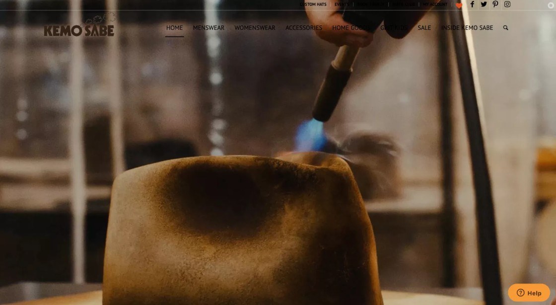
In fact, Kemo Sabe goes above and beyond the conventional hero image by using a background video that illustrates the process of producing one of their flagship hats. This is a great way to showcase your unique brand style, particularly if your company uses traditional or bespoke production methods.
WooCommerce examples for food sites
Because of the delectable nature of this particular category, it’s a good idea to see some WooCommerce food store examples.
Daelmans Stroopwafels
- Headquarters: New York, United States
- Revenue: <$1 Million
The Daelmans Stroopwafels website has a relatively straightforward design, but their team did an excellent job of integrating the brand’s color, style, and product into a single page.
This is one of the best WooCommerce examples of how a homepage can also give visitors clear access to various areas of the site without distracting from the visual design.
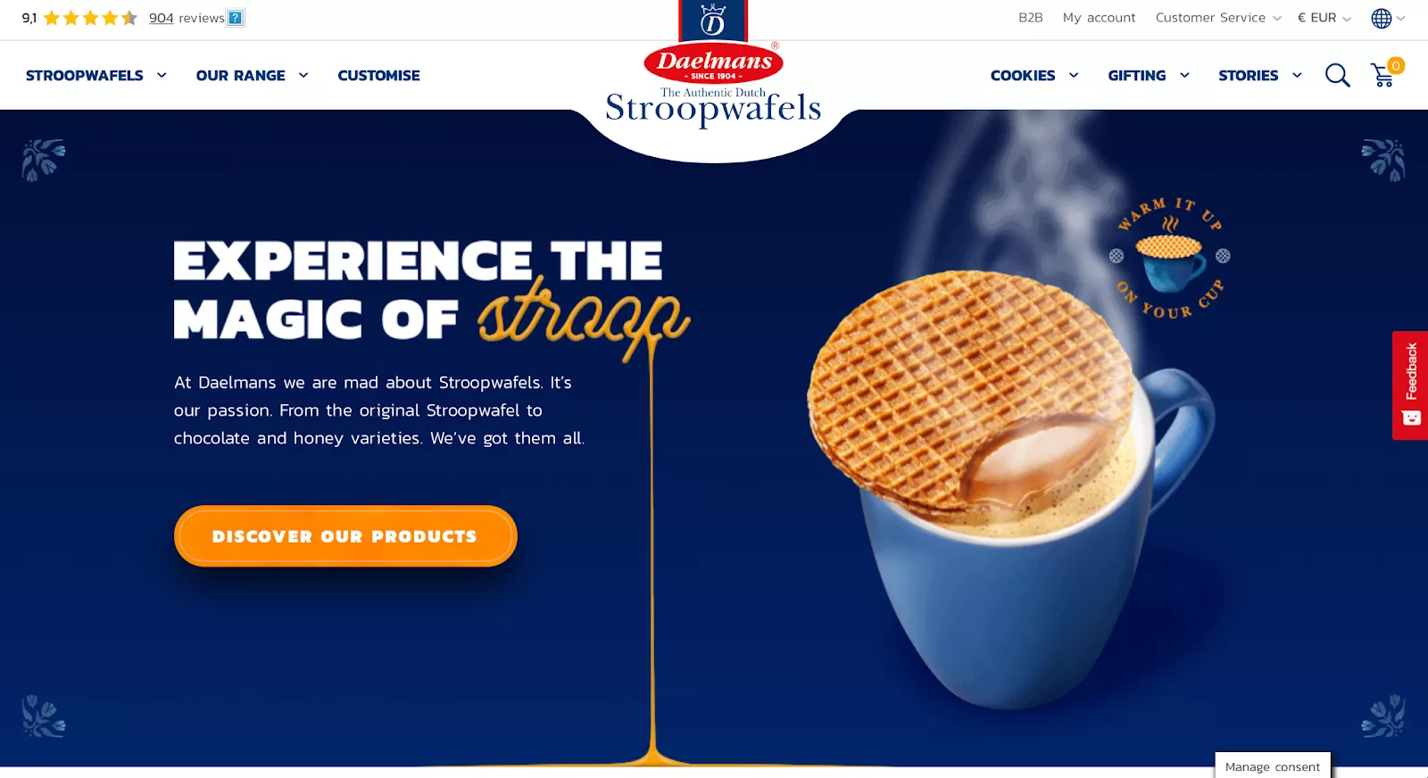
While the Daelmans website is extremely well-designed, we noticed that their prices are listed in euros—even for users accessing the store from North America. There’s a small dropdown menu in the upper-right corner for visitors who want to see prices in their local currency, but that’s an inelegant solution compared to simply showing localized prices by default.
WooCommerce examples for home decor sites
Get some inspiring ideas from these WooCommerce examples focused on the home decor category.
Martin’s Home & Garden
- Headquarters: United States
- Revenue: $25 million–$50 million
Martin’s Home & Garden is a family-run establishment offering a wide range of indoor plants and landscaping materials.
Their website effectively communicates their business’s essence through its color scheme. Green is a common choice for companies in the gardening industry, and Martin’s Home & Garden is no exception.
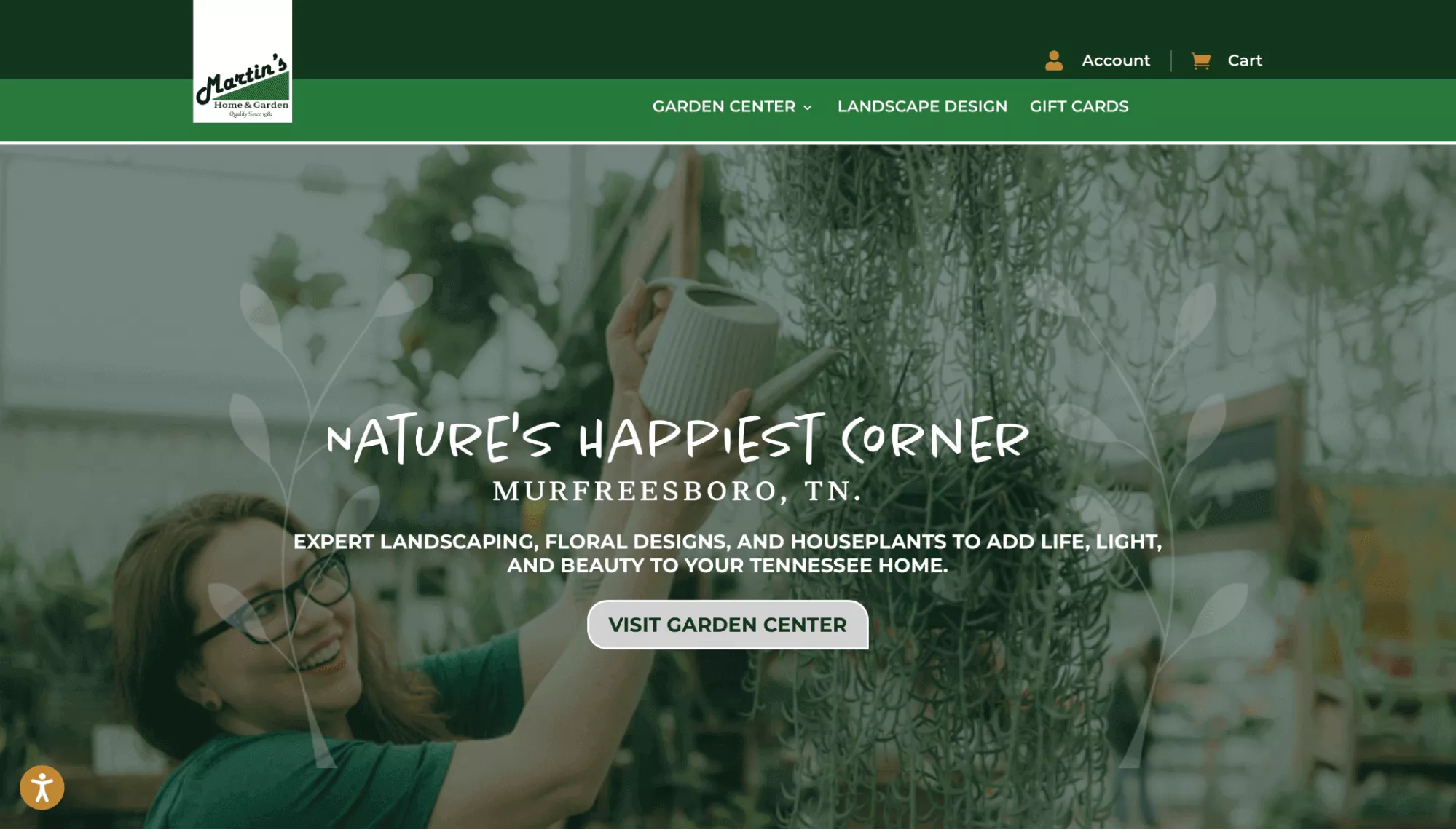
Additionally, there’s a small accessibility icon at the lower-left corner of the screen. Upon clicking it, a larger window appears, presenting a variety of accessibility options. Impressively, the company extends support to users with ADHD, which is a rare feature. You can even customize fonts, alignment, colors, and orientation.
It’s a good idea to ensure your website is accessible. This way, you can enhance the user experience and potentially give your search rankings a boost.
Taps Empire
- Headquarters: United Kingdom
- Revenue: $2 million–$5 million
Taps Empire is a British brand that delivers taps/faucets along with a variety of home products such as shower parts, toilets, basins/sinks, radiators, and more.
When someone goes to an online store to look at bathroom products, they usually aren’t there to window shop—they typically come in with a product or category in mind. The Taps Empire website is perfectly built around that fact, focusing directly on their best deals and the types of products they offer, with clear categories for each kind of item.
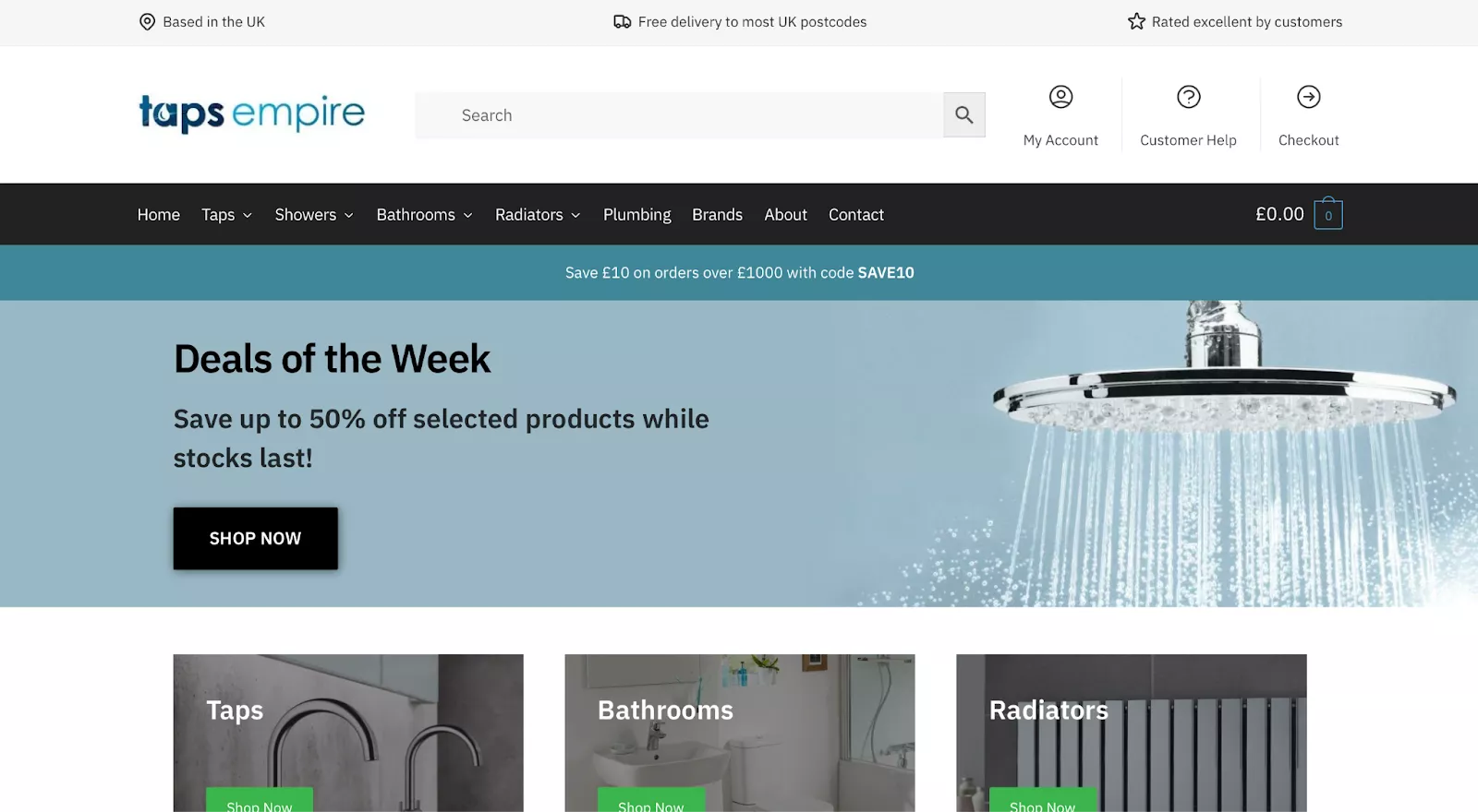
If you’re selling commodities or necessities, you should consider making your WooCommerce website less flashy and instead focusing on getting visitors to your products as quickly as possible.
Heymat
- Headquarters: Norway
- Revenue: <$1 Million
Like Sodashi, Heymat goes for a single hero image instead of a more broken-up design. While that isn’t necessarily the right decision for every ecommerce merchant, it often works well for brands in beauty, interior design, and other fields with a heavy emphasis on aesthetics.
Rather than a specific product or offer, Heymat starts with a more general tagline that invites customers to find out what makes them different from other brands. Visitors can scroll down to view some of their designs or click the “Read More” button to learn more about their history and philosophy.
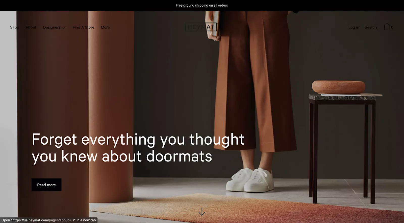
However, Heymat’s design still isn’t perfect. The positioning and color of the menu items at the top of the screen are clear oversights. The “Log in,” “Search,” and Cart options in the upper-right corner, for example, are barely visible against the dark background. Even the logo is mostly hidden except for the “AT” that shows up over the model’s hand.
WooCommerce examples for digital sites
Digital goods are a popular niche for ecommerce stores, and these WooCommerce examples can help you create your own.
GameTextures
- Headquarters: Washington, United States
- Revenue: $2 million–$5 million
GameTextures is a digital platform that sells ready-made textures and other assets to game developers. If a developer wants to add trees to their game, for example, they can simply pay for a pre-made tree from GameTextures instead of building an entire tree model from scratch.
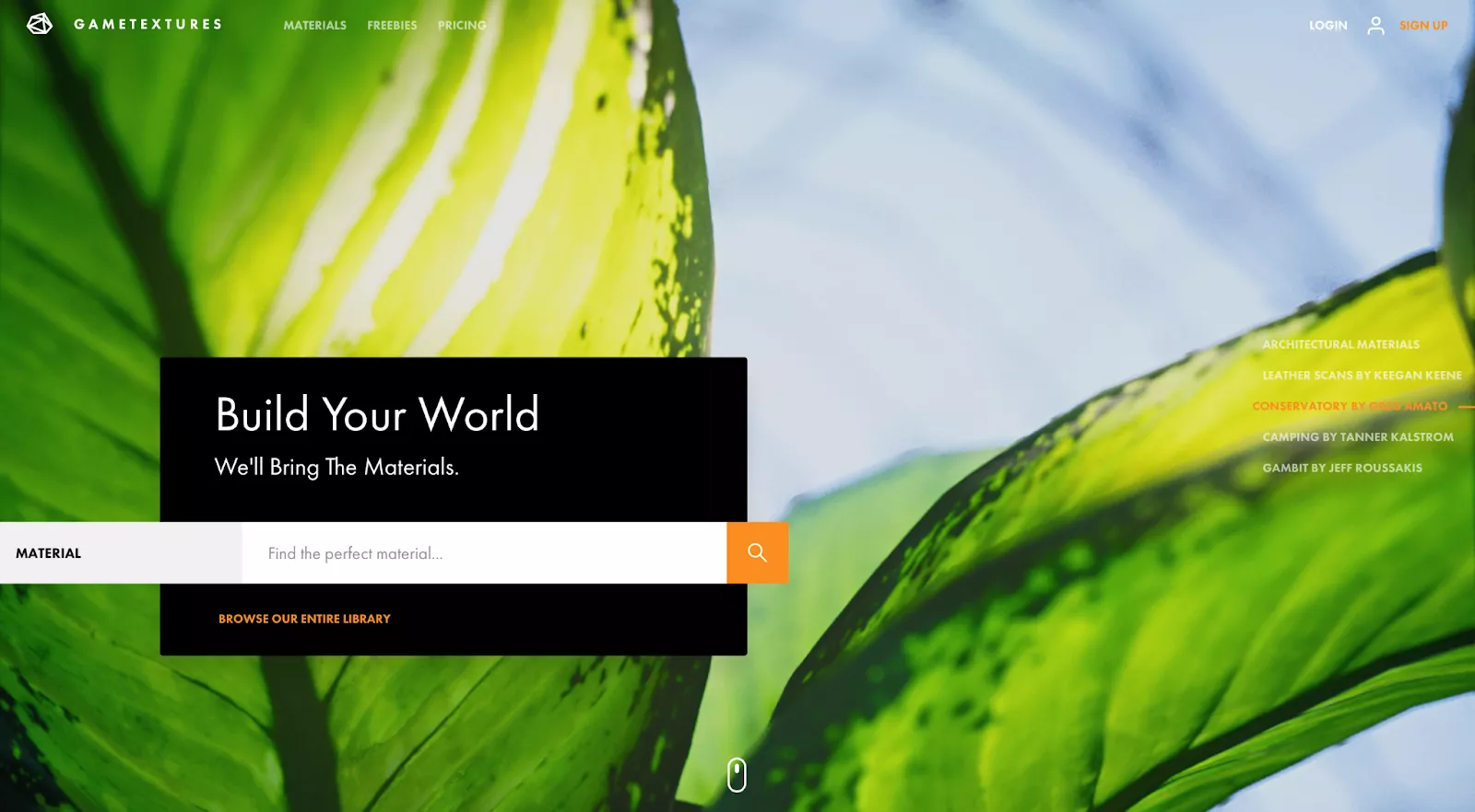
With that in mind, the visual quality of the textures is key to the brand’s pitch. The homepage accordingly focuses on the detail and vivid colors visitors can expect from a GameTextures asset. Users can easily scroll through five different samples to get an idea of the platform’s varied selection.
Printing New York
- Headquarters: New York, United States
- Revenue: $1 million–$2 million
Printing New York provides same-day printing services in New York City as well as shipping throughout the United States. Similar to Taps Empire, this WooCommerce online store likely gets visitors who already need a printing order and are not simply window shopping or browsing.
For users on a short timeline, the website immediately highlights same-day printing and invites visitors to make a rush order.
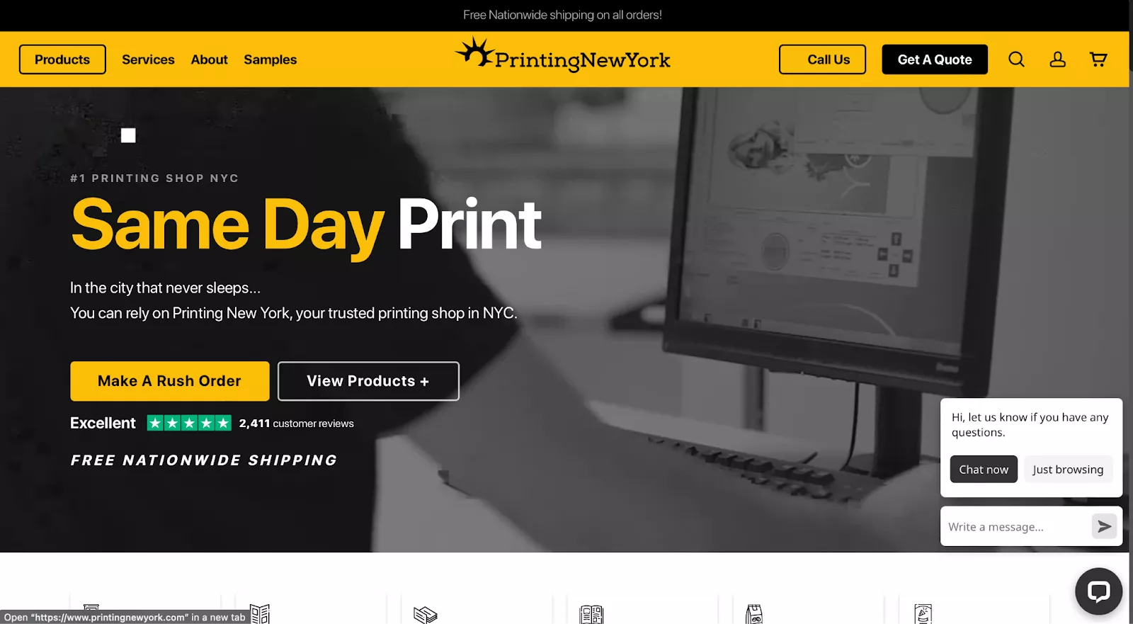
This WooCommerce website also stood out to us due to its inclusion of a live chat interface, which you can see in the bottom-right corner. Printing clients are likely to have a variety of questions about their orders. This is just one example of how their site design is built around a typical customer journey for their unique audience.
While live chat is better than nothing, the experience could be much improved with an automated chatbot. With no chatbot, help is only available when there’s a real person on the other end—even for simple questions that a chatbot could easily answer.
WooCommerce examples for health sites
Here are some great health and fitness WooCommerce examples.
Soothing Scents
- Headquarters: United States
- Revenue: $5 million–$10 million
Soothing Scents offers a wide range of products designed to promote relaxation, well-being, and stress relief. These include essential oil diffusers, aromatherapy jewelry, and various essential oil blends.
Soothing Scents’ pitch is simple: feel great no matter where you go by using their essential oils. Their website is designed to get visitors interested as quickly as possible without wasting their time.
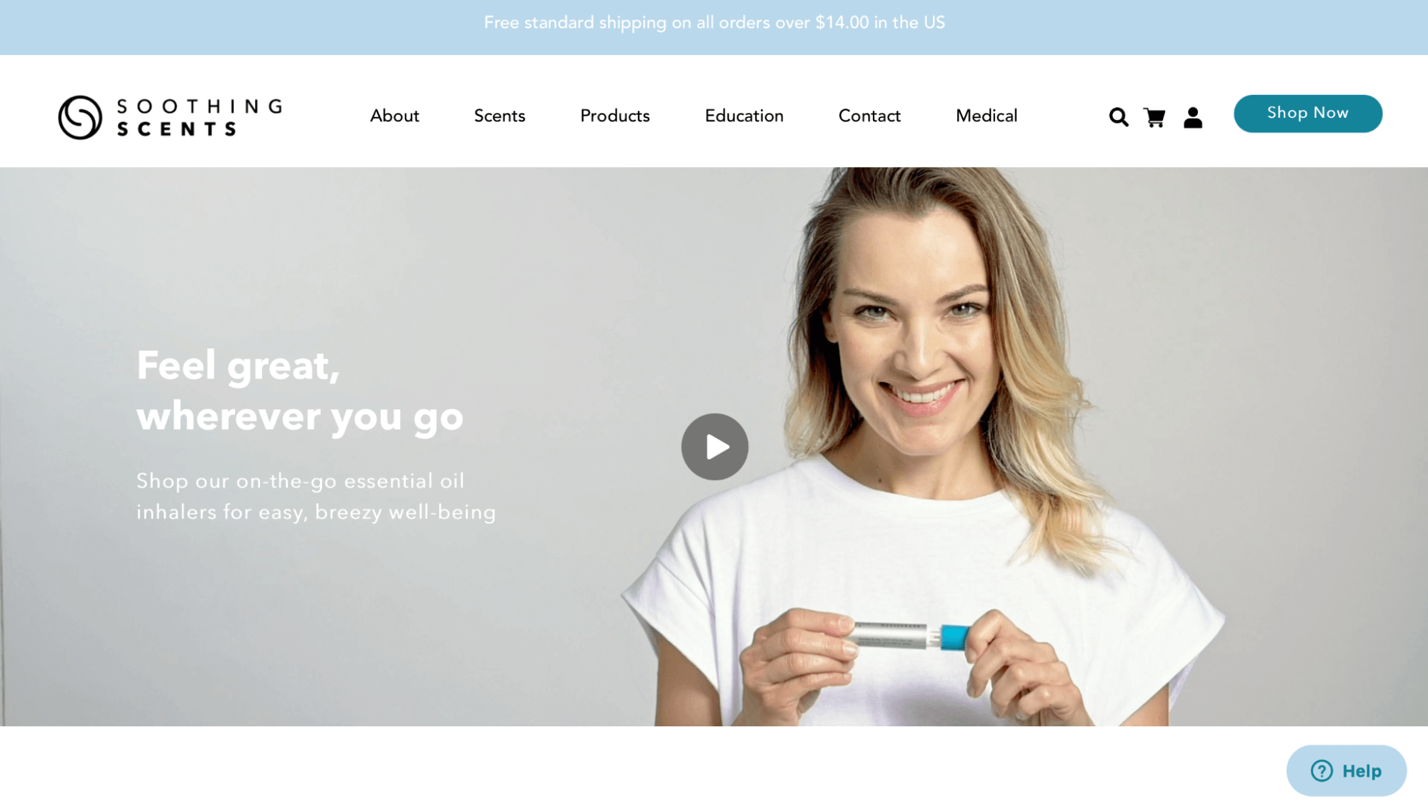
Take a moment to examine all the information presented to users upon their arrival at the site. Visitors are greeted with the logo and a glimpse of the product, a quick description of what to expect, and a clear outline of the company’s free shipping policy.
At the same time, Soothing Scents manages to provide all this information without making things too complicated. The choice of sentence case copy and a clean design works well, especially for direct-to-consumer brands that aim to connect with younger consumers.
R.E.D.D.
- Headquarters: Maine, United States
- Revenue: $15 million–$25 million
Last on our list of WooCommerce website examples is R.E.D.D., or “Radiant Energy Deliciously Delivered.” This health food company offers nutritionally dense bars and “elixirs” that come in a kind of pouch. Their colorful, vivid design matches their upbeat style, while their basic pitch is outlined in a clear font near the top of the page.
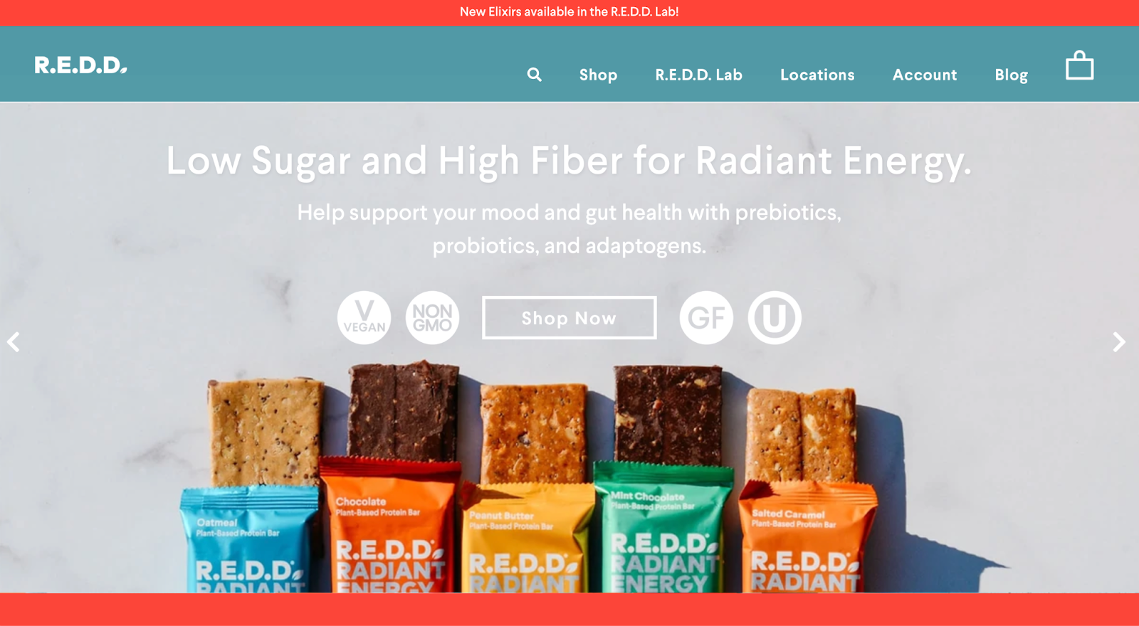
The photo itself shows off R.E.D.D.’s sleek branding and lets visitors know what the bars themselves look like. They also put several relevant labels on their homepage, clarifying that their products are vegan, non-GMO, and gluten-free. Also, they offer various ways of buying their products by single items or product bundles to match the buyer’s preferences.
Unfortunately, the homepage doesn’t say anything about their shipping practices or how customers can expect to have the bars delivered. That information is hidden in the FAQ, which is only linked at the very bottom of the page.
Final thoughts
In an increasingly competitive ecommerce environment, WooCommerce shops need to do more and more in order to stand out from the crowd.
If you’re working to optimize your WooCommerce business, get started with Omnisend for free to start developing more sophisticated omnichannel marketing campaigns.
Source from Omnisend
Disclaimer: The information set forth above is provided by omnisend.com independently of Alibaba.com. Alibaba.com makes no representation and warranties as to the quality and reliability of the seller and products.
